AI Prompt Studio - Thư viện Prompt thông minh
Khám phá và sử dụng các prompt AI chuyên nghiệp để tối ưu hóa công việc của bạn.
One-click Sử dụng
Websites
Văn bản Markdown
design-md
website-prompt
landing-page-prompt
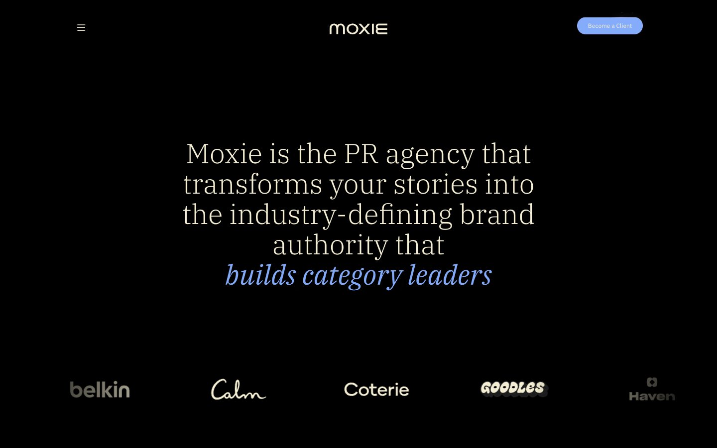
Moxie
Moxie — Style Reference
# Moxie — Style Reference
> Editorial darkroom with a single periwinkle flare — serif headlines float on a black void while a vivid blue accent punctuates the silence.
**Theme:** dark
Moxie's design system operates as an editorial PR-agency darkroom: deep black canvas, warm cream typography, and a single vivid periwinkle accent that lights up interactions like a stage spotlight. The pairing of IBM Plex Serif (for headlines) with IBM Plex Sans (for everything else) creates a magazine-meets-product tension — the serif whispers authority and editorial polish, while the sans keeps functional UI grounded and modern. Layout breathes generously with large centered serif hero statements, asymmetric card grids for work showcases, and horizontal scrolling case-study carousels. Color is used sparingly: the cream (#f4efd4) does the heavy lifting for text and hairline borders on cards, the periwinkle blue (#84acfb) acts as a singular accent for italic emphasis, active states, and the sole filled CTA, and deeper warm grays layer card-on-card depth. There are no shadows, no gradients, no decorative chrome — the system relies on generous spacing, type contrast, and selective color punctuation to create hierarchy.
## Tokens — Colors
| Name | Value | Token | Role |
|------|-------|-------|------|
| Periwinkle Flare | `#84acfb` | `--color-periwinkle-flare` | Primary action background, italic emphasis text, active nav state, heading accent — the lone chromatic signal in an otherwise achromatic system, used surgically to make interactions feel switched on |
| Warm Cream | `#f4efd4` | `--color-warm-cream` | Primary text, card borders, hairline dividers, card surfaces — a warm off-white that softens the black void and carries the editorial tone |
| Warm Ash | `#626055` | `--color-warm-ash` | Secondary card borders, muted text, button borders — a mid-tone warm gray for layering depth between cream borders and the black canvas |
| Charcoal Veil | `#333333` | `--color-charcoal-veil` | Subtle borders, low-emphasis dividers, body text borders — the deepest visible neutral for near-invisible structural lines |
Websites
Văn bản Markdown
design-md
website-prompt
landing-page-prompt
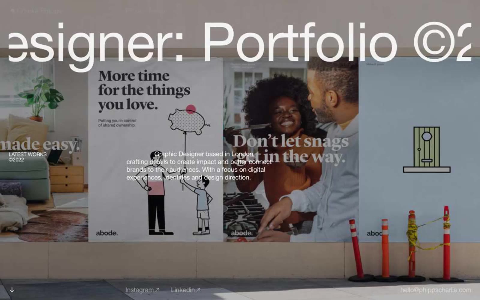
Charlie Phipps
Charlie Phipps — Style Reference
# Charlie Phipps — Style Reference
> oversized editorial gallery wall — một headline Helvetica khổng lồ duy nhất và một bức ảnh full-bleed, không gì khác
**Theme:** mixed
Charlie Phipps là portfolio của một graphic designer London, được thể hiện như một hệ thống poster editorial cỡ lớn: ảnh full-bleed làm hero canvas, một headline Helvetica Neue đồ sộ trên mỗi màn hình, và sự im lặng gần như tuyệt đối về màu sắc. Trang web mang phong cách như một zine in ấn được phóng to lên kích thước tường — weight 400 ở 162px là một sự phá vỡ quy tắc có chủ đích (không có tiếng hét in đậm, chỉ là những chữ cái mỏng manh tự tin) kết hợp với negative tracking mạnh, khiến headline cắt vào viewport. Canvas nền gần như đen (#101011) để những mảng màu chụp ảnh bùng nổ mạnh hơn, nhưng các content section lại chuyển sang trắng với cùng sự kiềm chế đầy kịch tính. Không có nút bấm, không góc bo tròn, không đổ bóng, không color token — tương tác được gợi ý bằng gạch chân mảnh và trạng thái con trỏ, navigation được rút gọn thành ba link mảnh ở một góc. Khoảng trắng là công cụ cấu trúc chính, không phải card hay divider.
## Tokens — Colors
| Tên | Giá trị | Token | Vai trò |
|------|-------|-------|---------|
| Canvas Black | `#101011` | `--color-canvas-black` | Canvas nền trang bên dưới ảnh full-bleed và các dải tối; màu chữ chính trên bề mặt sáng; gạch chân link trong ngữ cảnh tối |
| Paper White | `#ffffff` | `--color-paper-white` | Màu chữ chính trên nền tối/ảnh chụp; background content section; màu border chủ đạo (đường kẻ mảnh và divider xuyên suốt layout) |
| Ink Black | `#000000` | `--color-ink-black` | Màu heading và body text trên bề mặt sáng; màu border cấu trúc thứ hai — được dùng ở bất cứ đâu cần một cạnh cứng hơn #101011 |
| Fog Gray | `#ededed` | `--color-fog-gray` | Surface tint nhẹ để phân tách content block khỏi nền trắng; border mềm trên body text và card nơi đường kẻ trắng tinh sẽ biến mất |
Websites
Văn bản Markdown
design-md
website-prompt
landing-page-prompt
Qatalog
# Qatalog — Style Reference
# Qatalog — Style Reference
> ink on paper with two violet sparks
**Theme:** light
Qatalog operates as a near-monochrome productivity canvas: white background, dark slate ink, and a restrained two-violet accent system that appears as small functional punctuation rather than broad washes. Typography is compact and confident — Plus Jakarta Sans at weights 650-700 carries headlines with tight negative tracking, while Inter handles body and UI chrome at smaller sizes. Surfaces stay flat; depth comes from dark filled cards and 9px radii, never from drop shadows. The single vivid moment is a rainbow gradient that crowns the final dark CTA section, acting as the only chromatic release across an otherwise quiet, architectural layout.
## Tokens — Colors
| Name | Value | Token | Role |
|------|-------|-------|------|
| Ink | `#292d34` | `--color-ink` | Primary text, dark surface fills, structural borders — cool near-black that reads as the dominant ink across the system |
| Pure White | `#ffffff` | `--color-pure-white` | Page canvas, card surfaces, text on dark fills |
| Slate | `#646464` | `--color-slate` | Secondary text, link borders, muted UI chrome — the mid-gray that carries nav, list borders, and body annotations |
| Charcoal | `#202020` | `--color-charcoal` | Dark filled button backgrounds, dark card surfaces, deep accent panels |
Websites
Văn bản Markdown
design-md
website-prompt
landing-page-prompt
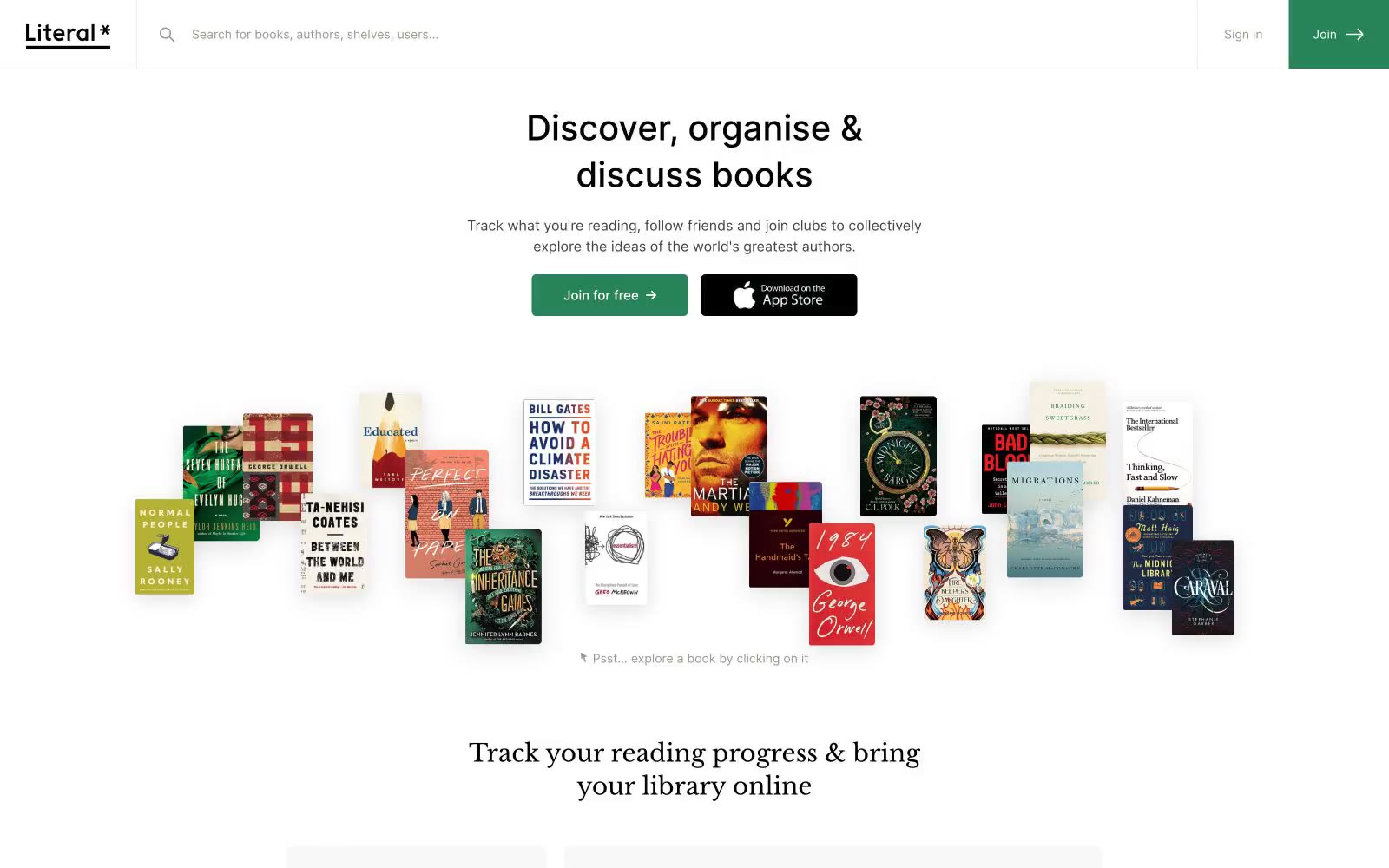
Literal
Literal — Style Reference
# Literal — Style Reference
> Thư viện trong ánh sáng dịu nhẹ — một phòng đọc nơi tường kem ấm áp giao hòa với kệ gỗ óc chó tối màu.
**Theme:** light
Literal là một phòng đọc văn học được tái hiện trong ánh sáng dịu nhẹ: một canvas gần như đơn sắc, nơi điểm nhấn màu sắc duy nhất là một tông xanh rừng (forest green) đánh dấu hành động chính. Headlines sử dụng serif ấm áp mang chất sách vở (Libre Baskerville), trong khi mọi thành phần chức năng đều dùng geometric Inter sạch sẽ, tạo nên sự căng thẳng nhẹ nhàng giữa phong cách editorial và digital. Các bề mặt mang chất giấy — canvas xám ấm mềm mại bên dưới những card trắng tinh với viền mảnh và hầu như không có bóng. Toàn bộ trải nghiệm mang cảm giác tĩnh lặng, thoáng đãng, lấy nội dung làm trung tâm, với bìa sách và ảnh chụp màn hình sản phẩm đảm nhận vai trò thị giác mà màu sắc và trang trí không làm.
## Tokens — Colors
| Tên | Giá trị | Token | Vai trò |
|------|-------|-------|------|
| Forest Green | `#278458` | `--color-forest-green` | Màu nền cho primary CTA, điểm nhấn thương hiệu, ký tự ngôi sao trong wordmark, trạng thái active — một điểm nhấn màu duy nhất neo giữ một giao diện gần như không màu |
| Charcoal | `#444340` | `--color-charcoal` | Văn bản body chính và UI text, icon strokes, đường viền mặc định |
| Soft Gray | `#f8f8f8` | `--color-soft-gray` | Nền canvas trang và nền section — tông trắng ngà ấm giúp card trắng có cảm giác phân lớp thay vì lơ lửng |
| Warm Gray | `#9a988b` | `--color-warm-gray` | Văn bản phụ trợ mờ, metadata thứ cấp, đường phân cách danh sách, link đã giảm nhấn mạnh |
Websites
Văn bản Markdown
design-md
website-prompt
landing-page-prompt
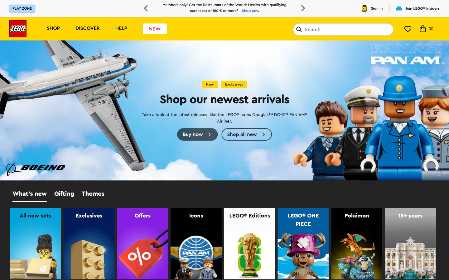
Lego
Home — Style Reference
# Home — Style Reference
> Lối đi đồ chơi màu primary — độ sáng của một hộp set vừa mới mở trên bàn trắng.
**Theme:** light
Cửa hàng kỹ thuật số của LEGO mang cảm giác như một lối đi đồ chơi được dựng bằng pixel — màu primary được triển khai không chút kiềm chế, ảnh sản phẩm đảm nhận toàn bộ công việc tạo cảm xúc trên nền trắng và gần đen. Màu vàng (#FFD502) là nhịp đập của thương hiệu: nó xuất hiện trên badge, nav highlight và thanh logo — một hằng số màu sắc duy nhất giữa khung neutral trắng/gần đen. CTA màu cam (#F47D20) trên nút pill 999px là màu call to action duy nhất — ấm áp, bo tròn, dễ đọc ngay lập tức trên nền trắng sản phẩm. Footer tối (#201D48) neo trang vào màu navy đậm cổ điển của LEGO, tạo điểm tựa cho một trang vốn sống trong ánh sáng ban ngày rực rỡ. Toàn bộ chữ là Cera Pro, một sans-serif hình học bo tròn tùy chỉnh, phản ánh đường cong của viên gạch LEGO — weight 700 cho heading với tracking dày, weight 400 cho body text, không có gì khác.
## Tokens — Colors
| Tên | Giá trị | Token | Vai trò |
|------|-------|-------|------|
| LEGO Yellow | `#FFD502` | `--color-lego-yellow` | Logo background, badge, active nav indicator, brand accent — hằng số màu duy nhất xuất hiện bất kể section nào trên trang, khiến mọi badge trông như một sticker giá trên hộp đồ chơi. |
| Brick Orange | `#F47D20` | `--color-brick-orange` | Nút CTA chính ('Mua ngay', 'Thêm vào giỏ', 'Trở thành hội viên') — ấm áp trên nền trắng sản phẩm, màu fill nút pill duy nhất cho hành động mua hàng. |
| Ember Dark | `#E96F14` | `--color-ember-dark` | Trạng thái hover/pressed của nút CTA — tối hơn Brick Orange 1 bậc. |
| LEGO Navy | `#201D48` | `--color-lego-navy` | Footer background, bề mặt brand đậm — bề mặt màu tối duy nhất, neo cuối trang với bản sắc thương hiệu. |
Websites
Văn bản Markdown
design-md
website-prompt
landing-page-prompt
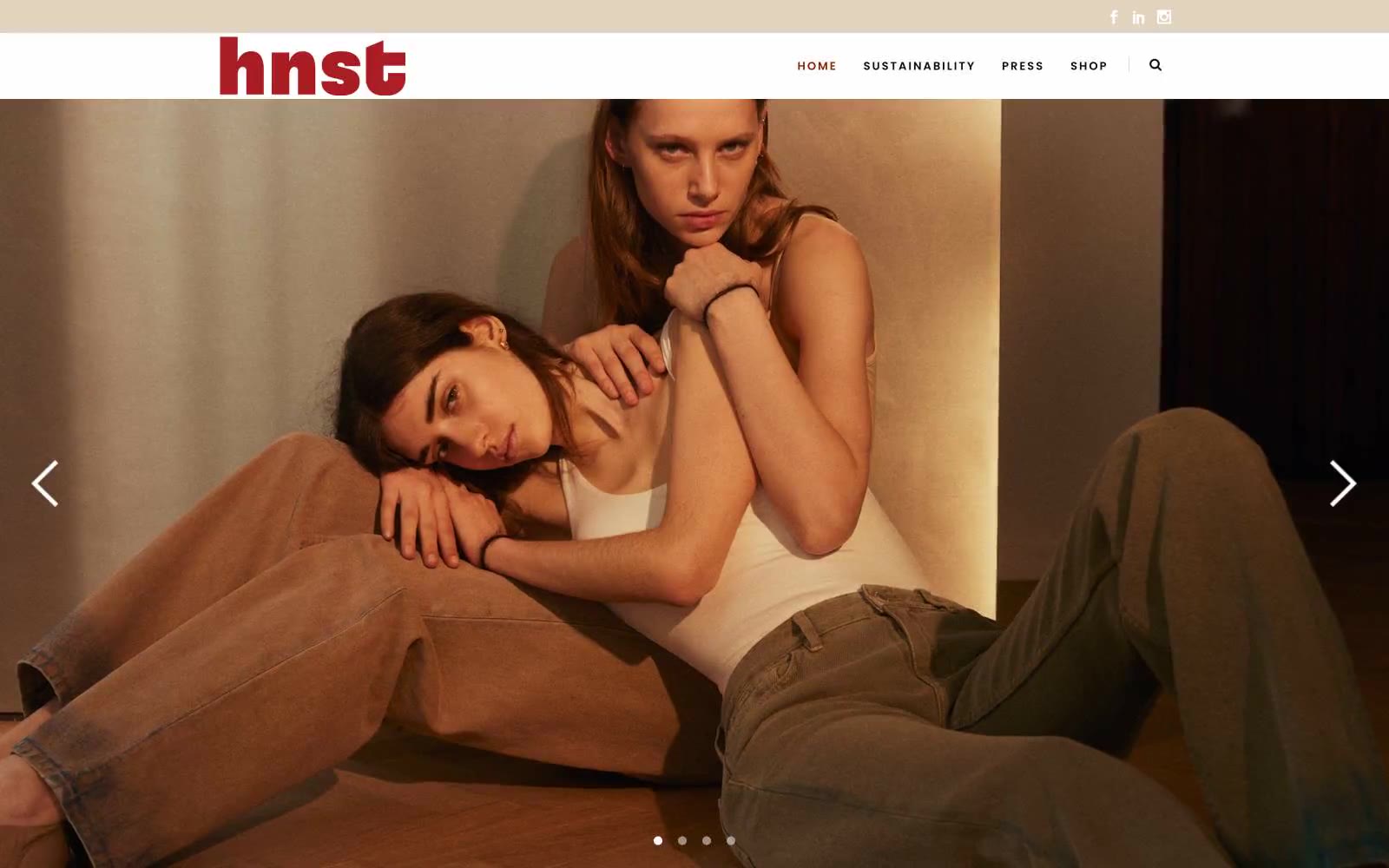
HNST Studio
HNST Studio — Style Reference
# HNST Studio — Style Reference
> atelier đất với gỉ sắt trên vải lanh — một gallery thời trang chậm nơi một điểm nhấn màu cam cháy duy nhất sưởi ấm nội thất kem và than củi vốn mang phong cách tu viện
**Theme:** light
HNST Studio nói bằng ngôn ngữ editorial ấm áp, mộc mạc: canvas trắng xương pha kem lụa thô, một điểm nhấn gỉ sắt neo mọi khoảnh khắc tương tác, và typography uppercase kiểu gallery giúp nhiếp ảnh có không gian thở. Trang web xử lý ảnh thời trang full-bleed như bề mặt chính — text và chrome siêu mảnh, được đặt như bảng chú thích trong bảo tàng xung quanh tác phẩm thị giác. Hai họ chữ phân chia công việc rõ ràng: Raleway đảm nhận UI, navigation, và body copy với tỷ lệ humanist, trong khi Poppins xử lý display heading với letter-spacing cực rộng, biến các nhãn section như 'TRENDING' thành bảng chỉ dẫn in ấn trong gallery. Các component được tinh giản đến mức tối thiểu — border mảnh, badge tông cát mềm, mực than cho hành động, không shadow, không gradient — để điểm nhấn gỉ sắt có trọng lượng editorial trên nền palette trung tính.
## Tokens — Colors
| Tên | Giá trị | Token | Vai trò |
|------|-------|-------|------|
| Rust Hearth | `#892500` | `--color-rust-hearth` | Logo thương hiệu, trạng thái navigation active, gạch chân section, dấu câu màu sắc duy nhất trong giao diện — mang toàn bộ trọng lượng nhận diện ở bất cứ đâu nó xuất hiện |
| Blush Whisper | `#ea9195` | `--color-blush-whisper` | Điểm nhấn màu phụ cho hover state, tag mềm, và các yếu tố trang trí đi kèm — không bao giờ đứng một mình, luôn hỗ trợ Rust Hearth |
| Linen | `#ffffff` | `--color-linen` | Trạng thái form trung tính, badge text, và phản hồi UI nhẹ nhàng nơi màu sắc cần giữ kín đáo. Không nâng cấp nó thành màu CTA chính |
| Raw Silk | `#f9f6f2` | `--color-raw-silk` | Nền trang ấm áp, thay thế cho trắng tinh khiết vô trùng — mang lại cảm giác xúc giác, sợi tự nhiên cho trang web |
Websites
Văn bản Markdown
design-md
website-prompt
landing-page-prompt
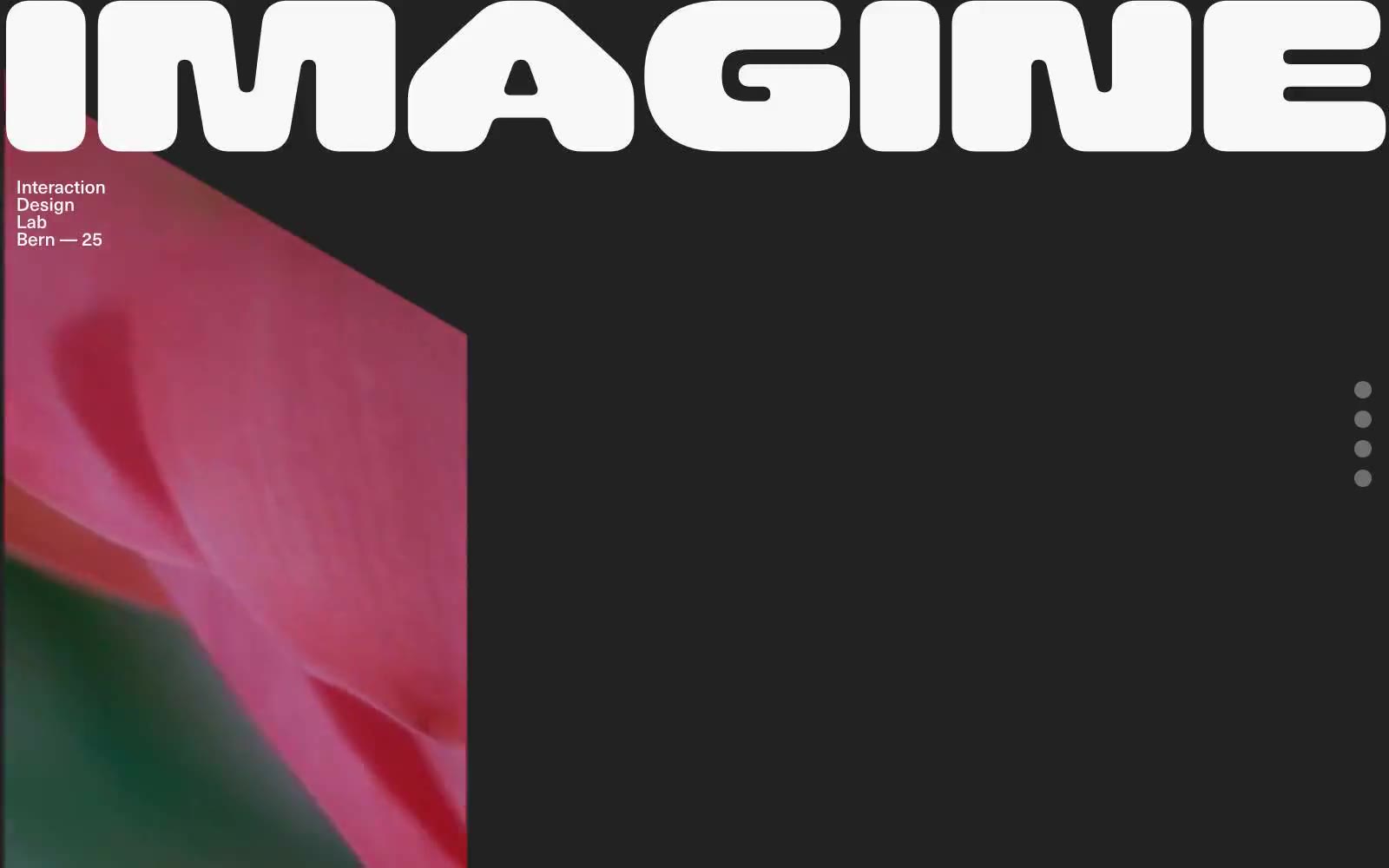
Iad-lab
# Iad-lab — Style Reference
# Iad-lab — Style Reference
> art-school exhibition on charcoal
**Theme:** dark
Iad-lab operates as a digital exhibition wall rather than a conventional website: a near-black canvas interrupted by full-bleed photographic panels and two colossal display words that bleed past the viewport edges. The palette is essentially binary — off-white on charcoal — with zero chromatic decoration, letting the photography carry all emotional and visual weight. Navigation is reduced to three floating dots on the right margin; there is no header bar, no menu, no buttons. Typography does the structural work: a single grotesk family at restrained sizes handles all UI copy while an enormous, rounded display face delivers program titles at architectural scale. The rhythm is gallery-like: wide quiet sections, then sudden full-bleed visual ruptures, then quiet again.
## Tokens — Colors
| Name | Value | Token | Role |
|------|-------|-------|------|
| Charcoal Canvas | `#222222` | `--color-charcoal-canvas` | Page background, the dominant surface across all sections and the base layer behind full-bleed photography |
| Bone | `#f8f8f8` | `--color-bone` | All body text, meta labels, navigation dots, and the dominant hairline border color — serves as the single foreground tone in this near-monochrome system |
| Graphite | `#2a2b2d` | `--color-graphite` | Secondary icon strokes, subtle list dividers, and muted fill details — sits one step darker than the canvas for low-contrast decoration |
| Ash | `#757577` | `--color-ash` | Inactive or resting state for navigation dots and quiet UI affordances |
Websites
Văn bản Markdown
design-md
website-prompt
landing-page-prompt
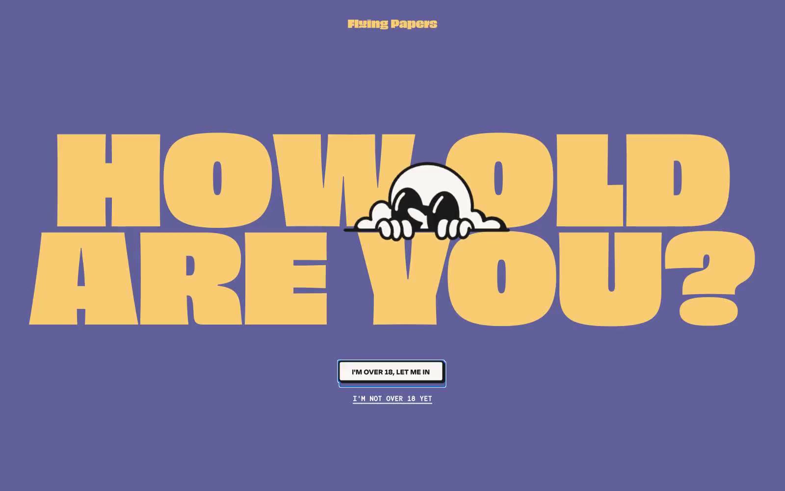
Flying Papers
# Flying Papers — Style Reference
# Flying Papers — Style Reference
> Saturday morning cartoon confessional
**Theme:** light
Flying Papers hoạt động như một bộ phim hoạt hình sáng thứ Bảy in trên giấy riso dày: một sân khấu tím nhạt phẳng, một dàn nhân vật nhỏ với màu sắc bão hòa rực rỡ, và typography cỡ lớn đến mức nuốt chửng viewport. Giọng thương hiệu to, táo bạo và không hề hối lỗi — nó không xin sự chú ý, nó cướp lấy. Mỗi màn hình phải giống như một poster đơn lẻ mạnh mẽ: một display headline chủ đạo, một mascot illustration hỗ trợ, một inline action, và khoảng thở rộng rãi. Borders đảm nhận vai trò chính thay vì shadows; màu sắc được dùng như sơn vẽ, không phải dữ liệu. Bề mặt luôn phẳng, góc cạnh sắc nét ở 6px, và thứ duy nhất mềm mại trong hệ thống là pill 100px trên gate button.
## Tokens — Colors
| Tên | Giá trị | Token | Vai trò |
|-----|---------|-------|---------|
| Dusk Violet | `#8584bd` | `--color-dusk-violet` | Primary canvas và hero background — sân khấu nơi mọi màu sắc khác biểu diễn |
| Hi-Vis Yellow | `#f4ed36` | `--color-hi-vis-yellow` | Yellow accent cho outlined action borders, linked labels, và lightweight interactive emphasis. Không nâng cấp nó thành primary CTA color |
| Buttery Yellow | `#f9cc73` | `--color-buttery-yellow` | Secondary display text và border mềm hơn — phiên bản dịu nhẹ hơn của Hi-Vis khi Hi-Vis quá mạnh |
| Lilac Shadow | `#61609a` | `--color-lilac-shadow` | Card và block backgrounds — một violet đậm hơn cho bề mặt lồng trên sân khấu violet |
Websites
Văn bản Markdown
design-md
website-prompt
landing-page-prompt
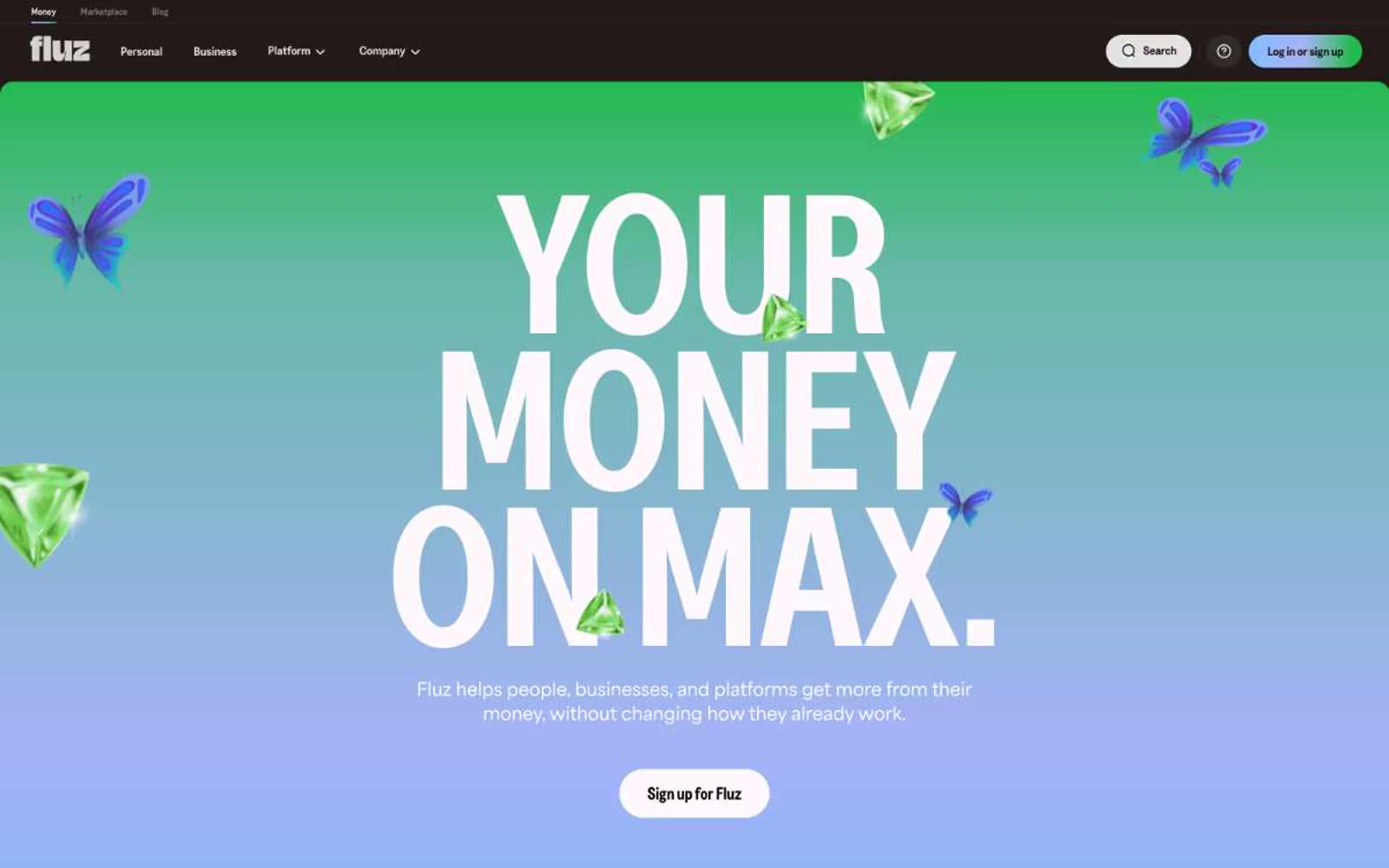
Fluz
Fluz — Style Reference
# Fluz — Style Reference
> Gemstone vault trên nền giấy ấm
**Theme:** light
Fluz xây dựng giao diện tài chính ấm áp, sang trọng dựa trên một màu thương hiệu gần như đen (#1a0000) — thay thế pure black bằng một chút nâu ca cao, khiến display typography đậm nét trở nên giàu có thay vì lạnh lẽo. Hero mang phong cách maximalist — gradient lăng kính full-bleed (xanh da trời → oải hương → bạc hà → ngọc lục bảo) phía sau headline Greed Condensed với kích thước 96–203px, nổi bật cùng đá quý 3D và bướm — trong khi mọi section khác giữ yên tĩnh, trắng và kỷ luật về mặt chữ. Các button có dạng pill mạnh mẽ (radius 200px) với nền đen ấm, tạo sự tương phản gần như kẹo ngọt so với grid card sản phẩm tối giản. Hệ thống cố tình dao động giữa hai chế độ: một màn hình bùng nổ sắc màu vui tươi, và một khu vực trưng bày sản phẩm dài trên nền kem, nơi tracking chặt chẽ và condensed display type đảm nhiệm việc truyền tải thương hiệu.
## Tokens — Colors
| Tên | Giá trị | Token | Vai trò |
|-----|---------|-------|---------|
| Espresso Ink | `#1a0000` | `--color-espresso-ink` | Primary text, filled CTA buttons, top navigation bar, icon strokes — warm near-black thay thế pure #000 để tạo cảm giác như bột ca cao thay vì mực in |
| Prism Spectrum | `linear-gradient(90deg, rgb(130, 190, 255), rgb(166, 180, 247) 47.21%, rgb(91, 184, 154) 73.75%, rgb(33, 186, 76) 91.26%)` | `--color-prism-spectrum` | Hero background gradient — xanh da trời đến oải hương đến bạc hà đến ngọc lục bảo, chỉ dùng một lần ở đầu trang |
| Canvas White | `#ffffff` | `--color-canvas-white` | Nền trang, bề mặt product card, chữ trên nền tối |
| Linen Mist | `#f2f2f2` | `--color-linen-mist` | Secondary card surface, nền section xen kẽ, tạo chiều sâu nhẹ so với pure white |
Websites
Văn bản Markdown
design-md
website-prompt
landing-page-prompt
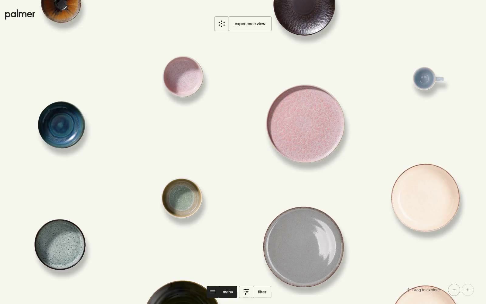
Palmer
Palmer — Style Reference
# Palmer — Style Reference
> Ceramic gallery in soft daylight — the interface is the wall, the objects are the art.
**Theme:** light
Palmer treats dinnerware like a museum exhibit on a warm cream canvas (#f5f6ee). The interface dissolves — no shadows, no chrome, no saturated accents — so hand-glazed ceramics become the only color in the room. Typography runs tight: TWK Lausanne at near-mono weights (300–500) with aggressive negative tracking that pulls letters together, including an enormous 120px display tier that functions more as editorial statement than UI label. Interactive elements are reduced to hairline borders and pill-shaped toggles, sitting at the edges of the viewport to leave the center completely uninterrupted. Everything below the fold assumes the same gallery logic: small text, thin rules, generous space between objects.
## Tokens — Colors
| Name | Value | Token | Role |
|------|-------|-------|------|
| Gallery Cream | `#f5f6ee` | `--color-gallery-cream` | Page canvas and base surface — a warm off-white that flatters glazed ceramics more than pure white would |
| Ink | `#222222` | `--color-ink` | Primary text, hairline borders, card outlines, icon strokes — the entire structural skeleton runs through this one near-black |
| Bone | `#ffffff` | `--color-bone` | Product image backgrounds, occasional inverse surface when a card needs to sit forward of the cream canvas |
| Fog | `#a1a19c` | `--color-fog` | Muted secondary borders and low-priority text — used when Ink would be too heavy for a structural divider |
Websites
Văn bản Markdown
design-md
website-prompt
landing-page-prompt
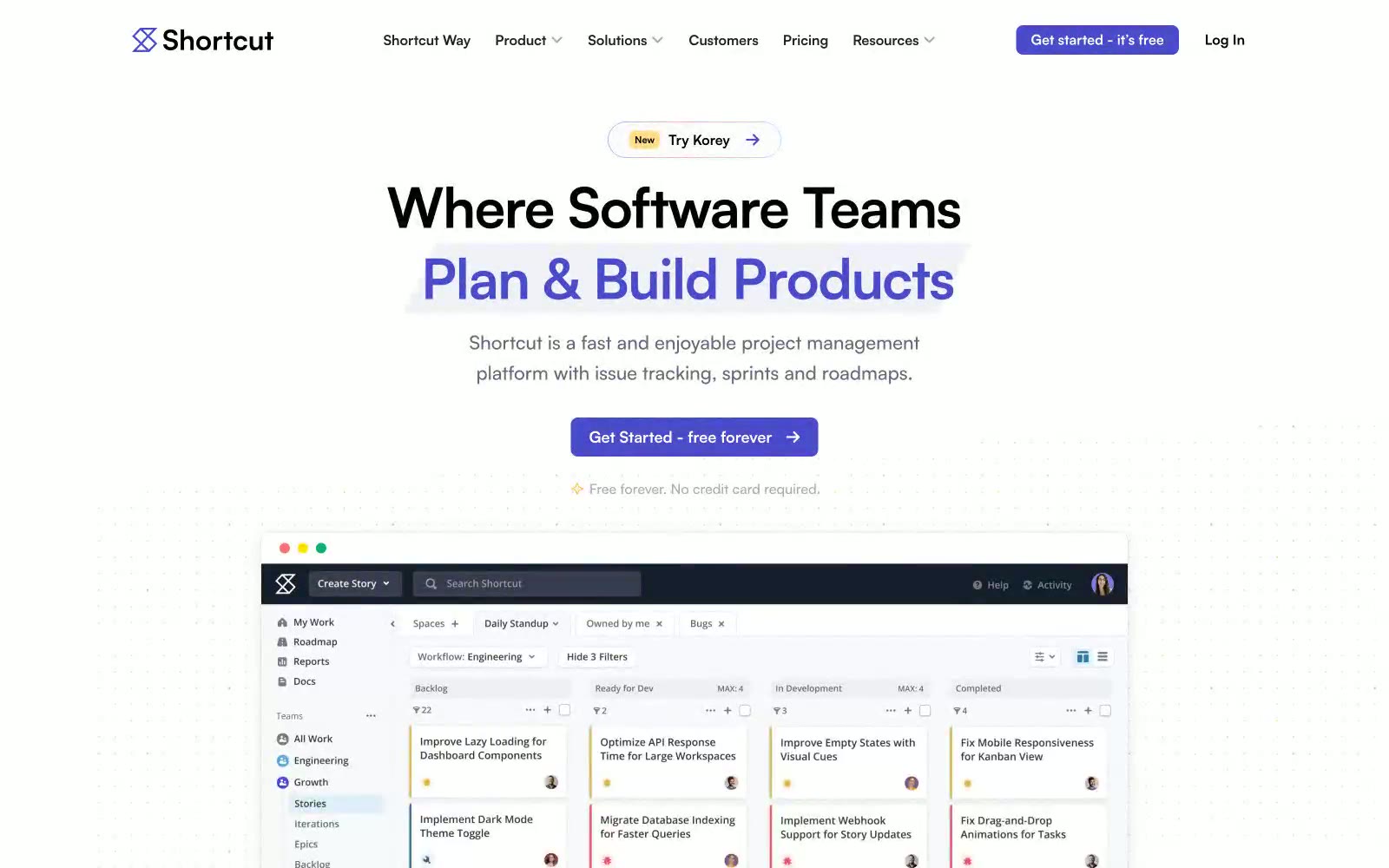
Shortcut
Shortcut — Style Reference
# Shortcut — Style Reference
> indigo ink on white paper — A whiteboard surface where one confident violet stroke does all the work.
**Theme:** light
Shortcut's visual language is an indigo-ink-on-white-paper system: a quiet, high-key canvas interrupted by a single vivid violet that does the talking. The product lives on flat white surfaces with near-invisible hairline borders; depth comes from generous whitespace and the occasional pale lavender card, never from drop shadows. Typography is a single geometric sans (Satoshi) set tight and confident at modest sizes — the interface never shouts, it narrates. Color is rationed like punctuation: deep midnight (#08093f) anchors dark sections and footers, vivid indigo (#494bcb) marks every primary action, and a single warm yellow badge appears as decorative accent. The mood is professional, restrained, and tool-like — a workhorse product UI dressed in just enough brand to feel deliberate without becoming decorative.
## Tokens — Colors
| Name | Value | Token | Role |
|------|-------|-------|------|
| Vivid Indigo | `#494bcb` | `--color-vivid-indigo` | Primary action background, filled buttons, active nav, brand focal point — the one chromatic color that carries the entire brand |
| Midnight Ink | `#08093f` | `--color-midnight-ink` | Footer background, dark section canvases, heading accent on dark surfaces — near-black with violet undertone ties it to the brand |
| Soft Violet | `#8a8ac6` | `--color-soft-violet` | Icon strokes, decorative SVG borders, illustration outlines — the muted cousin of the brand color, used where saturated indigo would be too loud |
| Pale Lavender | `#9f7ad0` | `--color-pale-lavender` | Badge accent border, decorative illustration strokes — provides warmth without competing with the primary |
Websites
Văn bản Markdown
design-md
website-prompt
landing-page-prompt
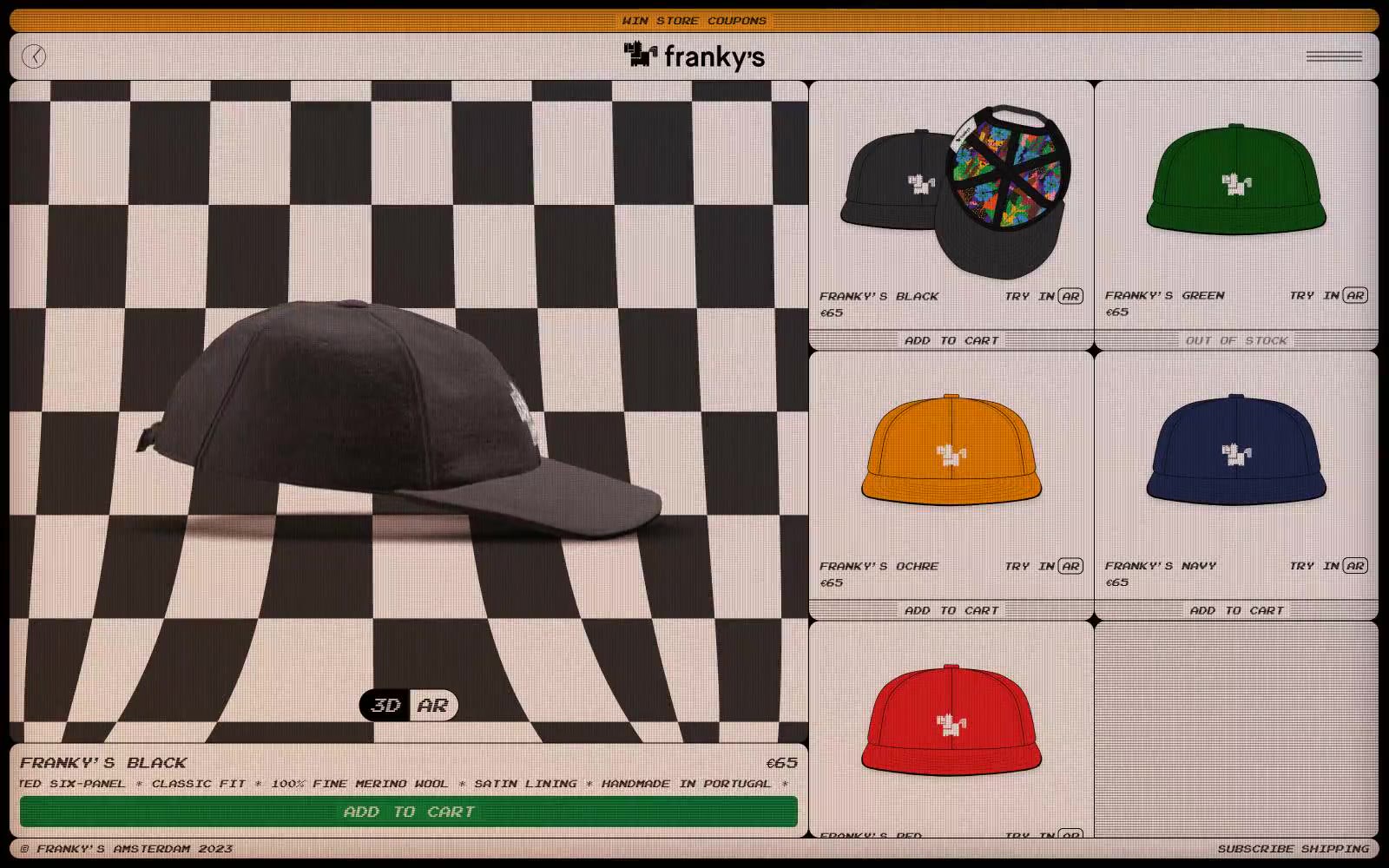
FRANKY'S
FRANKY'S — Style Reference
# FRANKY'S — Style Reference
> Retro arcade kiosk trên quầy skate-shop.
**Theme:** light
Franky's là một ngôn ngữ thị giác retro arcade kết hợp skate-shop: nền canvas màu kem ấm (#f3e5df) được bọc trong viền pixel-art cứng, bàn cờ đen-trắng xuất hiện khắp nơi, và một font Arcade pixel duy nhất mang mọi chữ trên site. Bảng màu được cố tình làm nghèo nàn — chỉ có hai màu sắc tồn tại (signal-orange #faa21f cho thanh marquee và một màu xanh nổi bật #128e44 cho nút mua hàng), toàn bộ hệ thống phân cấp được thể hiện qua sự chuyển đổi weight của font Arcade từ 400 lên 700 và qua độ tương phản đen-trên-kem. Các bề mặt luôn phẳng và nguyên khối; chiều sâu chỉ đến từ đường viền inset 1px màu kem trên nút và sự chơi tông màu của bàn cờ. Các component trông như sprite shopfront thập niên 1990: viền đen dày, border-radius 6–12px chặt chẽ, internal padding 4–8px gọn gàng, và các toggle 3D/AR trông như pixel icon thay vì chrome. Các trang mới nên giữ nguyên cảm giác arcade cabinet: không gradient ngoại trừ thanh marquee màu cam, không soft shadow, không typography trang trí — chỉ có giấy kem, pixel rule đen, và một màu cam ấm làm điểm nhấn.
## Tokens — Colors
| Tên | Giá trị | Token | Vai trò |
|------|-------|-------|------|
| Arcade Cream | `#f3e5df` | `--color-arcade-cream` | Nền trang, bề mặt product card, inset highlight trên nút |
| Ink Black | `#000000` | `--color-ink-black` | Text chính, ô bàn cờ, toàn bộ viền UI, đường viền card, icon stroke |
| Pixel Gray | `#e5e7eb` | `--color-pixel-gray` | Viền mảnh, đường phân cách card, structural rule giữa các ô grid |
| Charcoal | `#333333` | `--color-charcoal` | Tông bề mặt phụ, ô bóng của bàn cờ, màu shadow |
Websites
Văn bản Markdown
design-md
website-prompt
landing-page-prompt
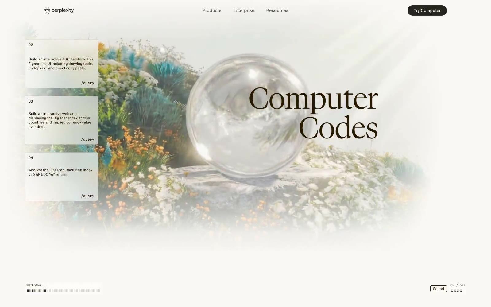
Perplexity AI
# Perplexity AI — Style Reference
# Perplexity AI — Style Reference
> Garden of computational flora — technical interface blooming through botanical haze
**Theme:** light
Perplexity Computer — naturalistic interface camouflage. The design mimics a lush garden: white flower clusters (cards) float against softly blurred botanical photography, like UI elements composited onto nature footage. Warm sepia text (#271a00 — nearly brown) and cream surfaces (#faf8f5) create the impression of aged parchment overlaid on living greenery. Serif headlines at display sizes contrast with sans-serif UI, echoing the organic/digital tension. 4px and 12px radii appear across all elements except nav pills (40px), maintaining subtle roundness without full-pill uniformity. Generous whitespace (28-40px vertical rhythm) lets content breathe like clearings in foliage. The typeface suite — pplxSans for interface, pplxSerif for declarations — reinforces brand identity through custom letterforms rather than stock choices.
## Tokens — Colors
| Name | Value | Token | Role |
|------|-------|-------|------|
| Aged Sepia | `#271a00` | `--color-aged-sepia` | Primary text, borders, icons, strokes — the near-brown warmth softens digital harshness without sacrificing legibility. Appears across every UI context from nav to body to buttons. |
| Parchment | `#faf8f5` | `--color-parchment` | Page backgrounds, card surfaces, heading text on dark — the cream canvas against which all content rests. Acts as both background and reversed foreground. |
| Fog | `#d1cfc7` | `--color-fog` | Button fills, borders, dividers — a muted gray-beige midtone that bridges Parchment and Aged Sepia without introducing new chromatic energy. |
| Absolute Black | `#000000` | `--color-absolute-black` | Footer backgrounds, high-contrast text inversion — appears sparingly, reserved for terminal anchoring at page bottom. |
Websites
Văn bản Markdown
design-md
website-prompt
landing-page-prompt
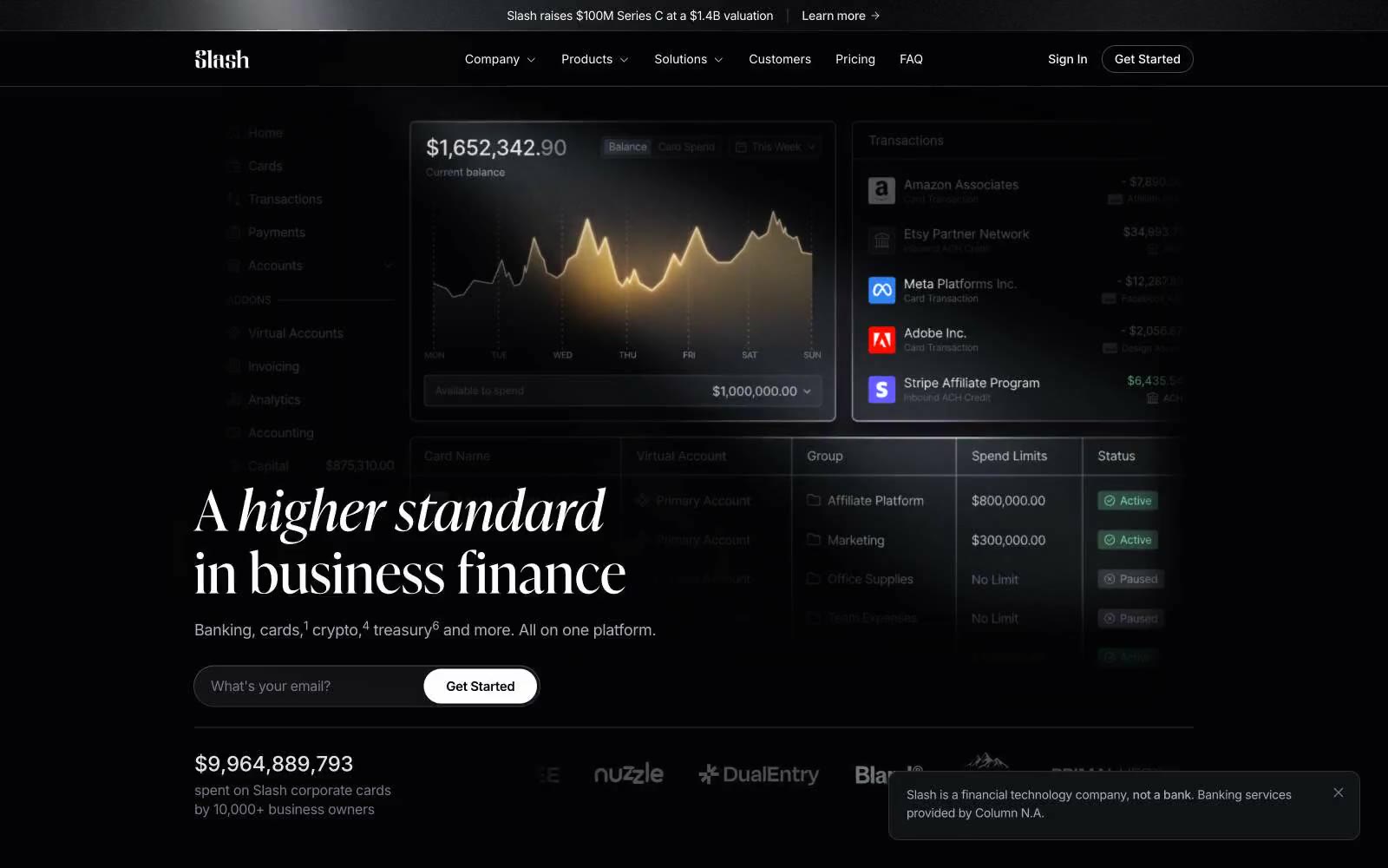
Slash
Slash — Style Reference
# Slash — Style Reference
> Nocturnal private bank — obsidian panels, gold ink. A vault door opening onto an editorial spread.
**Theme:** dark
Slash speaks in a dark editorial register: near-black canvases, Inter for the working surface, and a high-contrast display serif (Ivy Presto) that gives headlines the gravity of a financial broadsheet. Color is rationed — white and warm grays carry 95% of the interface, with a molten-gold gradient reserved for chart fills, emphasis strokes, and the occasional italic accent. Components are compact and sharp: 2px corners on inputs, nav, and inline links create a technical, ledger-like precision; 10px corners soften cards and image tiles just enough to feel modern without going soft. The feel is 'premium private banking rendered as a product UI' — quiet surfaces, confident typography, and gold used like a signature, not a brand wash.
## Tokens — Colors
| Name | Value | Token | Role |
|------|-------|-------|------|
| Obsidian | `#000000` | `--color-obsidian` | Deepest canvas, page background, elevation shadows |
| Carbon | `#030304` | `--color-carbon` | Recessed surfaces, card shadows, image matte backgrounds |
| Inkwell | `#08080a` | `--color-inkwell` | Primary dark surface, button borders, body depth |
| Graphite | `#121317` | `--color-graphite` | Raised button fills, input backgrounds, card body |
Websites
Văn bản Markdown
design-md
website-prompt
landing-page-prompt
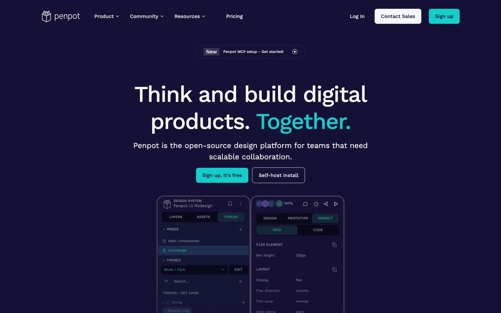
Penpot
Penpot — Style Reference
# Penpot — Style Reference
> studio thiết kế với tông màu midnight, điểm xuyết tia sáng teal — hero stage tím đậm, nơi một nút teal sáng và một từ teal thắp sáng toàn bộ canvas vốn đơn sắc.
**Theme:** mixed
Penpot vận hành như một hệ thống thị giác hai màn: hero stage tím đậm (midnight-violet) thu hút sự chú ý, sau đó chuyển sang vùng làm việc trắng sáng (off-white) để nội dung sản phẩm được thoáng đãng. Bảng màu có chủ đích tối giản — một tím đậm, một teal sống động, và các gam xám trung tính — để giao diện công cụ thiết kế đầy màu sắc (sản phẩm thực tế) trở thành nơi duy nhất có nhiều màu. Work Sans ở cỡ display lớn tạo headline tự tin, hơi siết chặt, trong khi cùng font ở 14–16px giữ cho interface chrome dễ đọc và không kiểu cách. Các component phẳng và hình học: border-radius 8px cho controls, 20px cho card, viền mảnh (hairline), không có đổ bóng trang trí. Điểm nhấn teal duy nhất được dùng rất tiết kiệm — nó kích hoạt CTA, từ nhấn mạnh trong headline, và một vài nét vẽ trang trí — khiến nó giống như một công tắc được bật lên chứ không phải đồ trang trí.
## Tokens — Colors
| Tên | Giá trị | Token | Vai trò |
|------|-------|-------|---------|
| Deep Space Violet | `#151035` | `--color-deep-space-violet` | Bề mặt thương hiệu chính — hero background, navigation, dark panels, code/token sidebars, và product UI shell. Tạo nên bản sắc dark-mode và tạo canvas để điểm nhấn teal phát sáng |
| Bright Teal | `#1ccac7` | `--color-bright-teal` | Màu nền cho action chính, từ nhấn mạnh trong headline, active tab indicator, và tia sáng trang trí. Nốt màu duy nhất — được dùng tiết kiệm cho CTA, highlight, và một từ mỗi headline — khiến mỗi lần xuất hiện đều cảm giác như được bật lên |
| Rich Violet | `#2f226c` | `--color-rich-violet` | Tím phụ cho viền mờ, đường phân cách, và nét nhấn trong dark panels. Cầu nối giữa Deep Space Violet và Bright Teal trên canvas tối |
| Off-White | `#fafafa` | `--color-off-white` | Page canvas, bề mặt card sáng, body text trên nền tối, icon fills. Workhorse của chế độ sáng — không bao giờ trắng tinh, hơi ấm để làm mềm độ tương phản với Deep Space Violet |
Websites
Văn bản Markdown
design-md
website-prompt
landing-page-prompt
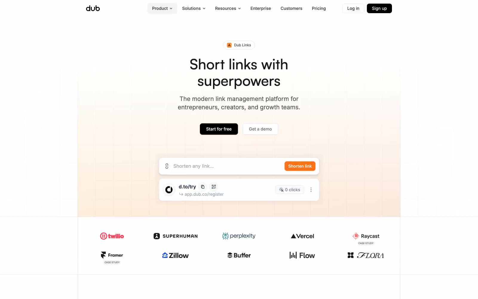
Dub Links
Dub Links — Style Reference
# Dub Links — Style Reference
> warm sunrise over monochrome architecture
**Theme:** light
Dub mang phong cách SaaS ấm áp, tự tin: giao diện gần như đơn sắc (near-monochrome) neo trên gradient kem-pha-trắng mềm mại, với một điểm nhấn cam rực duy nhất khiến mọi thao tác đều nổi bật. Hệ thống thở nhờ khoảng trắng rộng rãi trên lưới 4px nhỏ gọn, kết hợp độ chính xác tiện ích của Inter với nét display bo tròn của Satoshi cho headline. Bề mặt luôn mờ và sáng với viền mảnh (hairline border) và bóng cực nhạt — chiều sâu đến từ sự chuyển tông tinh tế và độ cao (elevation), không bao giờ dùng panel nặng. CTA chính luôn là pill đen với micro-accents màu cam than hồng (orange-ember) ở gần, tạo độ tương phản giữa tính trung tính cấu trúc và sự ấm áp của thương hiệu. Các component nên cảm giác nhanh và tiện dụng: bán kính 4px và 8px chiếm ưu thế, pill buttons mang CTA, và card là hình chữ nhật trắng phẳng trên nền canvas hơi ấm.
## Tokens — Colors
| Name | Value | Token | Role |
|------|-------|-------|------|
| Canvas Cream | `#f5f5f5` | `--color-canvas-cream` | Nền trang — tông trắng ngà ấm tạo cảm giác ngập nắng cho giao diện |
| Paper White | `#ffffff` | `--color-paper-white` | Bề mặt card, panel nâng cao, trường nhập liệu — trắng tinh cho container nội dung |
| Ink Black | `#0a0a0a` | `--color-ink-black` | Màu trung tính tối hỗ trợ cho text, icon và độ tương phản mạnh. Không dùng làm màu CTA chính |
| Charcoal | `#171717` | `--color-charcoal` | Text phụ, text button trên nền tối, heading weights |
Websites
Văn bản Markdown
design-md
website-prompt
landing-page-prompt
21 TSI
21 TSI — Style Reference
# 21 TSI — Style Reference
> Crimson void, single silhouette — a high-fashion editorial spread where the UI dissolves into atmosphere.
**Theme:** dark
21 TSI operates in the grammar of luxury fashion editorial: the interface itself is austere monochrome — white type, black canvas, hairline rules — while full-bleed crimson photography carries the entire emotional register. UI chrome is deliberately reduced to a single thin top divider, small uppercase wordmarks, and pill-bordered controls; nothing competes with the image. Typography is the structural skeleton: Saans at 12px for nav, then jumping to 106–245px for display — a near-vertical scale that makes individual headlines feel like runway installations rather than page headers. The system prefers silence over information density; every interactive element is a ghost, every frame is a photograph, and the only color that matters is whatever the lens captures.
## Tokens — Colors
| Name | Value | Token | Role |
|------|-------|-------|------|
| Black Void | `#000000` | `--color-black-void` | Page canvas behind full-bleed imagery, button borders on inverted elements, deepest surface layer |
| Paper White | `#ffffff` | `--color-paper-white` | Primary text, navigation labels, ghost-button borders, hairline rules, every UI stroke above imagery |
| Smoke | `#4d4d4d` | `--color-smoke` | Muted secondary borders and dividers used when full white feels too hot against the photographic background |
| Crimson Heat | `#b62b1a` | `--color-crimson-heat` | Dominant brand atmosphere from full-bleed editorial photography — the only chromatic note in the system, always carried by the image rather than applied to UI chrome |

Websites
Văn bản Markdown
design-md
website-prompt
landing-page-prompt
Aboard
Aboard — Style Reference
# Aboard — Style Reference
> Editorial field journal under industrial light
**Theme:** mixed
Aboard reads as an editorial dossier drafted inside a working warehouse: Tobias serif headlines at weight 300 float over Atkinson Hyperlegible Mono body copy, a pairing that treats the page as a technical specification rather than a marketing surface. The system alternates full-bleed dark documentary bands with warm off-white reading sections, the rhythm controlled by a single vivid ember-orange that punctuates CTAs, icons, and active states against an otherwise achromatic palette. Components are deliberately thin: pill-shaped CTAs, translucent floating nav, hairline borders at 1px, almost no shadow or elevation — the interface recedes so the photography and the prose can carry the page. The warmth of the neutrals (bone white, linen, warm graphite) keeps the dark sections from feeling cold, while the orange never decorates — it always signals an action or a live status.
## Tokens — Colors
| Name | Value | Token | Role |
|------|-------|-------|------|
| Ember Orange | `#de4c00` | `--color-ember-orange` | Primary CTAs, active nav items, icon fills, link accents — the only chromatic color in the UI, it acts as a power-switch indicator against the muted neutrals |
| Soft Ember | `#efa680` | `--color-soft-ember` | Hover-state borders, subdued accent outlines, tag strokes — a desaturated echo of Ember Orange for quieter accents |
| Bone White | `#fffefb` | `--color-bone-white` | Page canvas on light sections, text color on dark/image sections |
| Linen | `#f3f2ee` | `--color-linen` | Warm secondary surface, elevated card backgrounds, subtle shadow tint |
Websites
Văn bản Markdown
design-md
website-prompt
landing-page-prompt
Bpowell
Bpowell — Style Reference
# Bpowell — Style Reference
> type as architecture on white plaster
**Theme:** mixed
Một portfolio chỉ gồm chữ, để typography đảm nhận mọi vai trò — không hình ảnh, không trang trí, không chrome. Trang đọc như một danh sách kiến trúc: những label nhỏ được set dày đặc đóng vai trò đánh dấu section, sau đó tên dự án cỡ lớn xếp chồng lên nhau như những khối bê tông trên tường. Hai bề mặt xen kẽ — canvas trắng sáng cho tác phẩm design, canvas gần đen đảo ngược cho film — và sự tương phản giữa chúng là nhịp điệu thị giác duy nhất. Layout bất đối xứng triệt để: một cột duy nhất gồm text cỡ lớn neo bên trái, gutter rộng rãi của negative space, và top nav trải dài trên toàn bộ chiều rộng viewport thay vì dồn vào một góc. Hệ thống không có button, không có card, không có border theo nghĩa truyền thống — thứ gần nhất với border là một đường kẻ mảnh 1px màu đen, và ngay cả đường đó cũng được dùng rất hạn chế. Kết quả mang cảm giác như đọc một credits sequence in trên tường gallery: khắc khổ, có chủ đích, và đầy tự tin rằng chính những cái tên đã mang đủ sức nặng.
## Tokens — Colors
| Tên | Giá trị | Token | Vai trò |
|------|-------|-------|------|
| Plaster White | `#ffffff` | `--color-plaster-white` | Canvas chính cho các section sáng; màu text trên section tối; đường kẻ mảnh (hairline) trên section tối |
| Carbon | `#111111` | `--color-carbon` | Nền trang cho section tối/film; body text chính trên section sáng; fill cấu trúc cho tên dự án dạng typography |
| Ink Black | `#000000` | `--color-ink-black` | Text phụ và fill trên section sáng; dùng khi cần độ tương phản tối đa trên canvas trắng |
| Graphite | `#2b2b2b` | `--color-graphite` | Border tối nhẹ cho các đường kẻ ít quan trọng trên bề mặt sáng |
Websites
Văn bản Markdown
design-md
website-prompt
landing-page-prompt
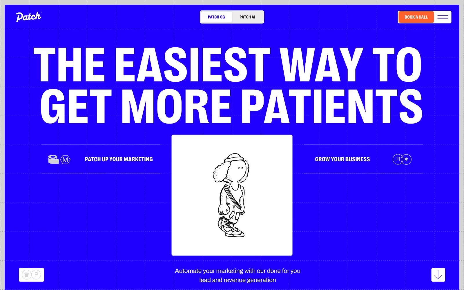
Patch
Patch — Style Reference
# Patch — Style Reference
> electric blueprint on drafting paper
**Theme:** light
Patch uses a loud, electric-blue blueprint aesthetic: a vivid indigo canvas (#1f00ff) alternates with stark white cards, and every interface element either lives inside a crisp hairline border or against the full-bleed blue. Typography is aggressive and condensed — PP Right at weight 800 with sub-1.0 line heights makes headlines feel architectural rather than friendly, while Archivo keeps body text quiet and functional. A single warm orange (#ff622b) punctures the blue/white duopoly as the only fill color used for primary actions. Hand-drawn line illustrations (sketchy people, objects) sit centered inside white cards, reinforcing a 'marketing blueprint' mood. The overall feel is a confident, slightly retro-tech agency identity — medical marketing pitched as engineering, not healthcare.
## Tokens — Colors
| Name | Value | Token | Role |
|------|-------|-------|------|
| Electric Indigo | `#1f00ff` | `--color-electric-indigo` | Full-bleed hero canvas, section backgrounds, heading text on light surfaces, all primary borders and dividers — the single chromatic color that defines the entire system |
| Patch Orange | `#ff622b` | `--color-patch-orange` | Filled CTA buttons and active nav markers — the only warm color, reserved exclusively for conversion moments |
| Pure White | `#ffffff` | `--color-pure-white` | Page canvas, hero reverse text, card surfaces, icon fills — the neutral that makes the indigo vibrate |
| Fog Gray | `#f2f2f2` | `--color-fog-gray` | Secondary card surfaces, subtle elevation between cards and canvas |
Websites
Văn bản Markdown
design-md
website-prompt
landing-page-prompt
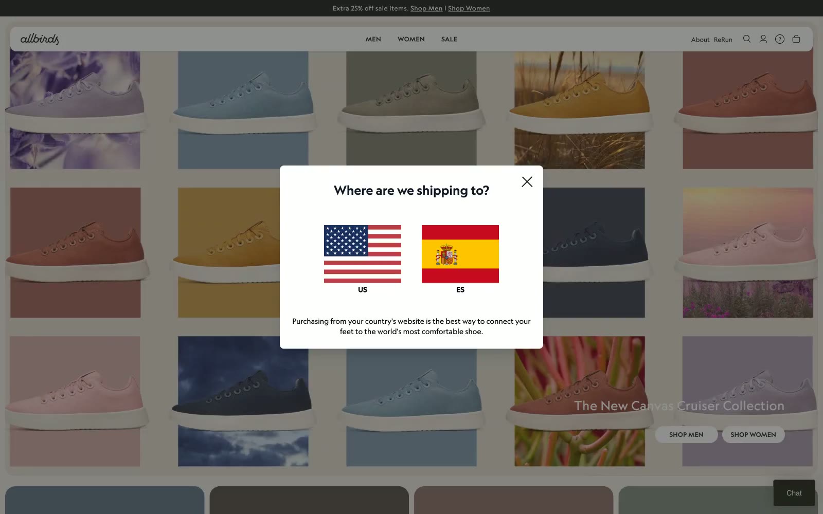
Allbirds
Allbirds — Style Reference
# Allbirds — Style Reference
> Chất liệu tự nhiên trên nền vải lanh trắng
**Theme:** light
Allbirds vận hành dựa trên sự tự nhiên, tự tin và nhẹ nhàng — một bảng màu gần như hoàn toàn achromatic, được chấm phá bởi tông cát ấm (#e0dacf) và các gam màu đất trầm lấy trực tiếp từ ảnh sản phẩm. UI luôn đứng sang một bên để nhường chỗ cho sản phẩm: bề mặt trắng, đường viền mảnh (hairline borders), navigation chữ in hoa với tracking dày, và các pill controls trông như nút bấm vật lý chứ không phải element web. Self Modern (một custom serif) chỉ được dùng cho những khoảnh khắc mang tính editorial — hero headlines và tên bộ sưu tập — trong khi Geograph đảm nhận mọi label, body text, button ở ba trọng lượng được kiểm soát chặt chẽ. Category cards trở thành hệ thống màu sắc: mỗi card lấy màu nền từ chính sản phẩm nó giới thiệu, biến navigation thành một bảng Pantone sống động.
## Tokens — Colors
| Name | Value | Token | Vai trò |
|------|-------|-------|---------|
| Canvas White | `#ffffff` | `--color-canvas-white` | Nền trang, bề mặt card, nền card sản phẩm |
| Charcoal | `#212121` | `--color-charcoal` | Màu trung tính hỗ trợ cho secondary UI, divider, label mờ. Không dùng làm màu CTA chính |
| True Black | `#000000` | `--color-true-black` | Headline, icon, border tương phản cao, nav text |
| Warm Sand | `#e0dacf` | `--color-warm-sand` | Nền hero section, tông bề mặt phụ, panel editorial lớn |
Websites
Văn bản Markdown
design-md
website-prompt
landing-page-prompt
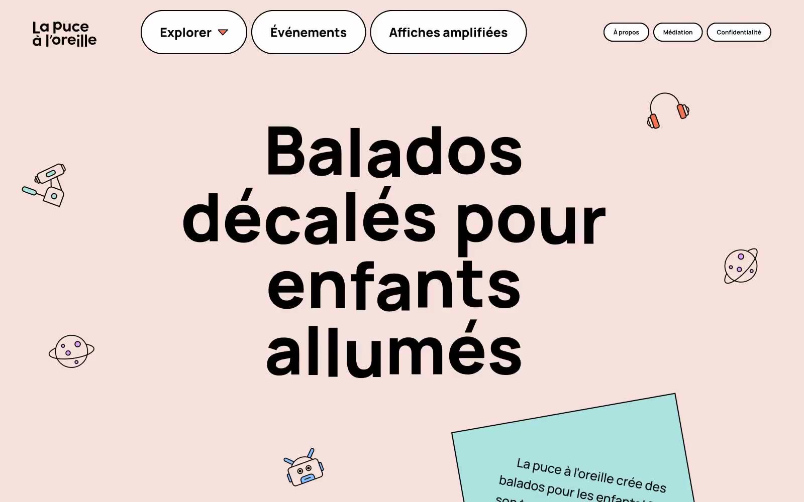
Lpalo
Lpalo — Style Reference
# Lpalo — Style Reference
> Một trang truyện thiếu nhi trên nền giấy đào ấm — một headline slab-serif to tướng đang hét lên giữa những hình vẽ nguệch ngoạc bằng bút chì màu rải rác.
**Theme:** light
La puce à l'oreille mang phong cách một trang truyện thiếu nhi trải trên nền giấy đào ấm — một nền tảng podcast vui tươi, nơi headline slab-serif đen chunky neo giữ trang, trong khi các điểm nhấn màu sắc rực rỡ và hình minh họa line-art lơ lửng nhảy múa xung quanh. Nhịp điệu thị giác rộng rãi và thong thả: một canvas đào mềm (#f6e0db) chứa những hình vẽ nguệch ngoạc rải rác, các container hình pill nổi với viền đen dày, và một headline cỡ lớn duy nhất (Alfa Slab One ở gần 120px) làm toàn bộ công việc nặng nhọc cho brand voice. Các component có cảm giác thủ công hơn là được kỹ thuật hóa — card trắng viền đen, pill radii 47px, không shadow, không gradient. Màu sắc được xử lý như một bảng màu bút chì lấy từ một hộp duy nhất: mọi sắc thái đều bão hòa và phẳng, được dùng như dấu câu trang trí trên bề mặt, icon, và nền section thay vì là trạng thái UI chức năng. Sự tương phản giữa trọng lượng slab-serif nghiêm túc của chữ và hình minh họa kỳ quặc tạo ra tension nhận diện của site — giọng điệu có thẩm quyền, cách truyền đạt như trẻ con.
## Tokens — Colors
| Tên | Giá trị | Token | Vai trò |
|------|-------|-------|------|
| Peach Paper | `#f6e0db` | `--color-peach-paper` | Canvas trang — nền pastel ấm giúp mọi viền đen và điểm nhấn màu nổi bật |
| Charcoal Ink | `#000000` | `--color-charcoal-ink` | Text chính, đường kẻ mảnh, viền card, nav outlines — bộ khung cấu trúc với hơn 1400 lần xuất hiện border |
| Snow | `#ffffff` | `--color-snow` | Canvas trang chính và bề mặt card trắng. Không nâng nó lên thành màu CTA chính |
| Ember Orange | `#ef724f` | `--color-ember-orange` | Điểm nhấn trang trí và bề mặt card ấm — màu cam bút chì xuất hiện nhiều nhất trong số các màu sắc trên UI |
Websites
Văn bản Markdown
design-md
website-prompt
landing-page-prompt
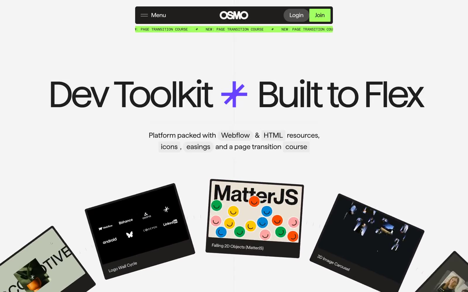
Osmo
Osmo — Style Reference
# Osmo — Style Reference
> bảo tàng developer trên nền concrete gray
**Theme:** light
Osmo mang phong cách editorial brutalist dành cho web craftspeople: một canvas concrete gray được đóng dấu bởi display type đen cỡ lớn, sau đó được chấm phá bằng ba cú đấm màu phẫu thuật — một màu xanh vôi phóng xạ (radioactive lime) cho brand accents, một màu tím đậm (deep violet) cho featured cards, và một màu đỏ chu sa (vermillion red) cho các chú thích viết tay. Hệ thống từ chối lối mặc định soft-SaaS: các góc được phân chia giữa độ chính xác phẫu thuật 2–5px và bo tròn pill cực đại 1600px, tạo ra sự căng thẳng thị giác giữa các content tiles chính xác như máy và các control hình viên ngậm (lozenge) chunky. Typography đảm nhận phần lớn công việc truyền tải thông qua các display cuts Haffer XH có thể chạy tới 150px với negative tracking mạnh, trong khi font label monospaced đóng dấu metadata kỹ thuật. Mật độ compact và content-led, với các product cards nghiêng xòe ra như portfolio của developer được ghim lên tường gallery.
## Tokens — Colors
| Tên | Giá trị | Token | Vai trò |
|------|-------|-------|---------|
| Concrete | `#f4f4f4` | `--color-concrete` | Canvas trang, bề mặt card, và hầu hết border work — màu off-white mà mọi thứ đặt lên |
| Ash Gray | `#eaeaea` | `--color-ash-gray` | Lớp bề mặt nâng cao (elevated surface layer), trường nhập liệu, nền card phụ |
| Bone | `#e1e1e1` | `--color-bone` | Divider tinh tế, phân cách danh sách, nền bề mặt cấp ba |
| Smoke | `#b8b8b8` | `--color-smoke` | Viền ảnh mờ, đường viền trạng thái disabled, viền badge |
Websites
Văn bản Markdown
design-md
website-prompt
landing-page-prompt
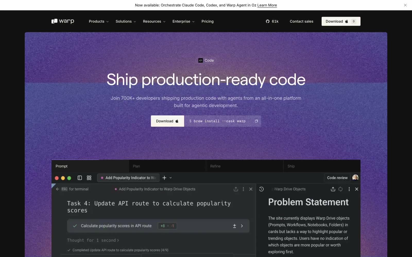
Warp
Warp — Style Reference
# Warp — Style Reference
> Màn hình terminal dưới ánh kính hổ phách
**Theme:** dark
Warp vận hành như một phòng điều khiển mờ tối: canvas ấm áp gần như đen, bề mặt sản phẩm lấy cảm hứng từ terminal, và typography hình học chặt chẽ mang phong cách command line được in ấn. Bảng màu gần như hoàn toàn đơn sắc với tông ấm — không có xanh lam lạnh hay xám vô trùng — mang đến cho mọi màn hình ánh hổ phách của một buổi code đêm khuya. Màu nhấn được sử dụng cực kỳ hạn chế: một màu vàng gold nhẹ và một màu xanh lam-xám duy nhất chỉ xuất hiện khi terminal cần dấu câu syntax hoặc một link cần nổi bật. Các component phẳng, dày đặc và không trọng lượng — không có decorative shadow, không có độ sâu skeuomorphic, không có button bo tròn mềm mại. Mọi element đều có chỗ đứng nhờ sự chính xác của typography và negative tracking rộng ở kích thước display.
## Tokens — Colors
| Tên | Giá trị | Token | Vai trò |
|------|-------|-------|---------|
| Warm Off-White | `#faf9f6` | `--color-warm-off-white` | Headline chính, body text, nav links — màu kem ấm đọc mềm hơn trắng tinh trên nền charcoal |
| Bone Gray | `#868684` | `--color-bone-gray` | Secondary text, captions, muted labels — midtone tách biệt khỏi Off-White mà vẫn giữ ấm |
| Pale Stone | `#b4b4b2` | `--color-pale-stone` | Tertiary text, ghost button labels, low-emphasis copy |
| Faint Linen | `#e3e2e0` | `--color-faint-linen` | Hairline borders, divider mờ, selected state outlines |