AI Prompt Studio - Thư viện Prompt thông minh
Khám phá và sử dụng các prompt AI chuyên nghiệp để tối ưu hóa công việc của bạn.
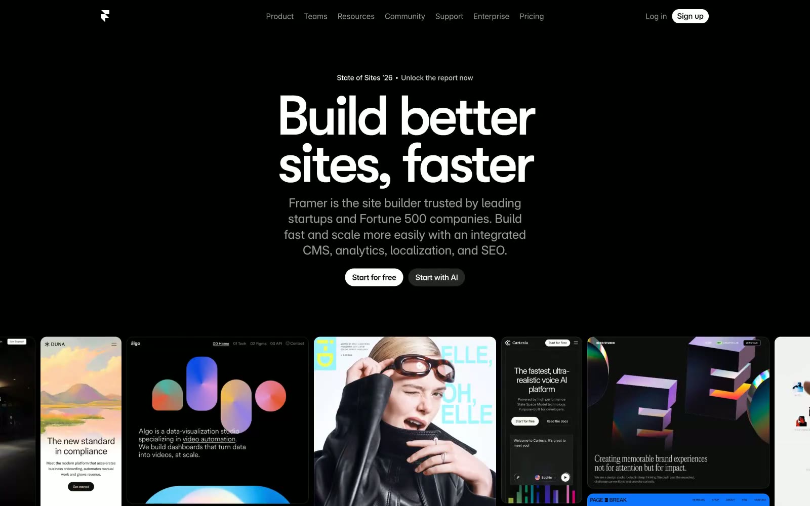
Framer
# Framer — Style Reference **Framer** — Style Reference

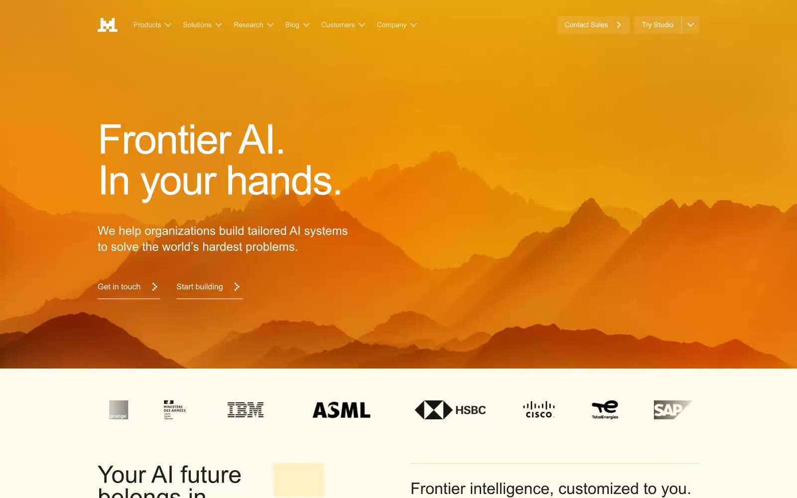
Frontier AI LLMs
Frontier AI LLMs — Style Reference
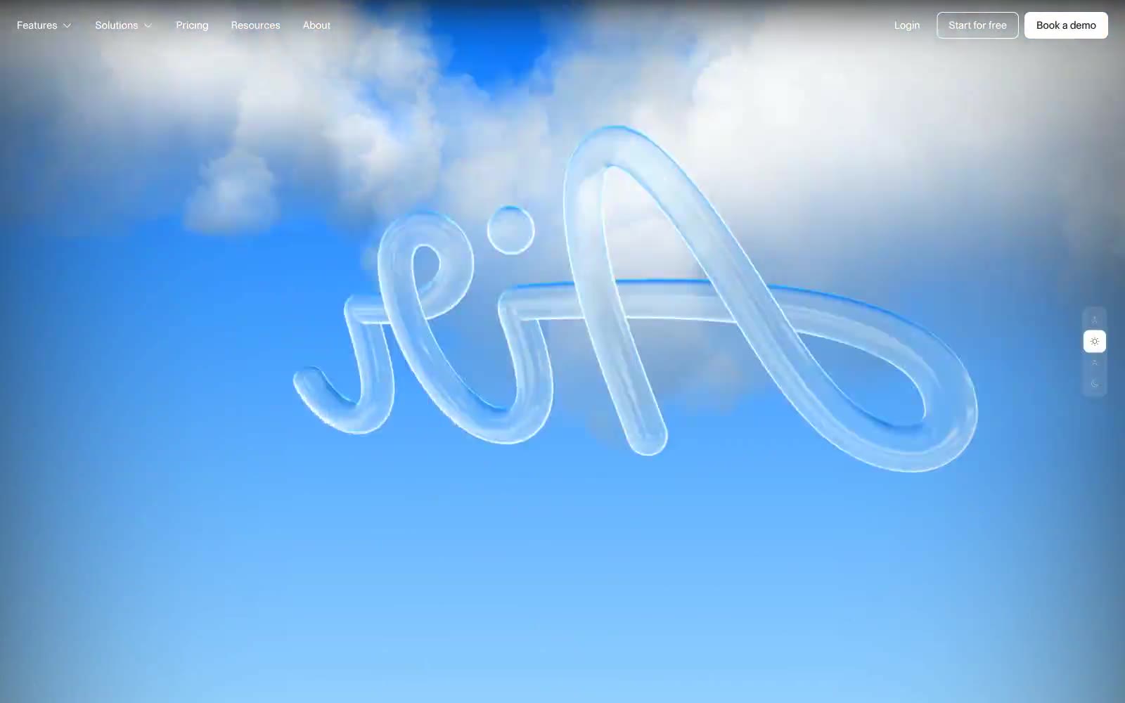
Air
Air — Style Reference
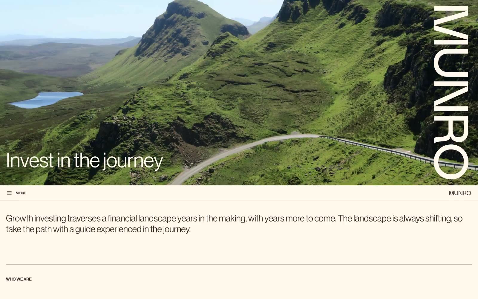
Munro Partners
# Munro Partners — Style Reference
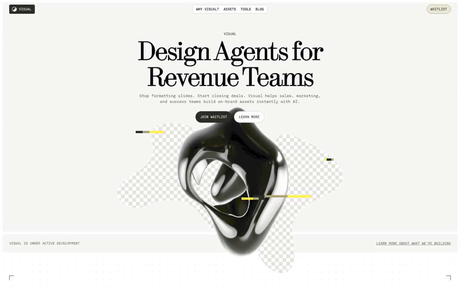
Visual
Visual — Style Reference
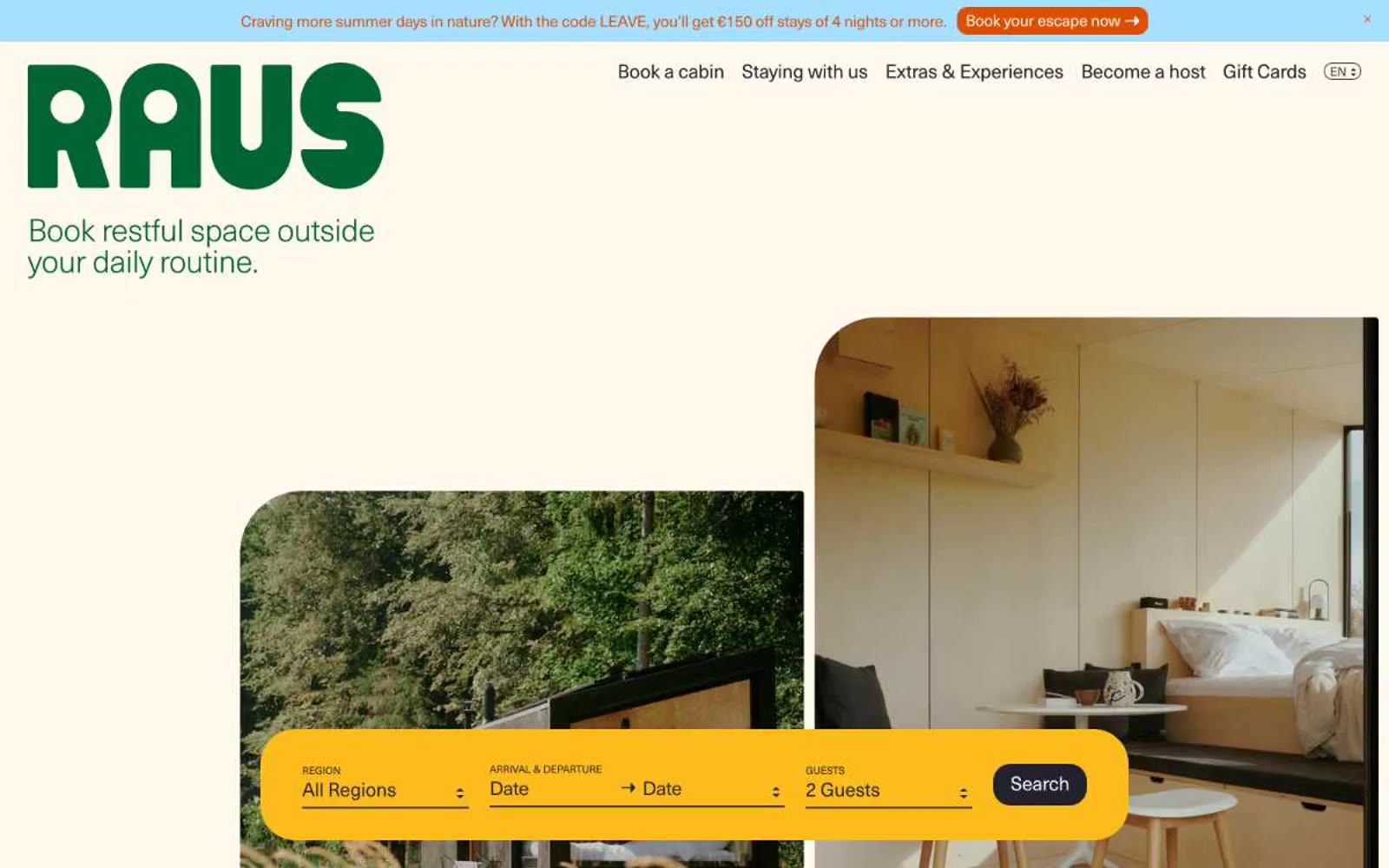
Raus
Raus — Style Reference
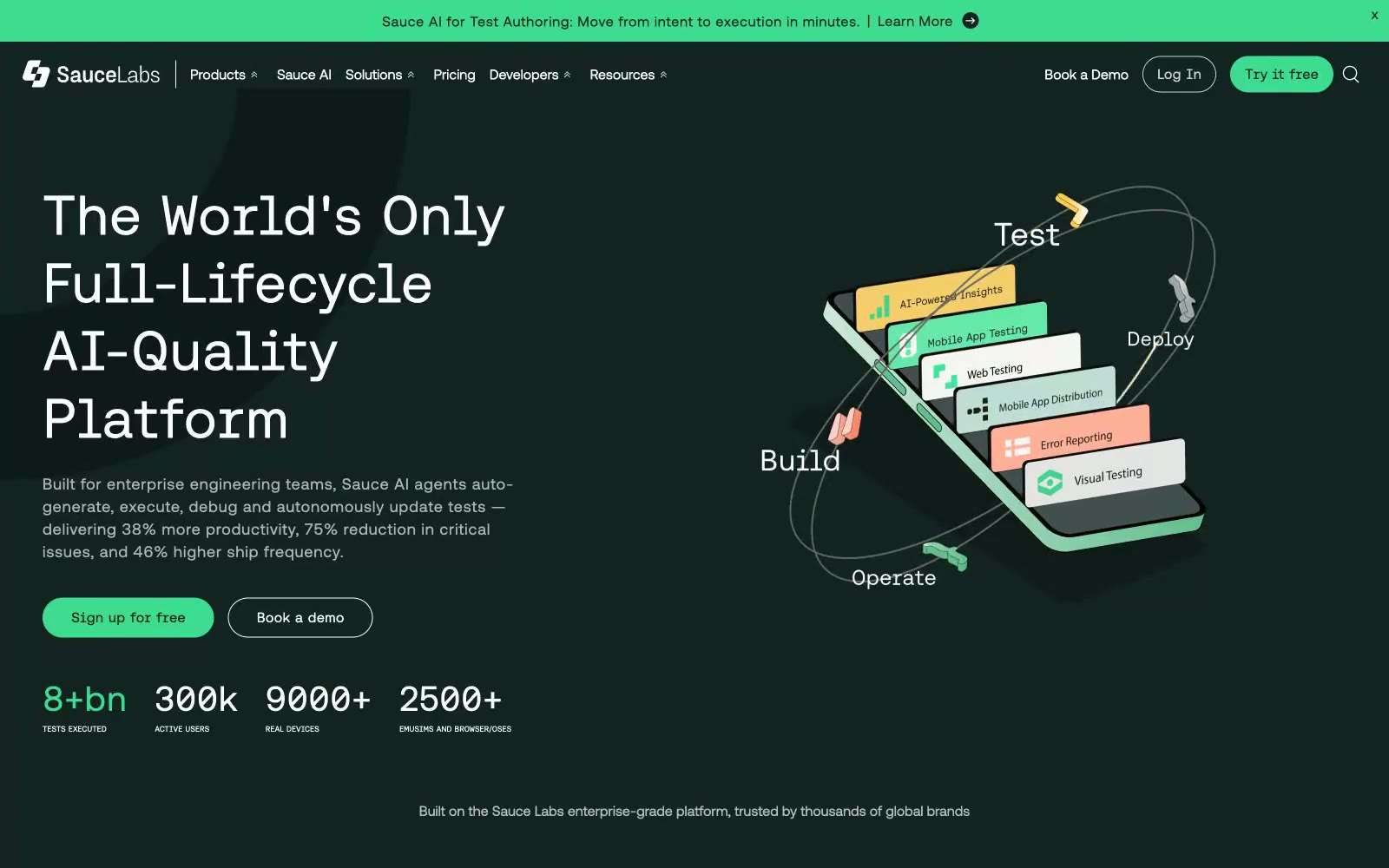
Sauce Labs
Sauce Labs — Style Reference
Epidemicsound
# Epidemicsound — Style Reference
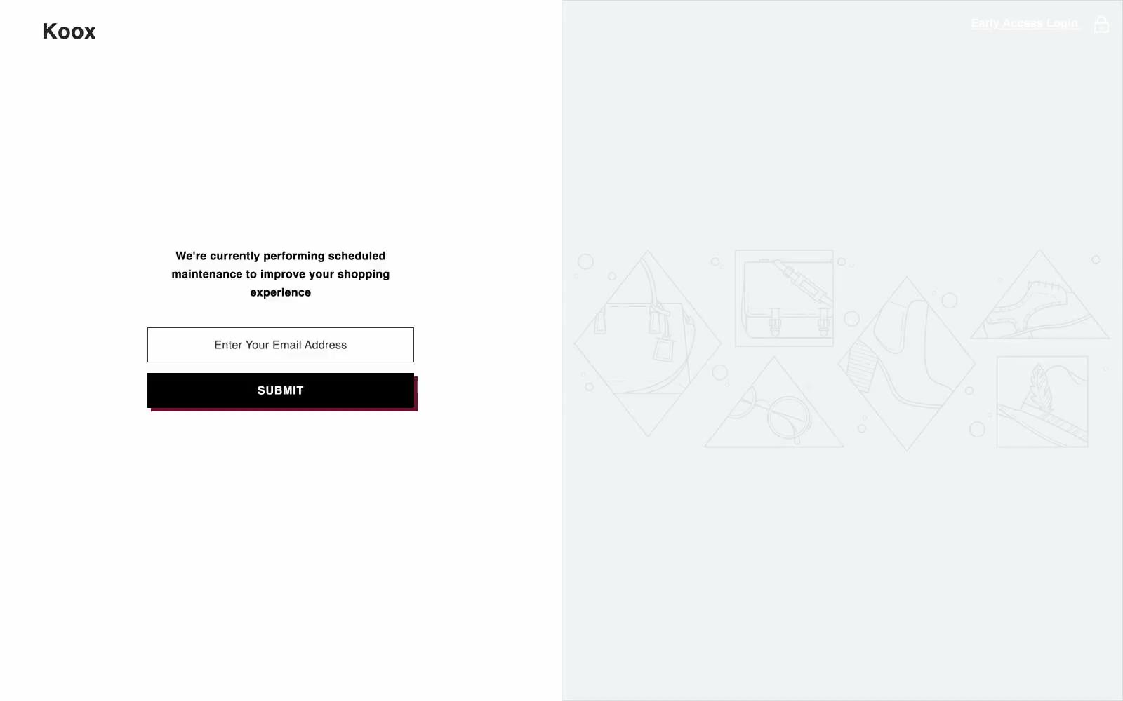
Koox
Koox — Style Reference
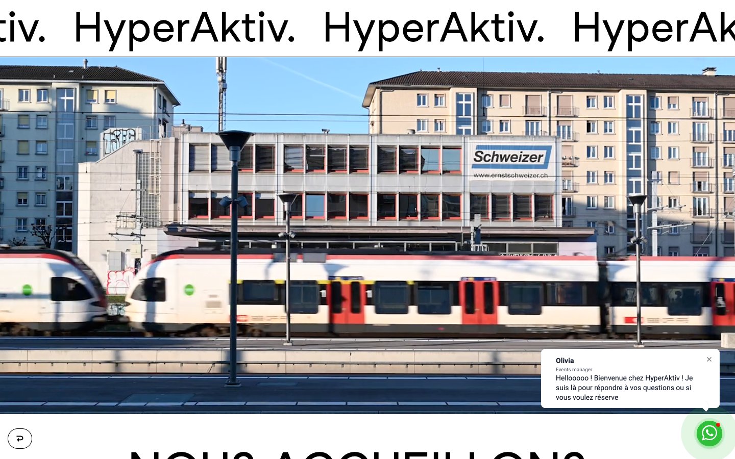
HyperAktiv
HyperAktiv — Style Reference
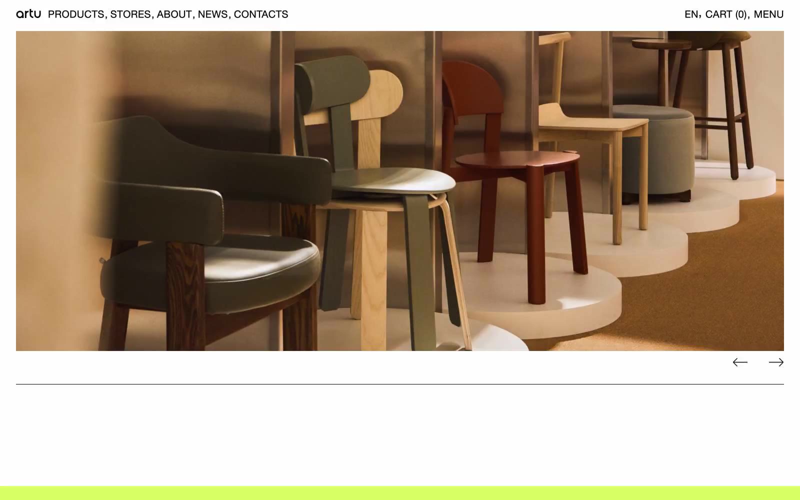
ARTU
ARTU — Style Reference
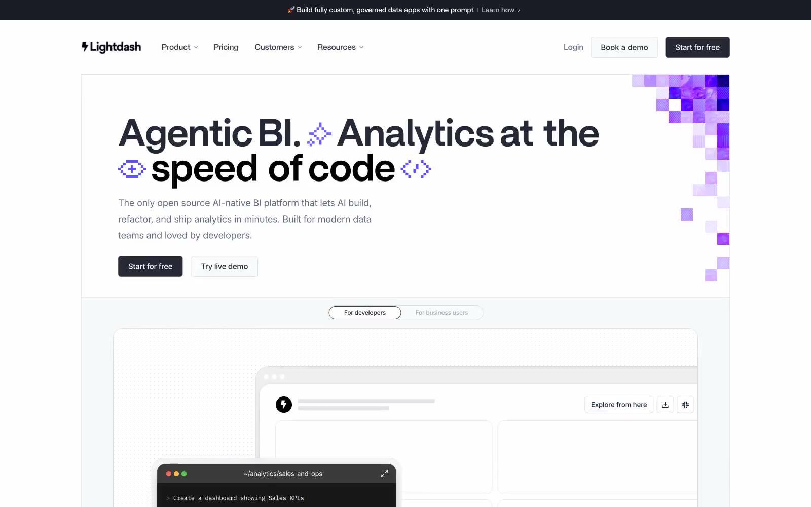
Lightdash
# Lightdash — Style Reference
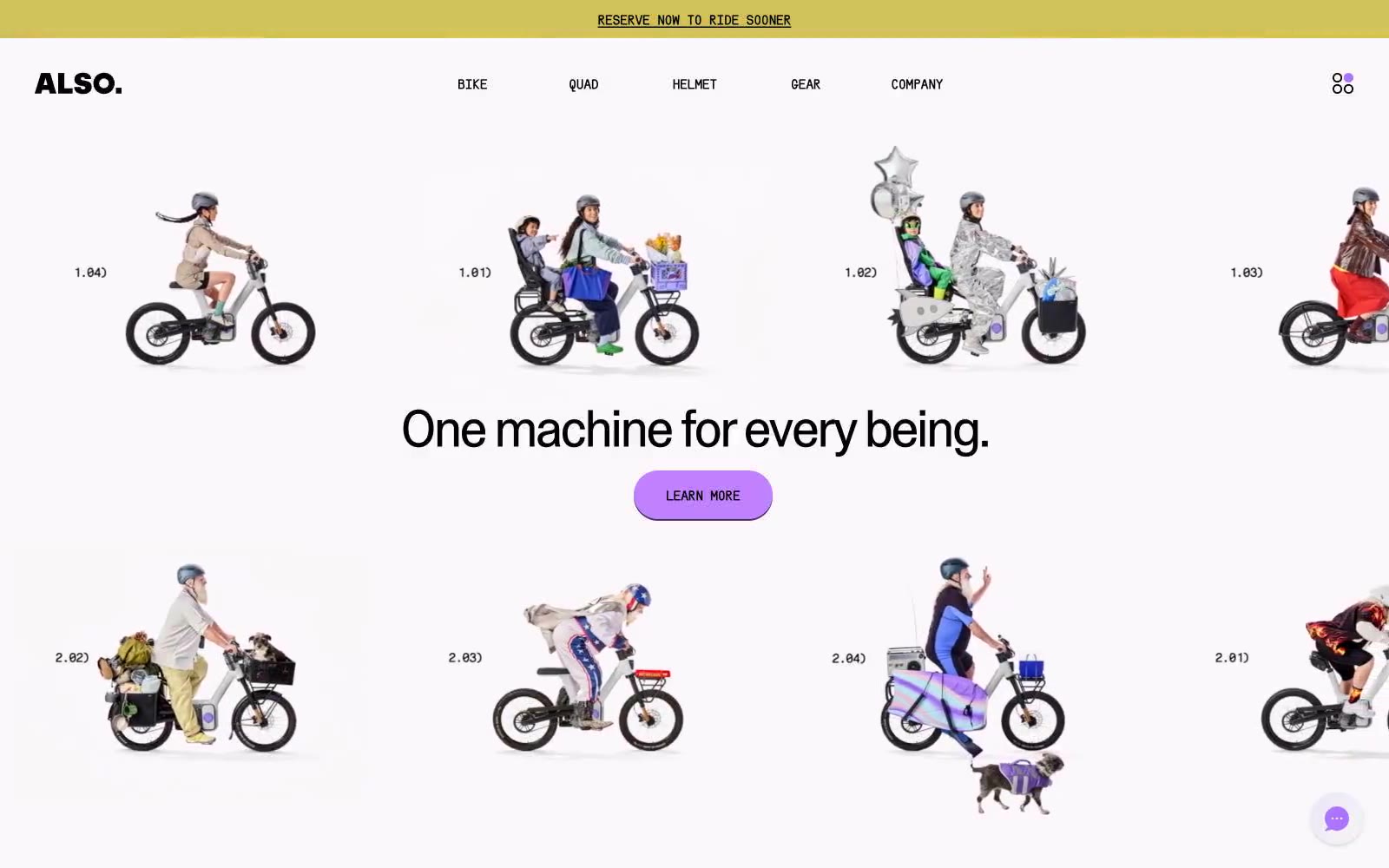
ALSO
ALSO — Style Reference
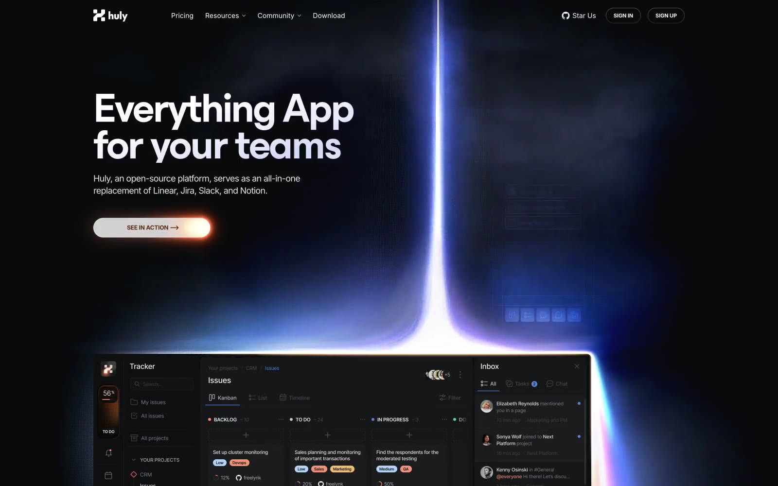
Huly
Huly — Style Reference
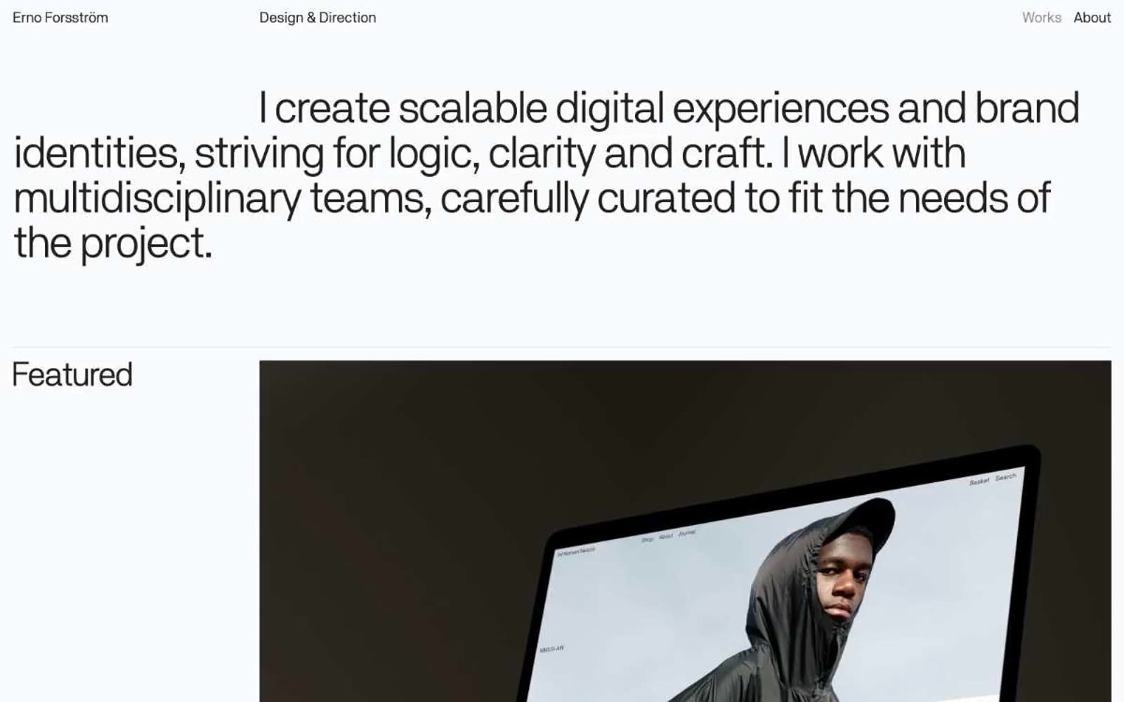
Erno Forsström
Erno Forsström — Style Reference
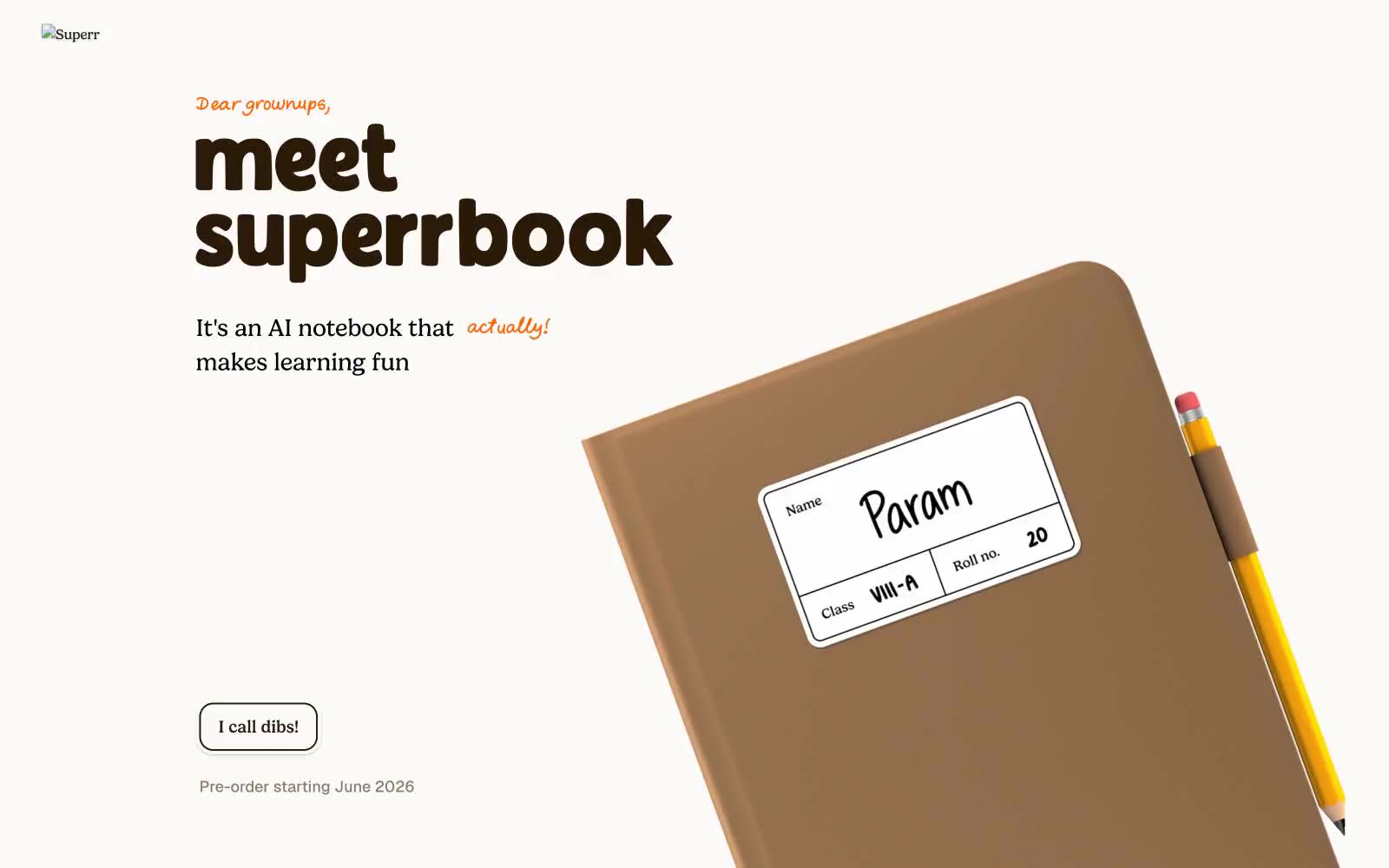
Superr
Superr — Style Reference
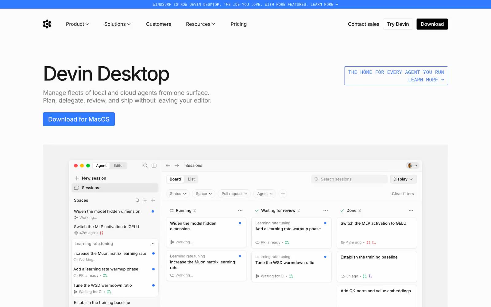
Windsurf
Windsurf — Style Reference
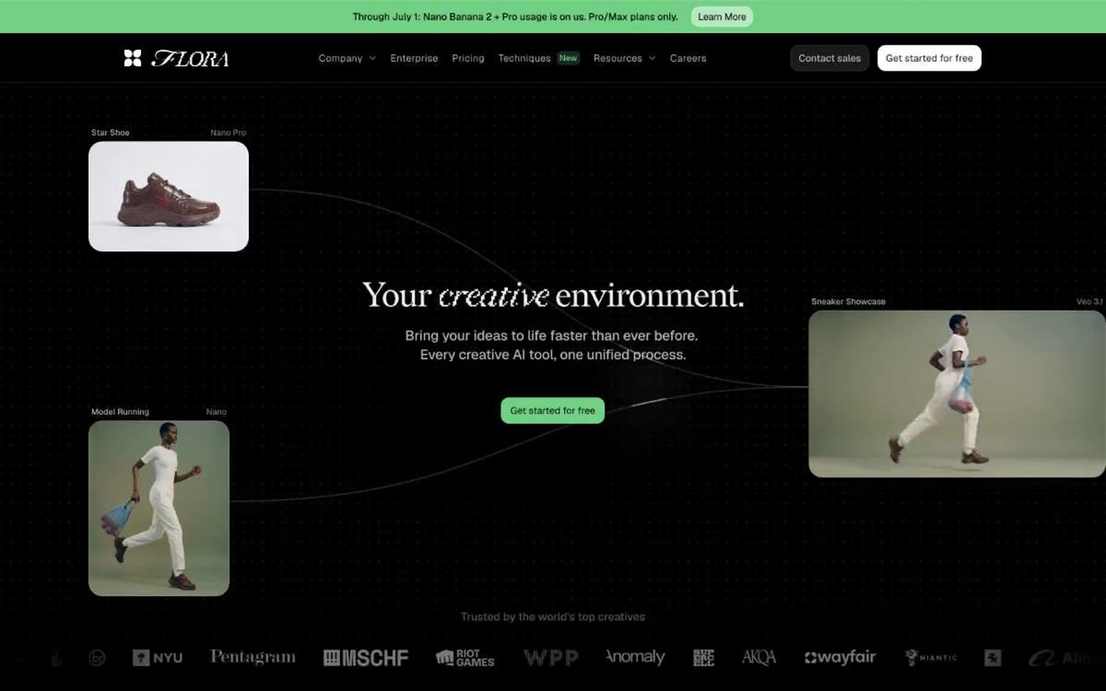
FLORA
# FLORA — Style Reference
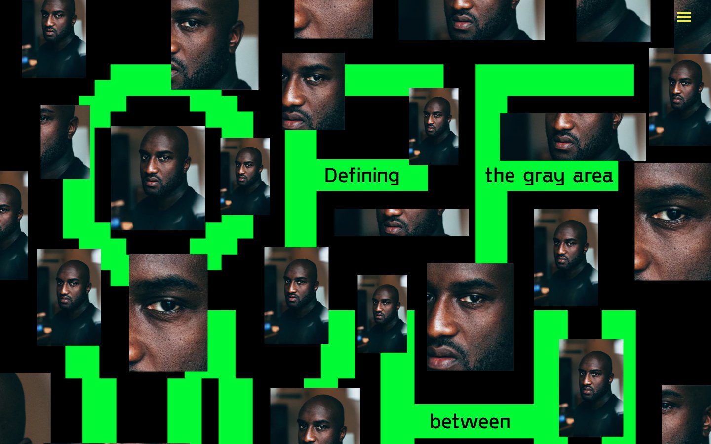
OFF WHITE
OFF WHITE — Style Reference
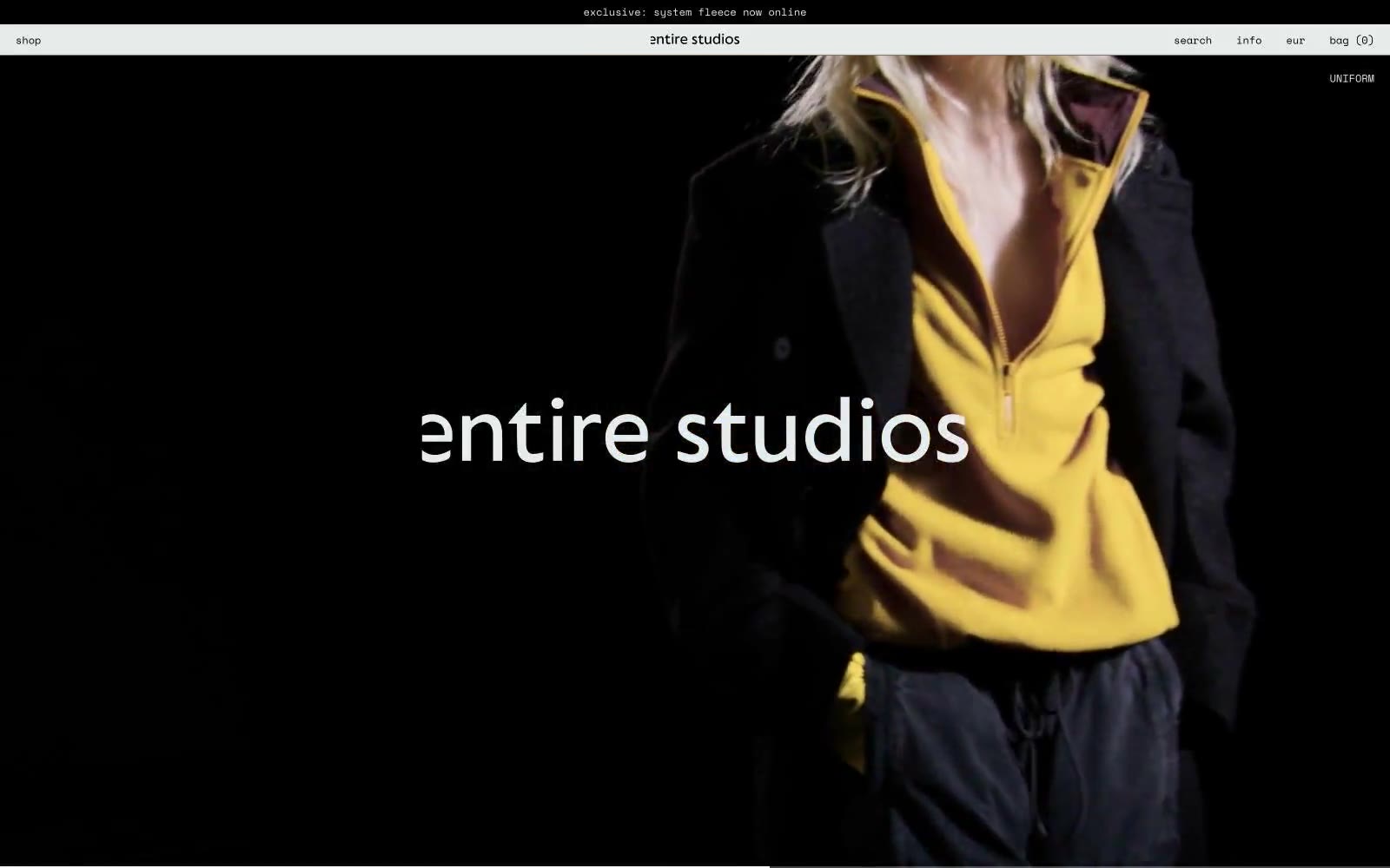
entire studios
entire studios — Style Reference
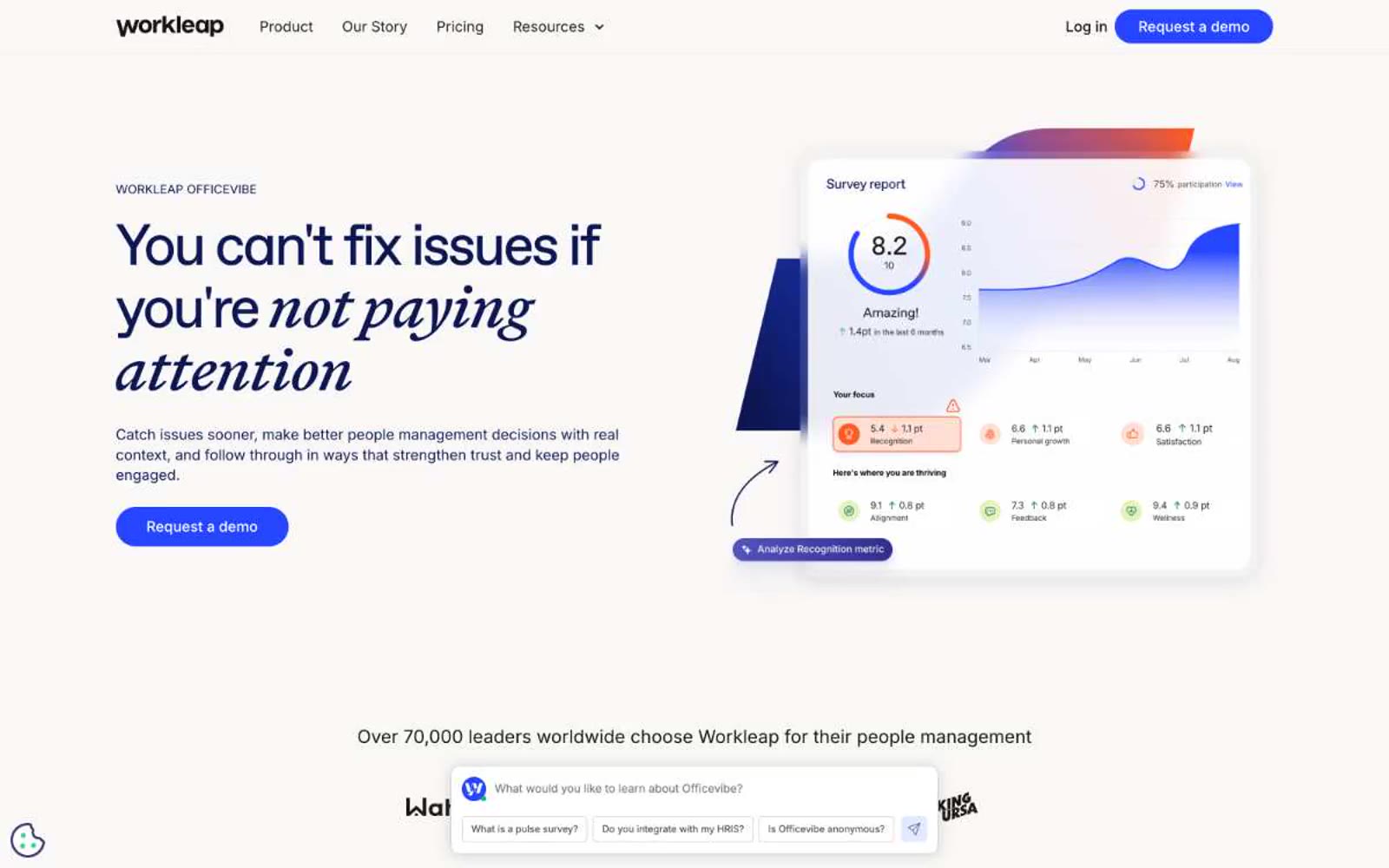
Officevibe
Officevibe — Style Reference
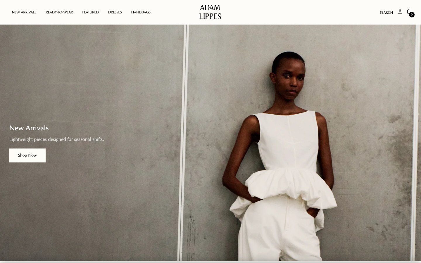
Adam Lippes
# Adam Lippes — Style Reference **Adam Lippes** — Tham khảo phong cách
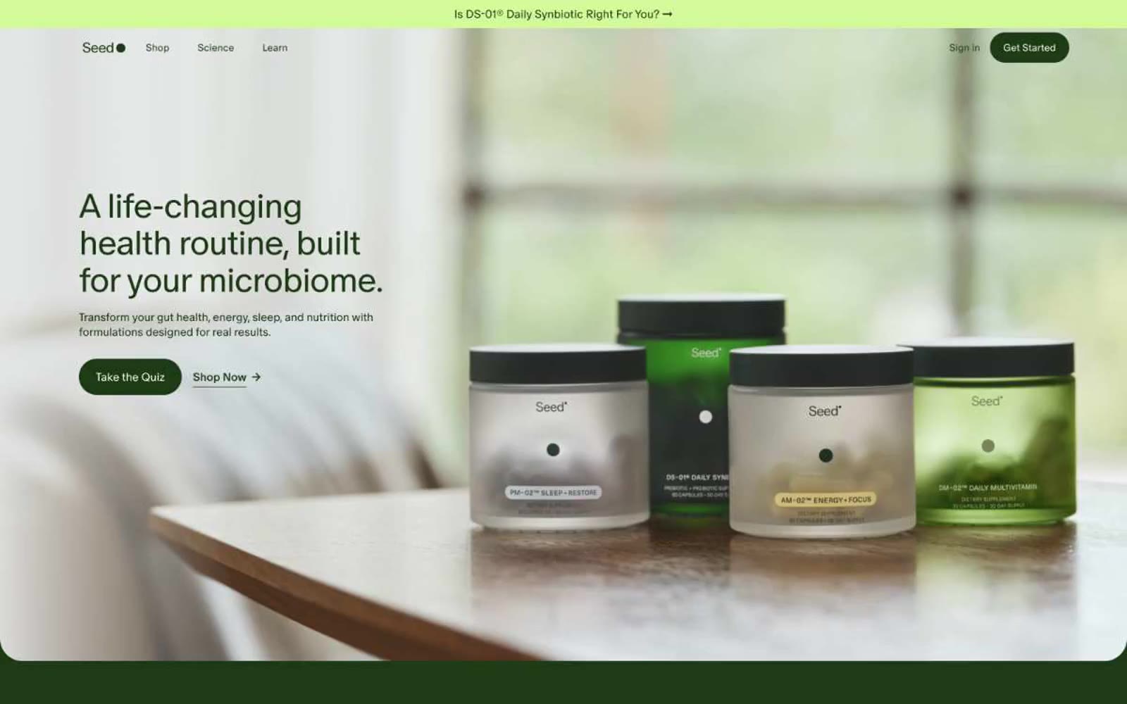
Seed
Seed — Style Reference
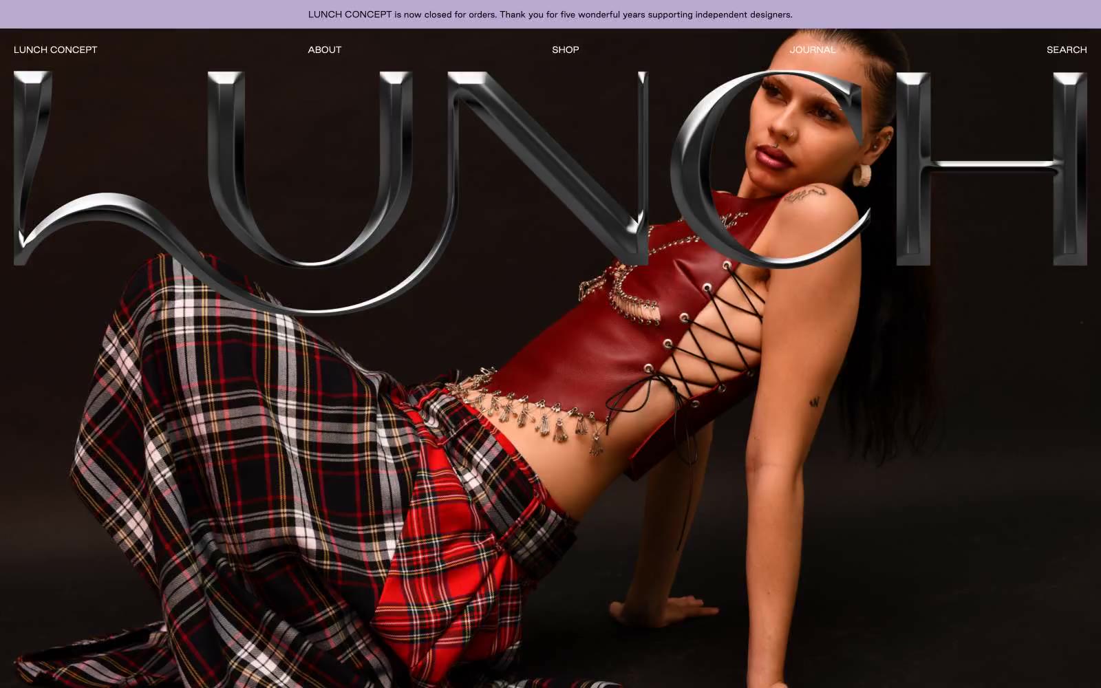
LUNCH
LUNCH — Style Reference