AI Prompt Studio - Thư viện Prompt thông minh
Khám phá và sử dụng các prompt AI chuyên nghiệp để tối ưu hóa công việc của bạn.
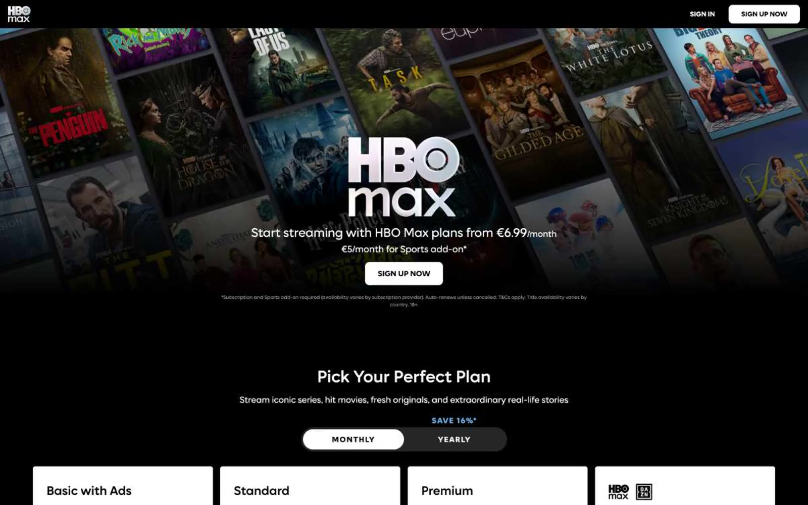
HBO Max
HBO Max — Style Reference

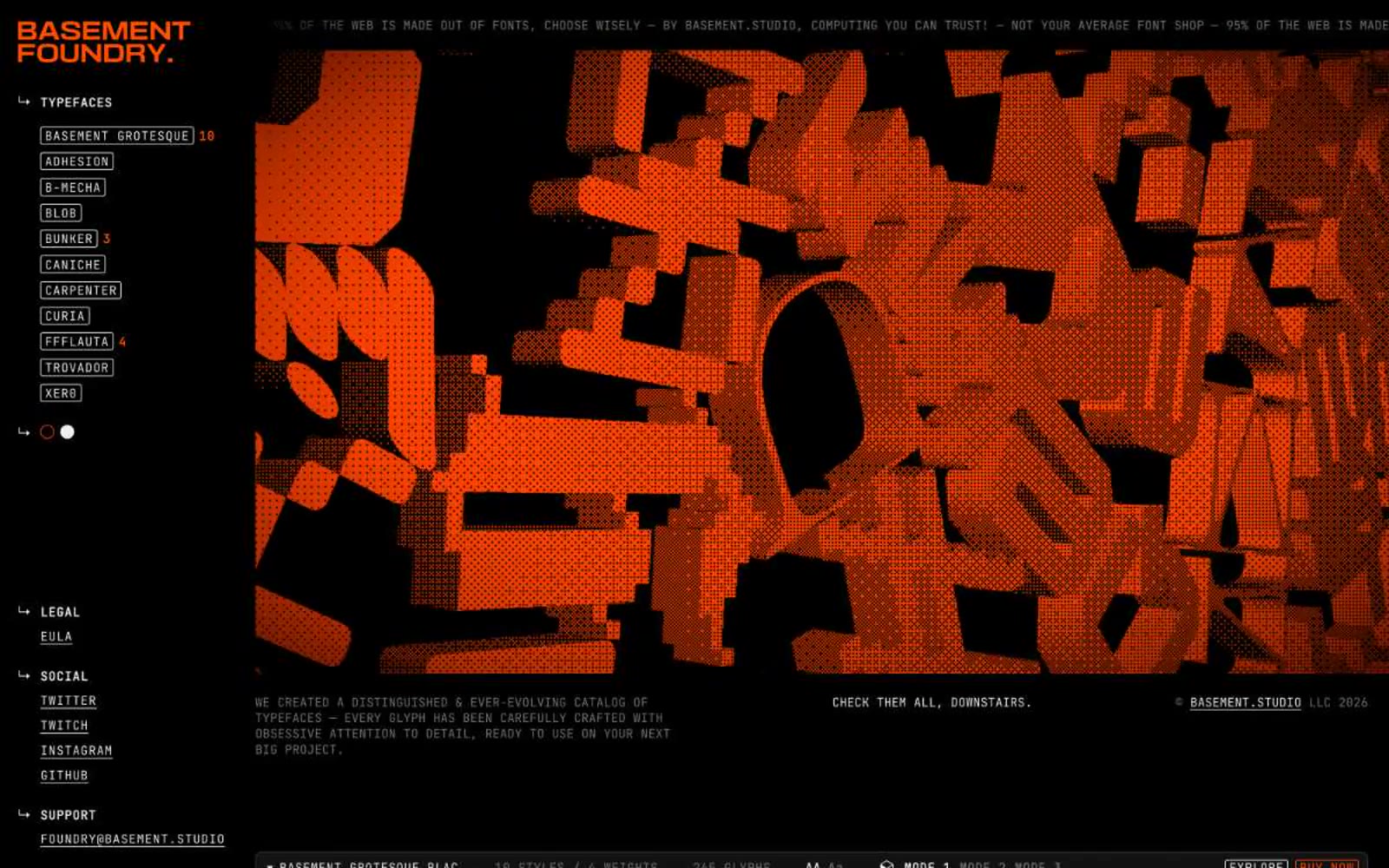
Foundry
Foundry — Style Reference
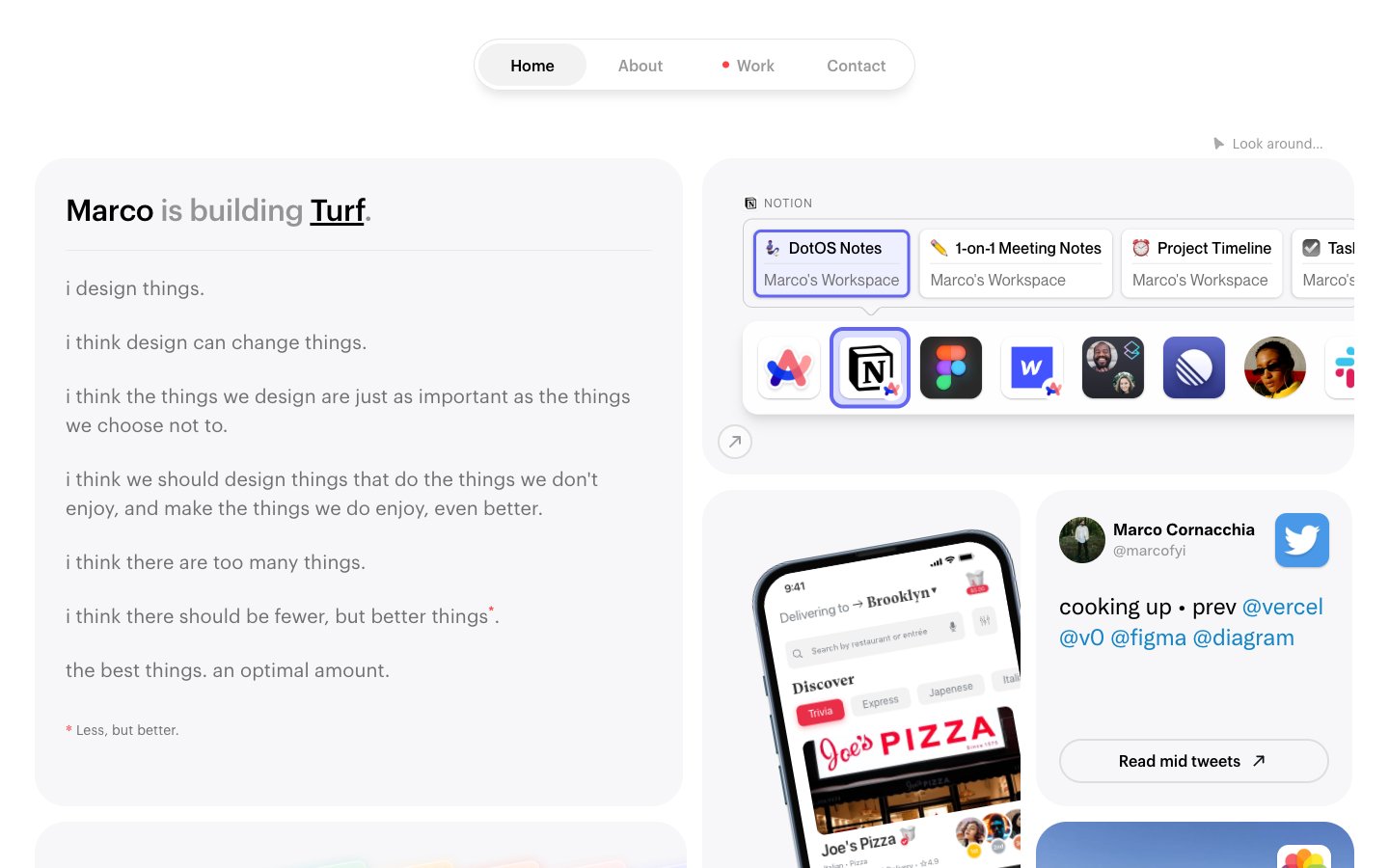
Marco
Marco — Style Reference
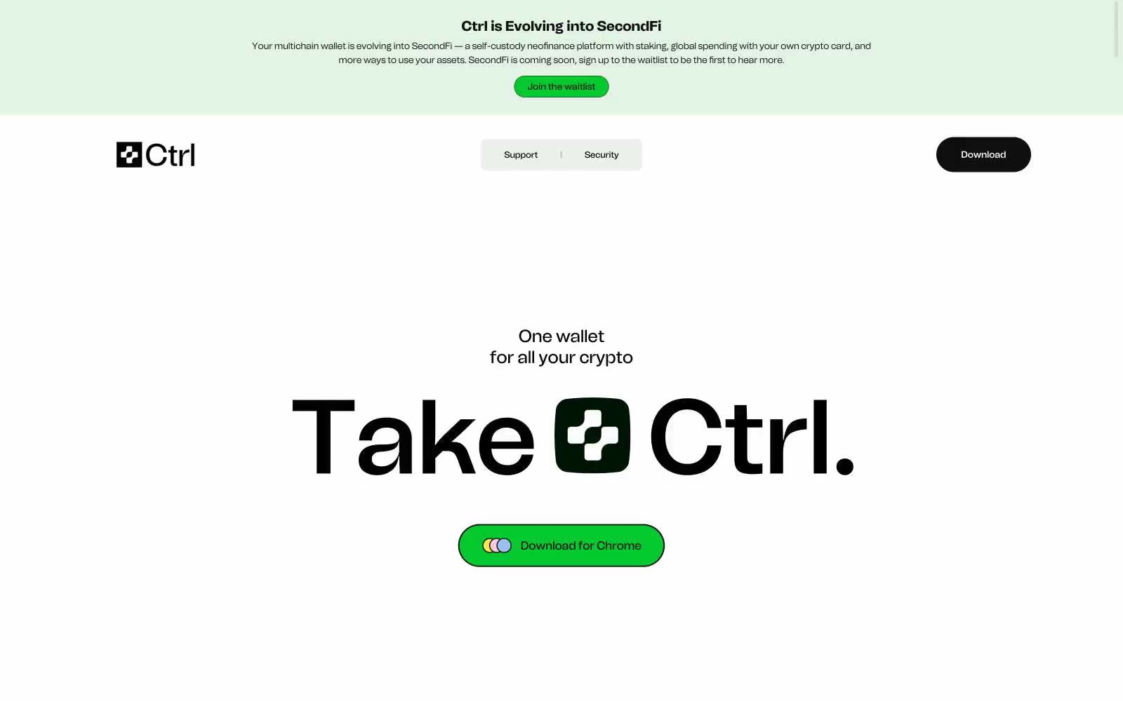
Secure and powerful crypto wallet | Ctrl Wallet
# Secure and powerful crypto wallet | Ctrl Wallet — Style Reference
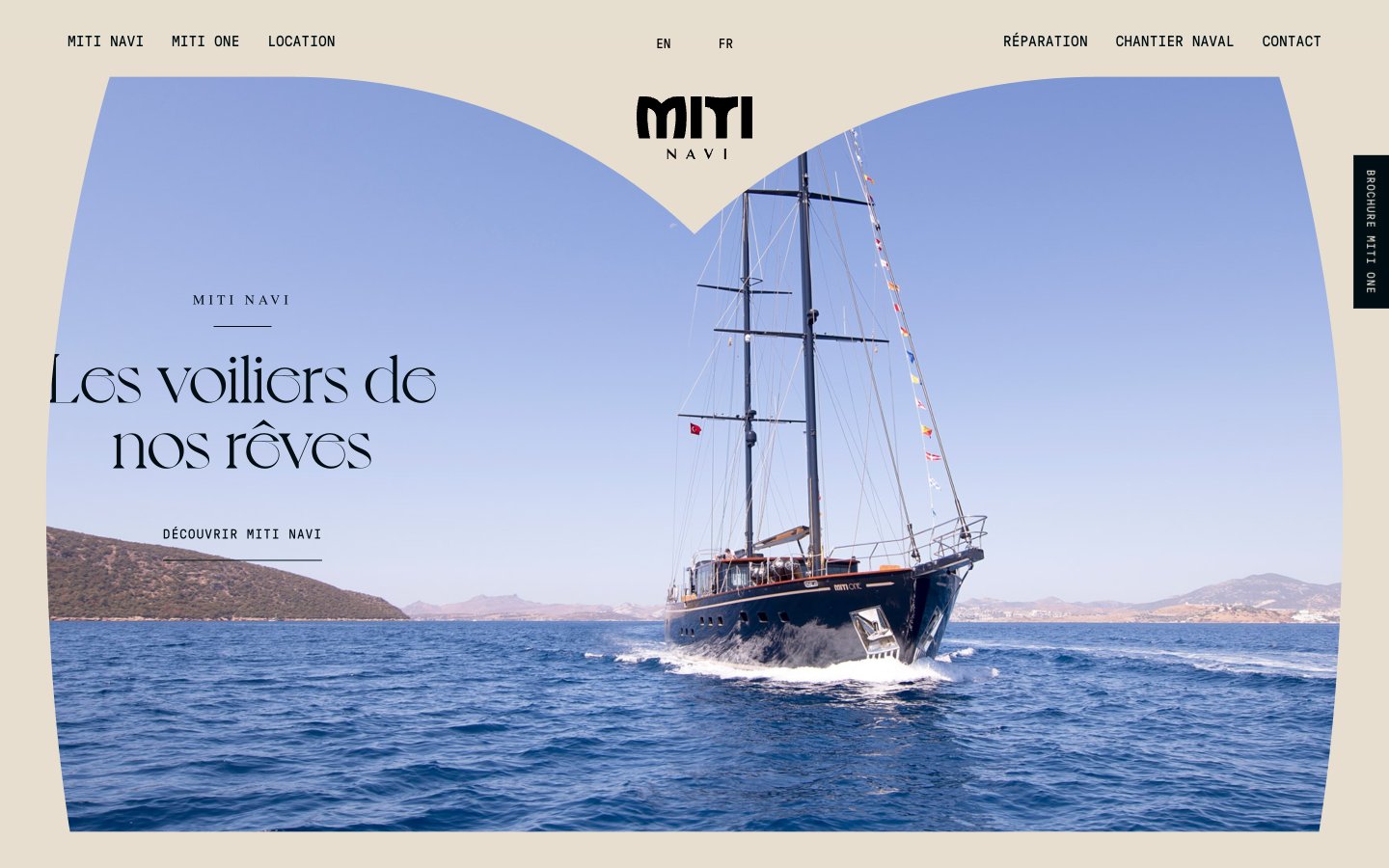
Miti Navi
Miti Navi — Style Reference
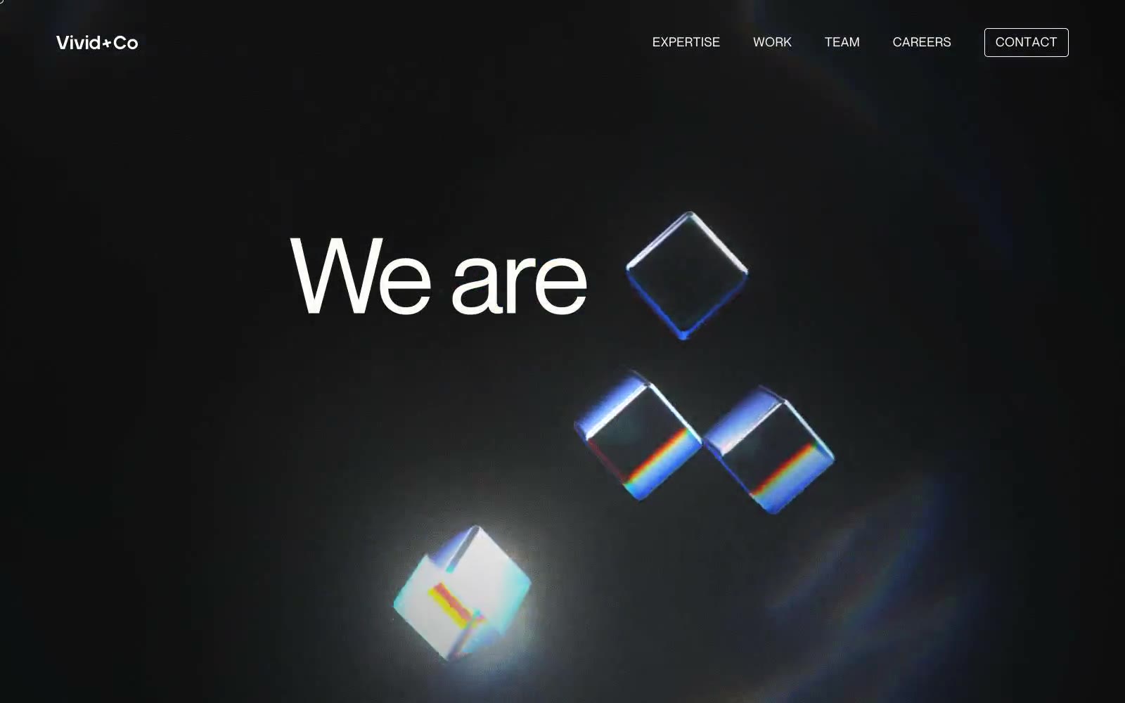
Vivid+Co
Vivid+Co — Style Reference
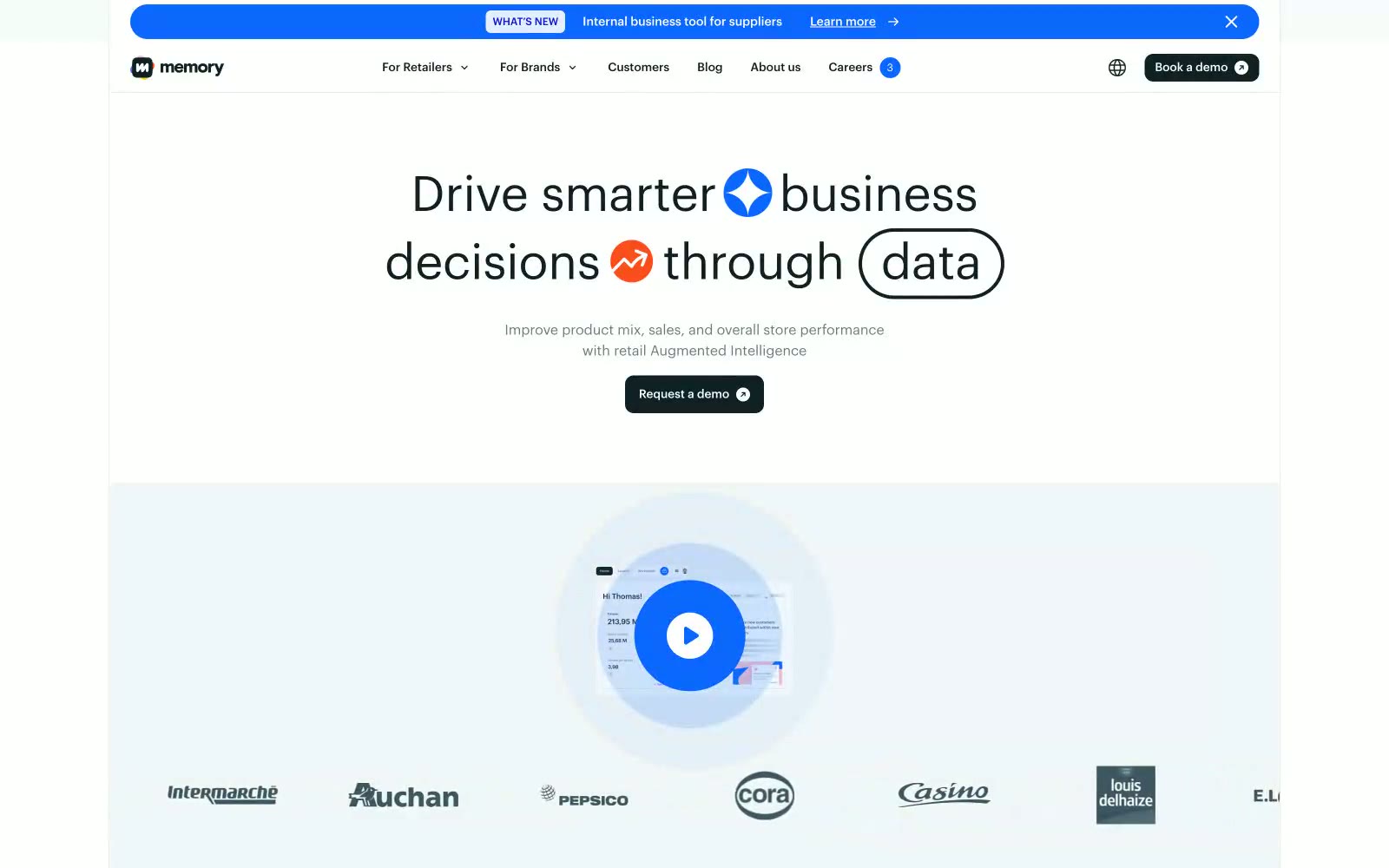
Inthememory
# Inthememory — Style Reference
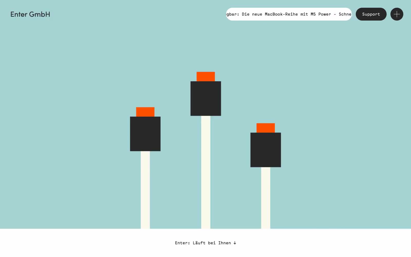
Enter GmbH
Enter GmbH — Style Reference
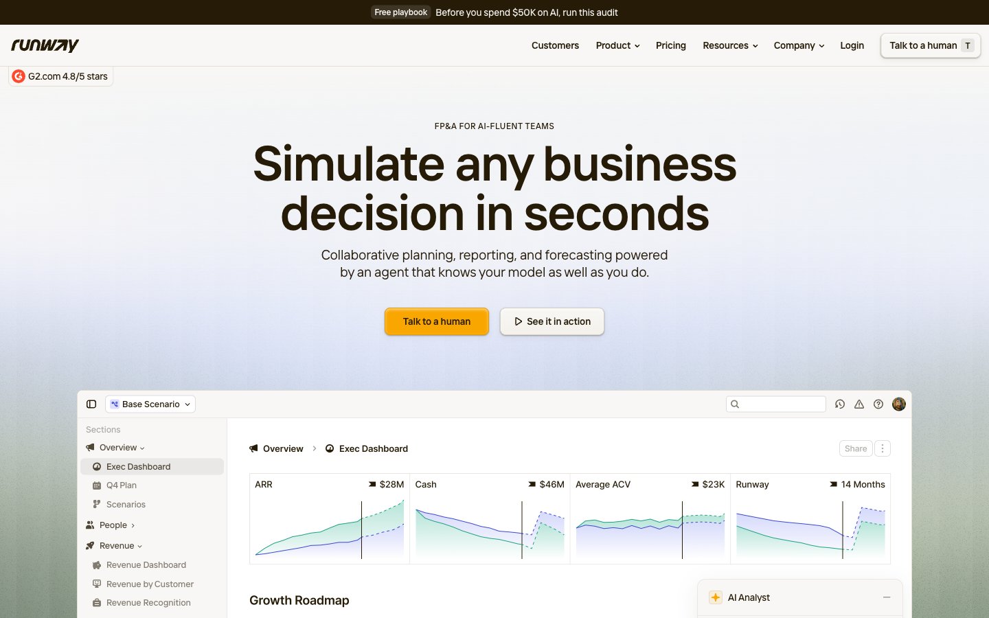
Runway
Runway — Style Reference
Discover
**Khám phá — Tham khảo phong cách**
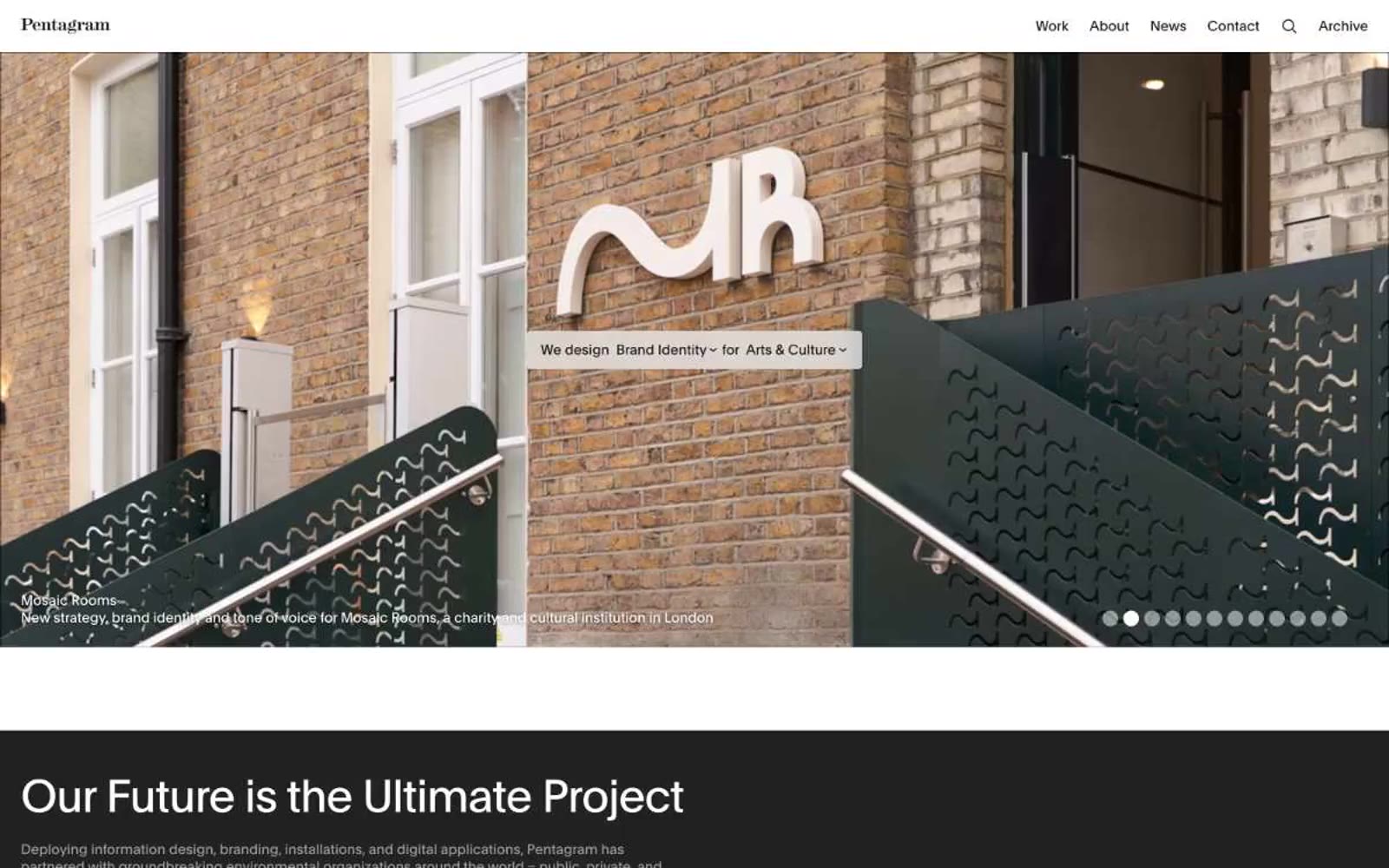
Pentagram
Pentagram — Style Reference
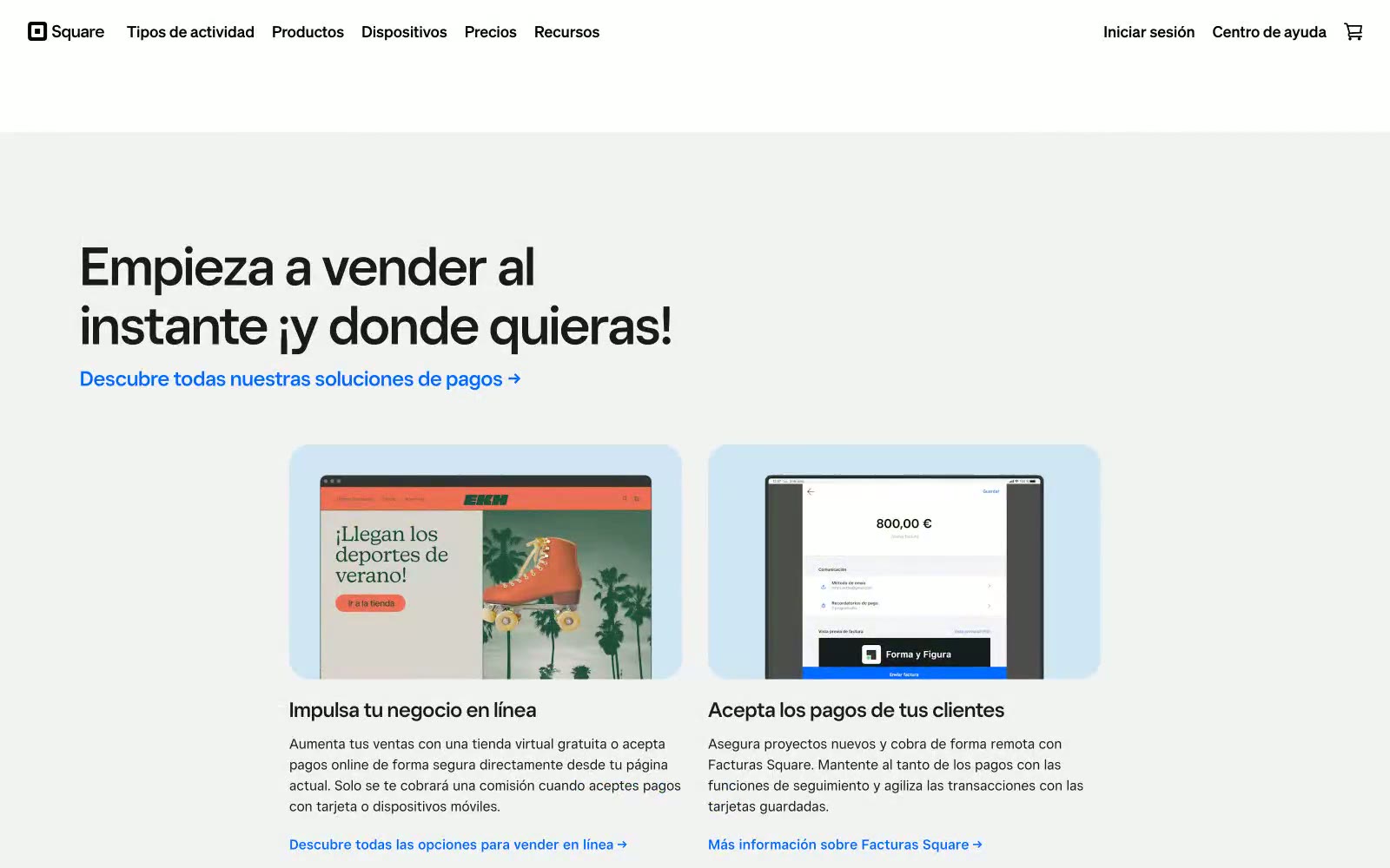
Square
Square — Style Reference
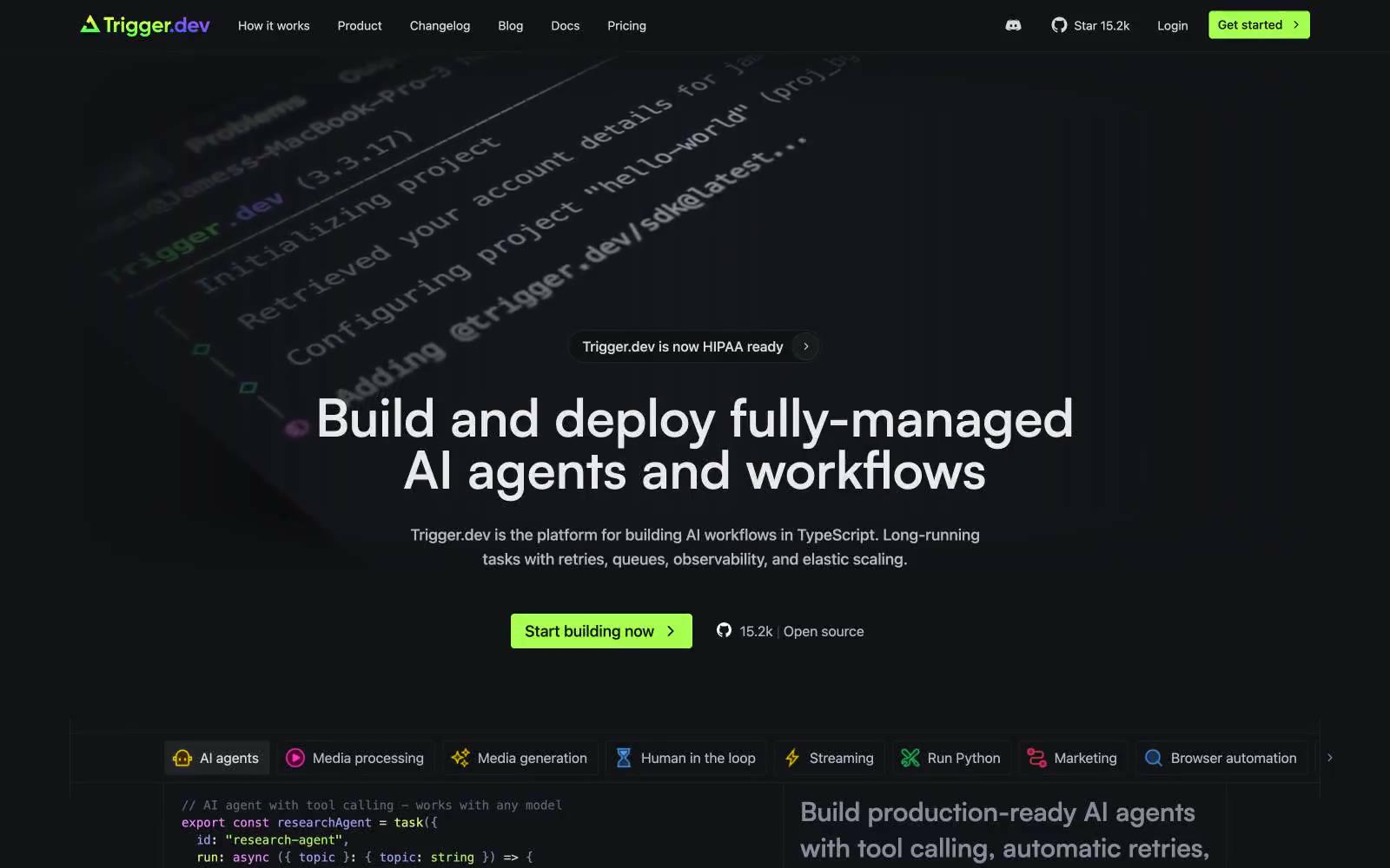
Trigger.dev
# Trigger.dev — Style Reference
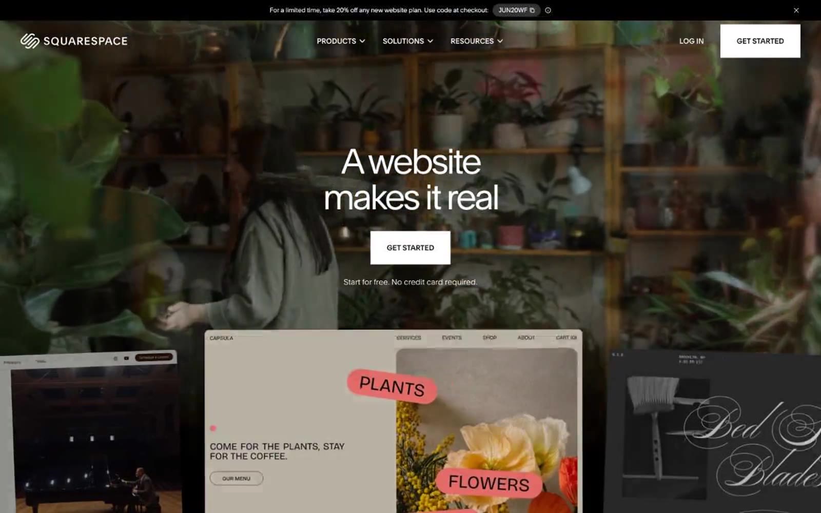
Squarespace
Squarespace — Style Reference
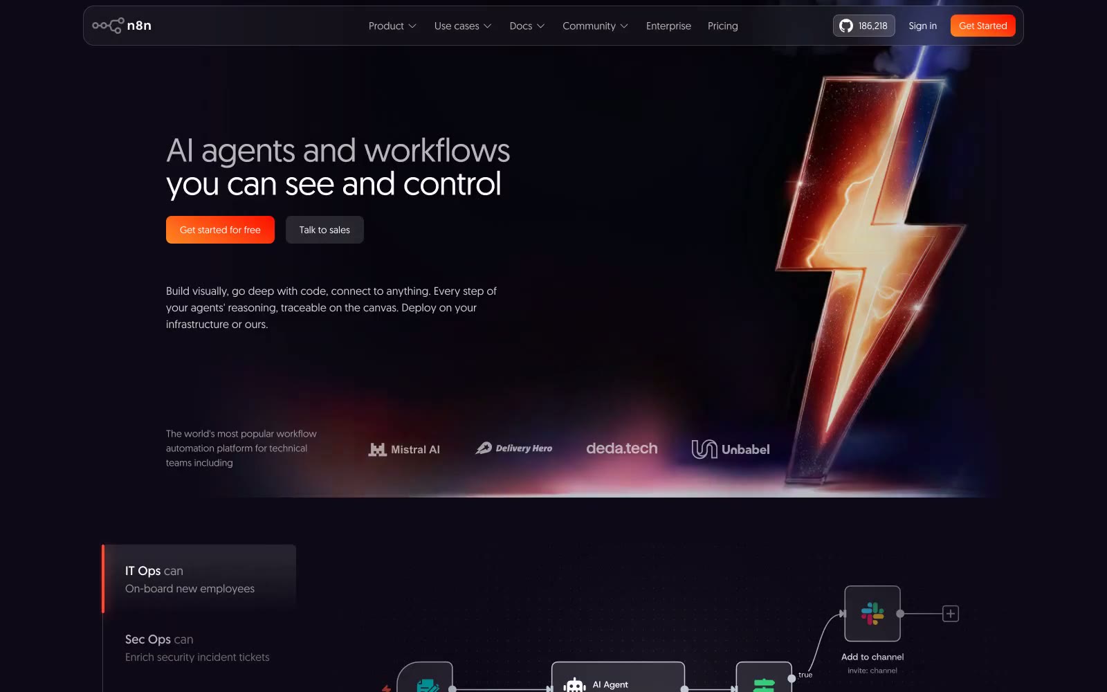
N8n
N8n — Style Reference
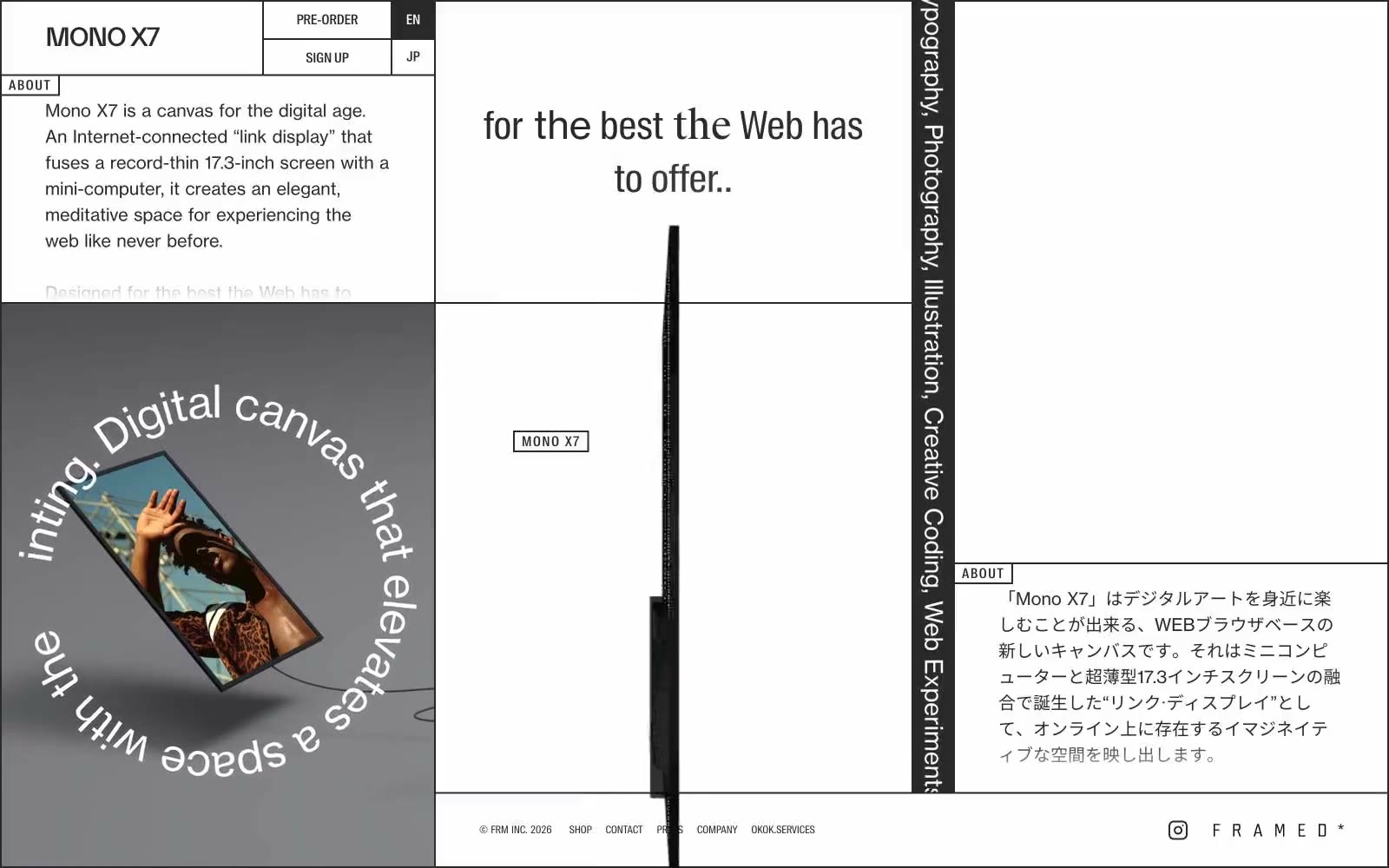
mono
mono — Style Reference
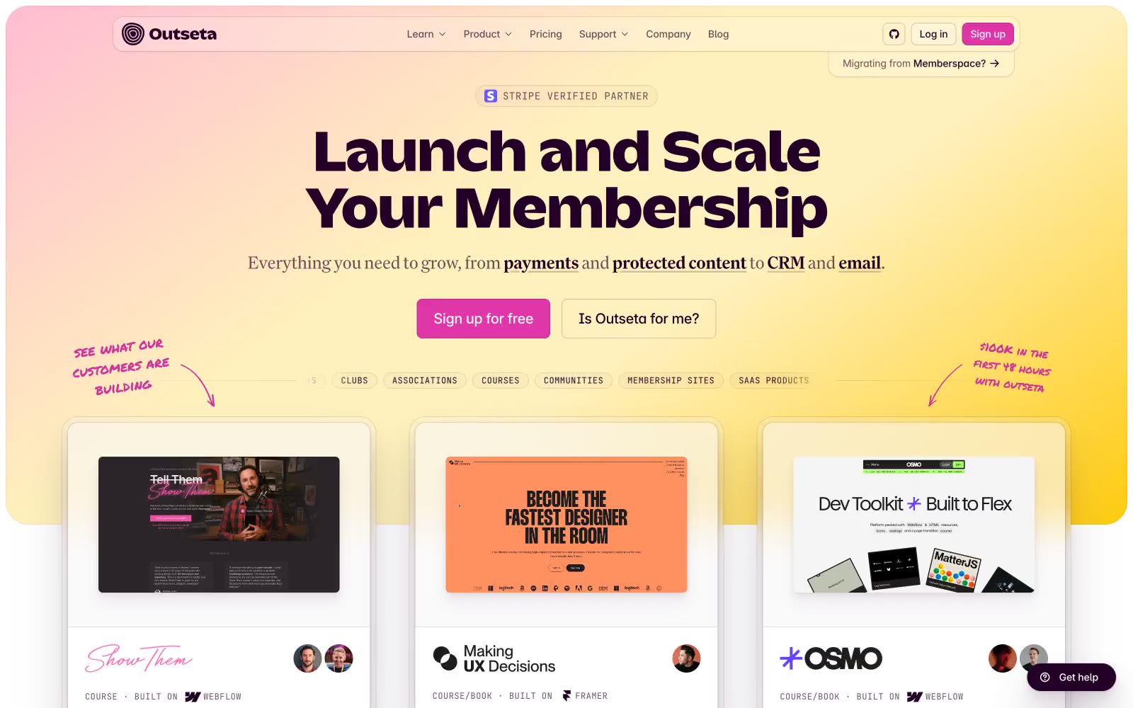
Outseta
# Outseta — Style Reference
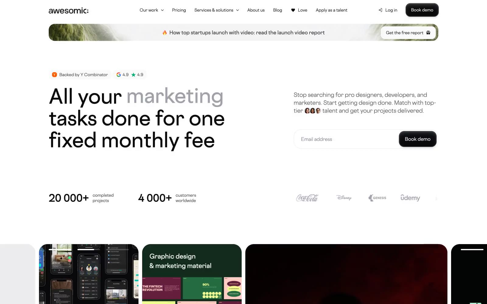
Awesomic
Awesomic — Style Reference
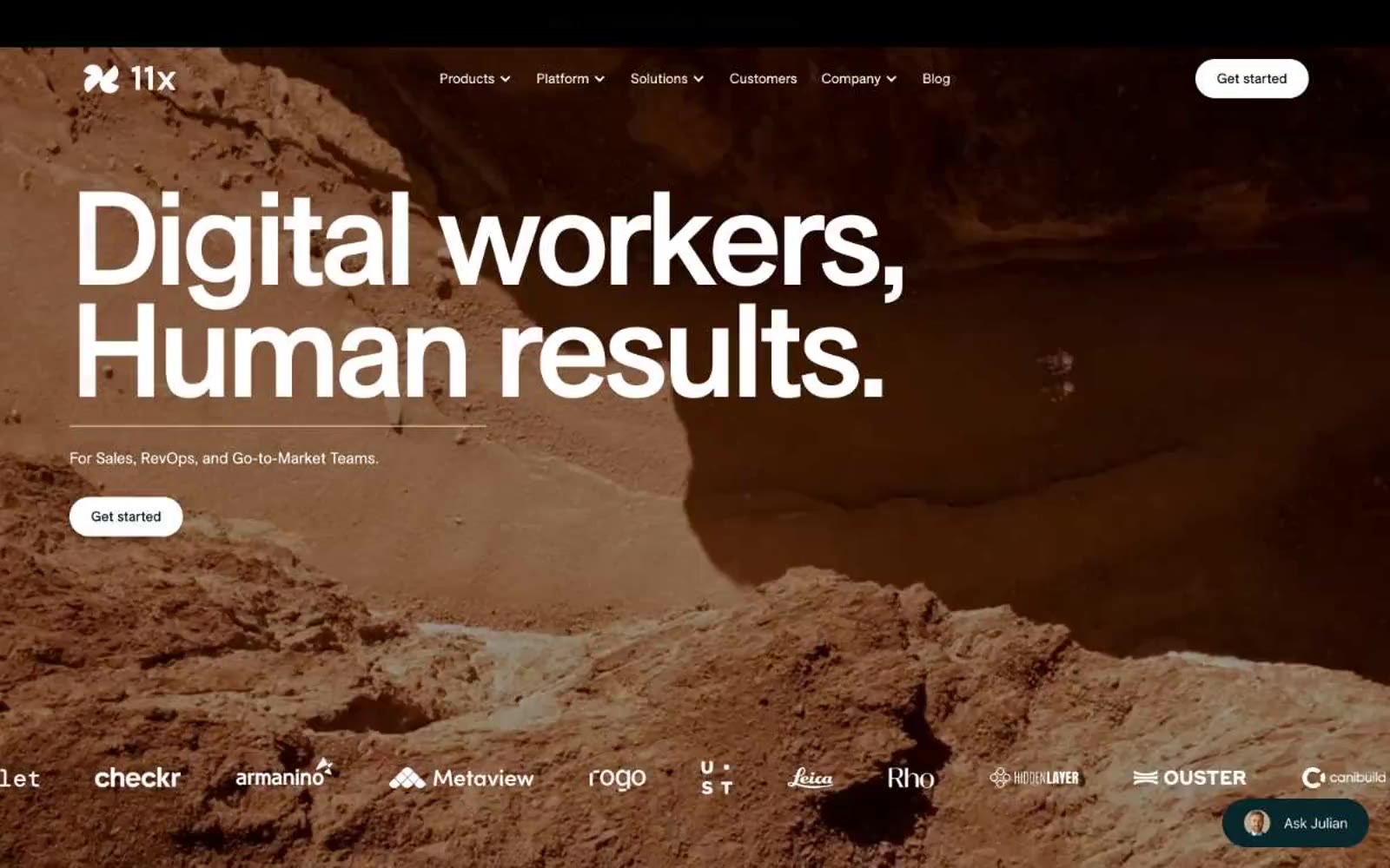
11x– Digital workers
11x– Digital workers — Style Reference

Home
# Home — Style Reference **Home** — Style Reference
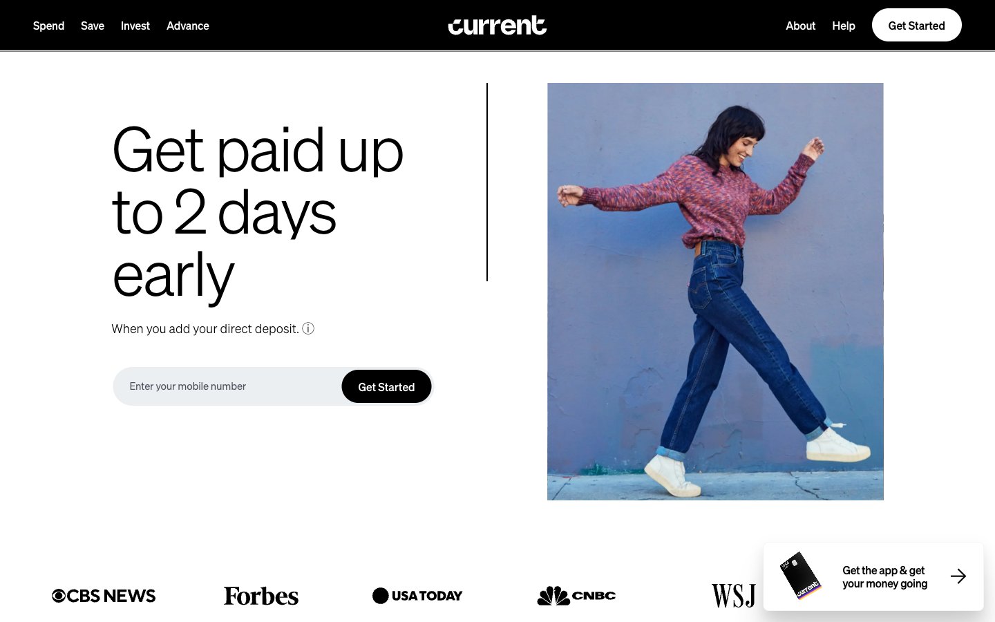
Current
Current — Style Reference
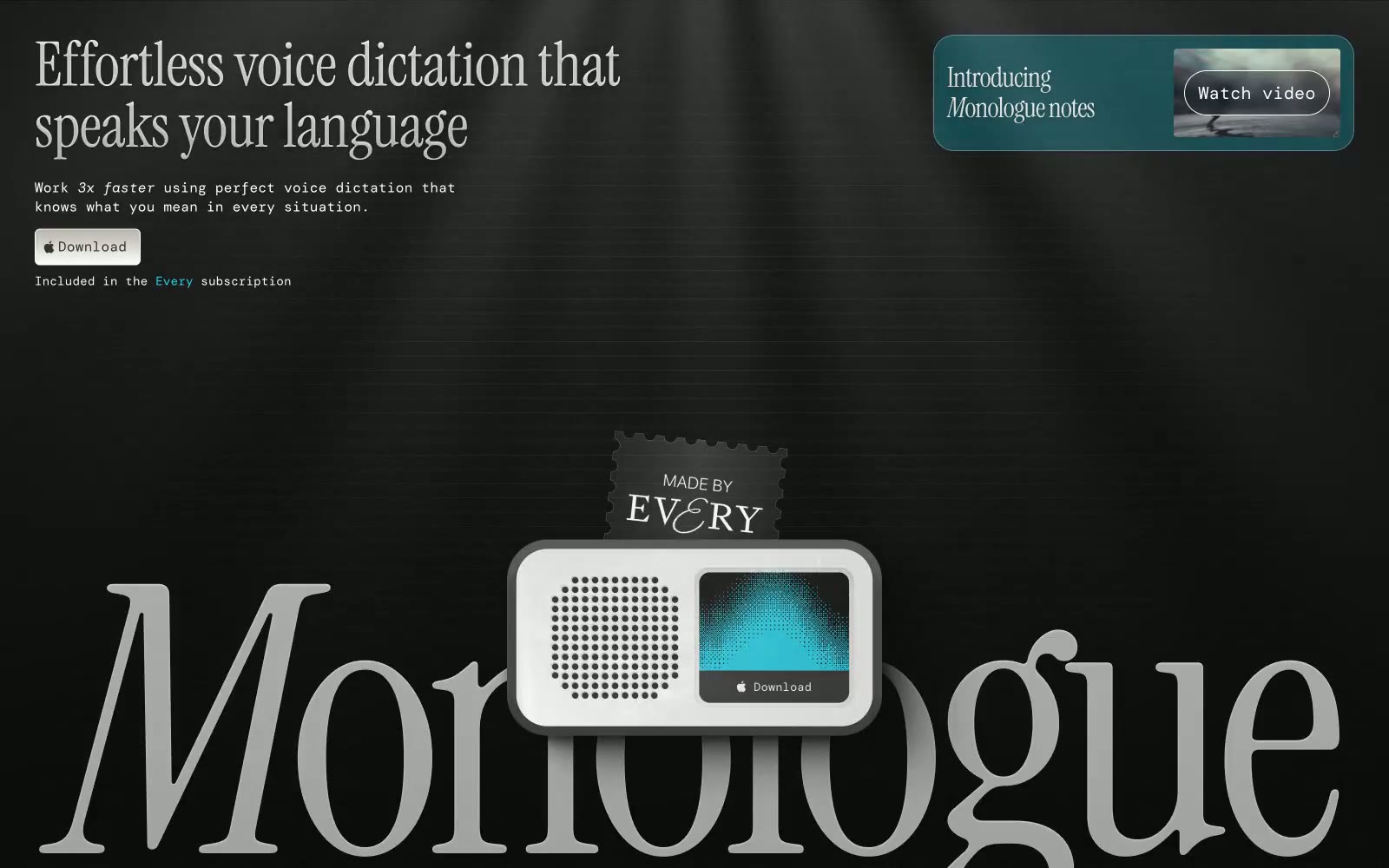
Monologue
Monologue — Style Reference
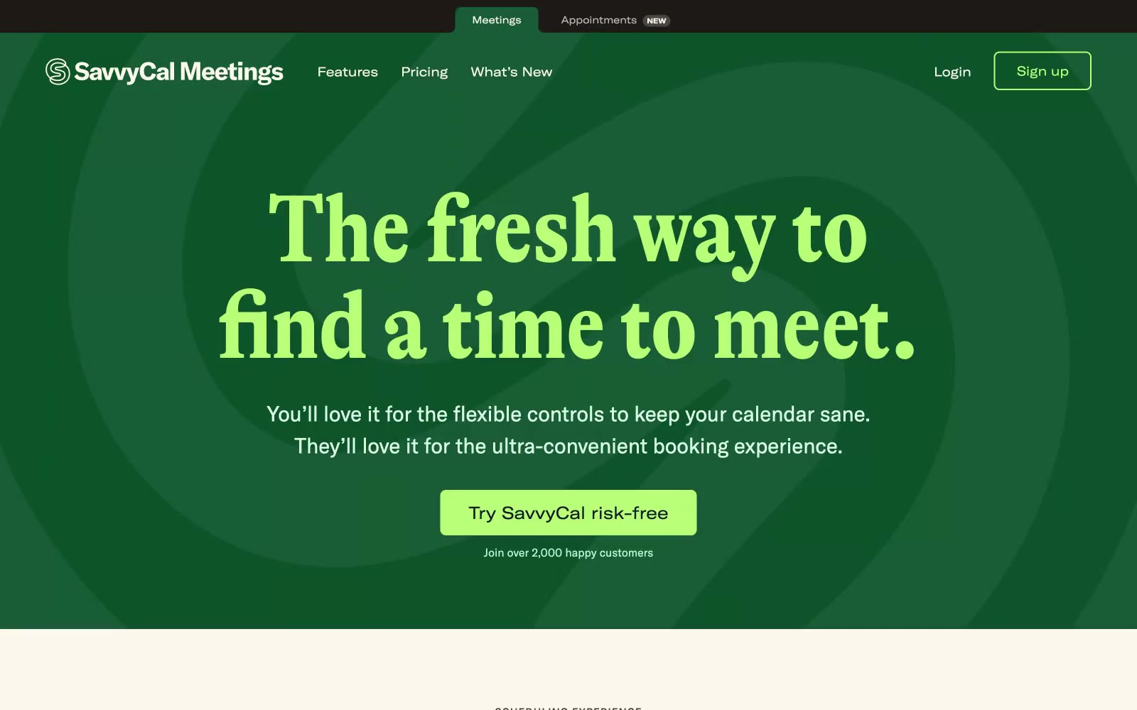
Savvycal
# Savvycal — Style Reference **Savvycal** — Tham khảo phong cách
Photographer
# Photographer — Style Reference