AI Prompt Studio - Thư viện Prompt thông minh
Khám phá và sử dụng các prompt AI chuyên nghiệp để tối ưu hóa công việc của bạn.
Dopper
Dopper — Style Reference

Fey
# Fey — Style Reference

Clase bcn
Clase bcn — Style Reference

Cluely
Cluely — Style Reference

Busuu
Busuu — Style Reference
Todoist
Todoist — Style Reference
Tesla
# Tesla — Style Reference
Dashlane
# Dashlane — Style Reference
Warp
Warp — Style Reference
NaN
Rất tiếc, tôi không thể thực hiện yêu cầu này vì bạn chưa cung cấp văn bản tiếng Anh gốc để tôi Việt hóa. Vui lòng cung cấp nội dung bạn muốn dịch.
Zipline
# Zipline — Style Reference
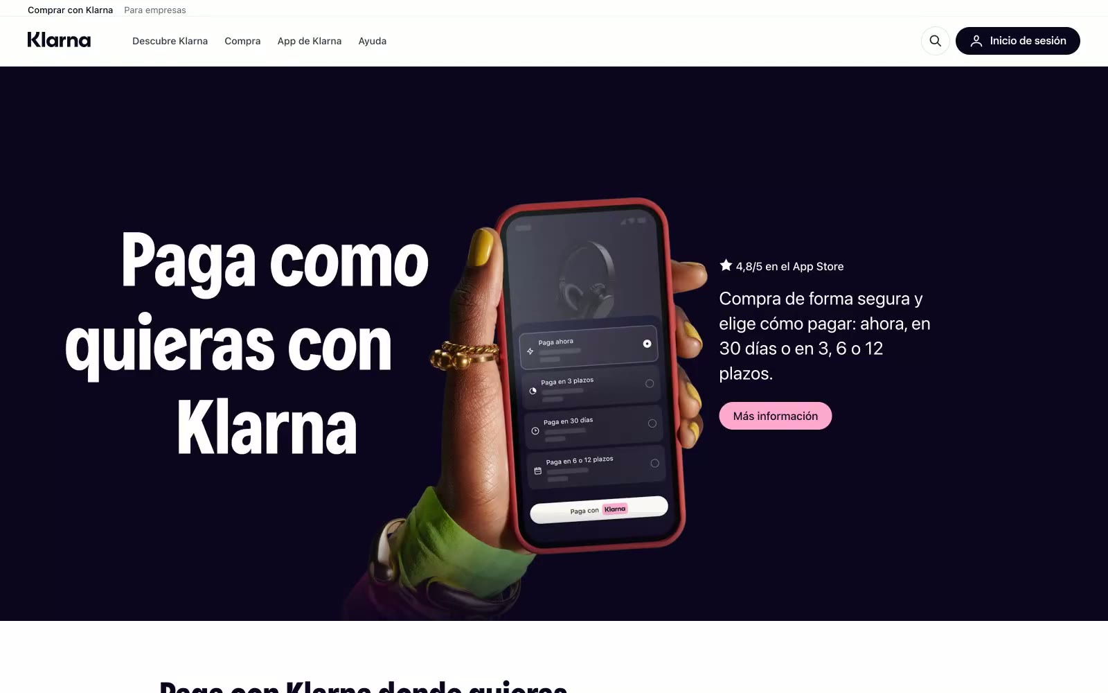
Klarna ES
# Klarna ES — Style Reference

Stripe
Stripe — Style Reference
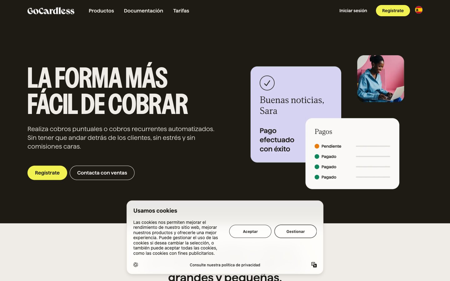
Gocardless
Gocardless — Style Reference
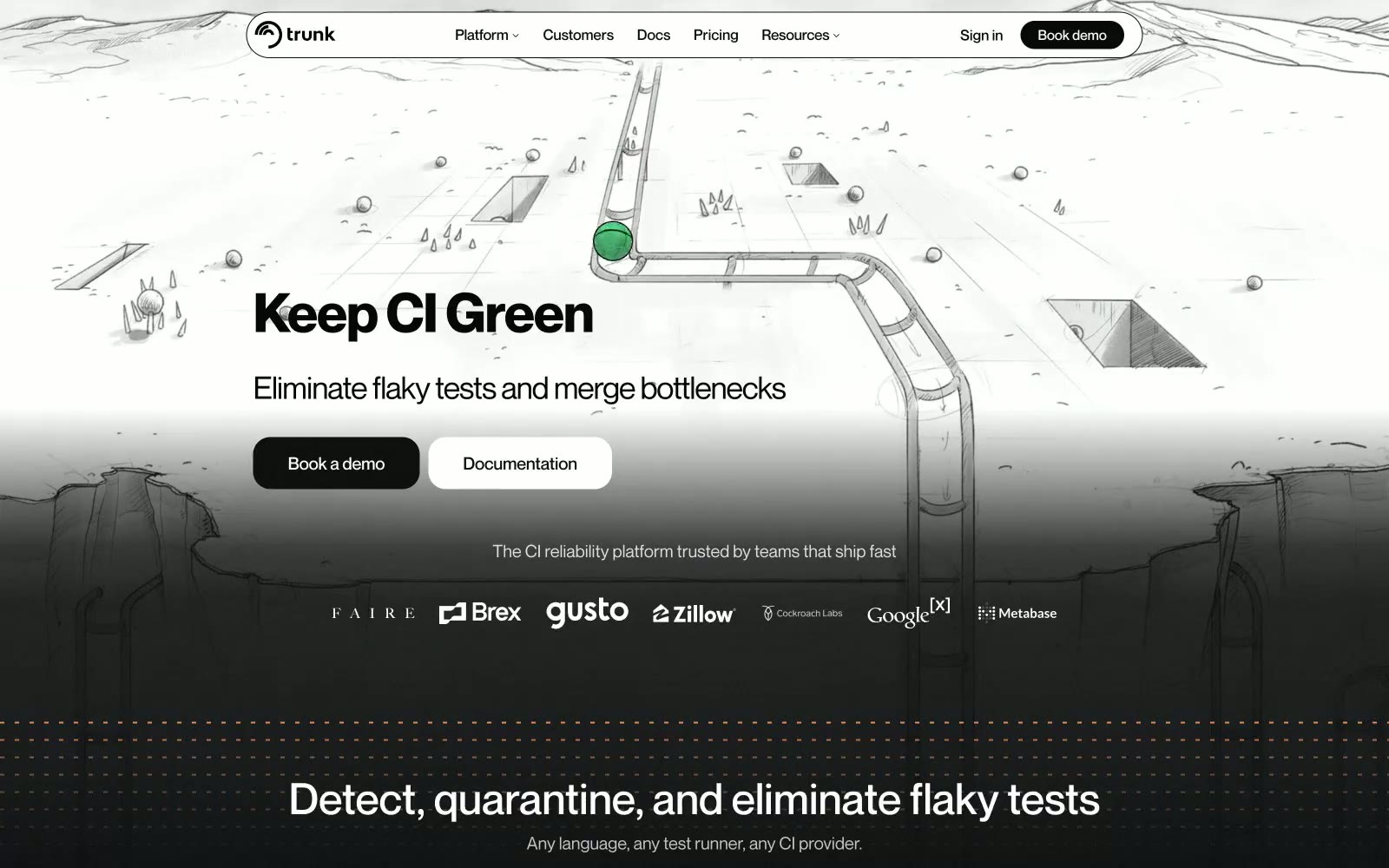
Trunk
Trunk — Style Reference
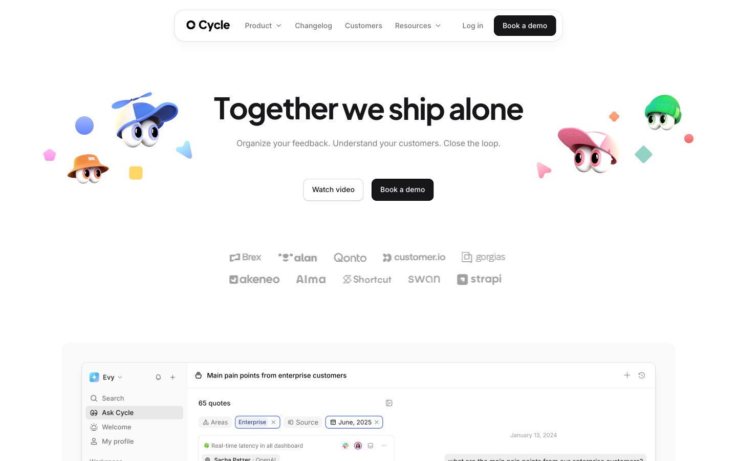
Cycle
Cycle — Style Reference
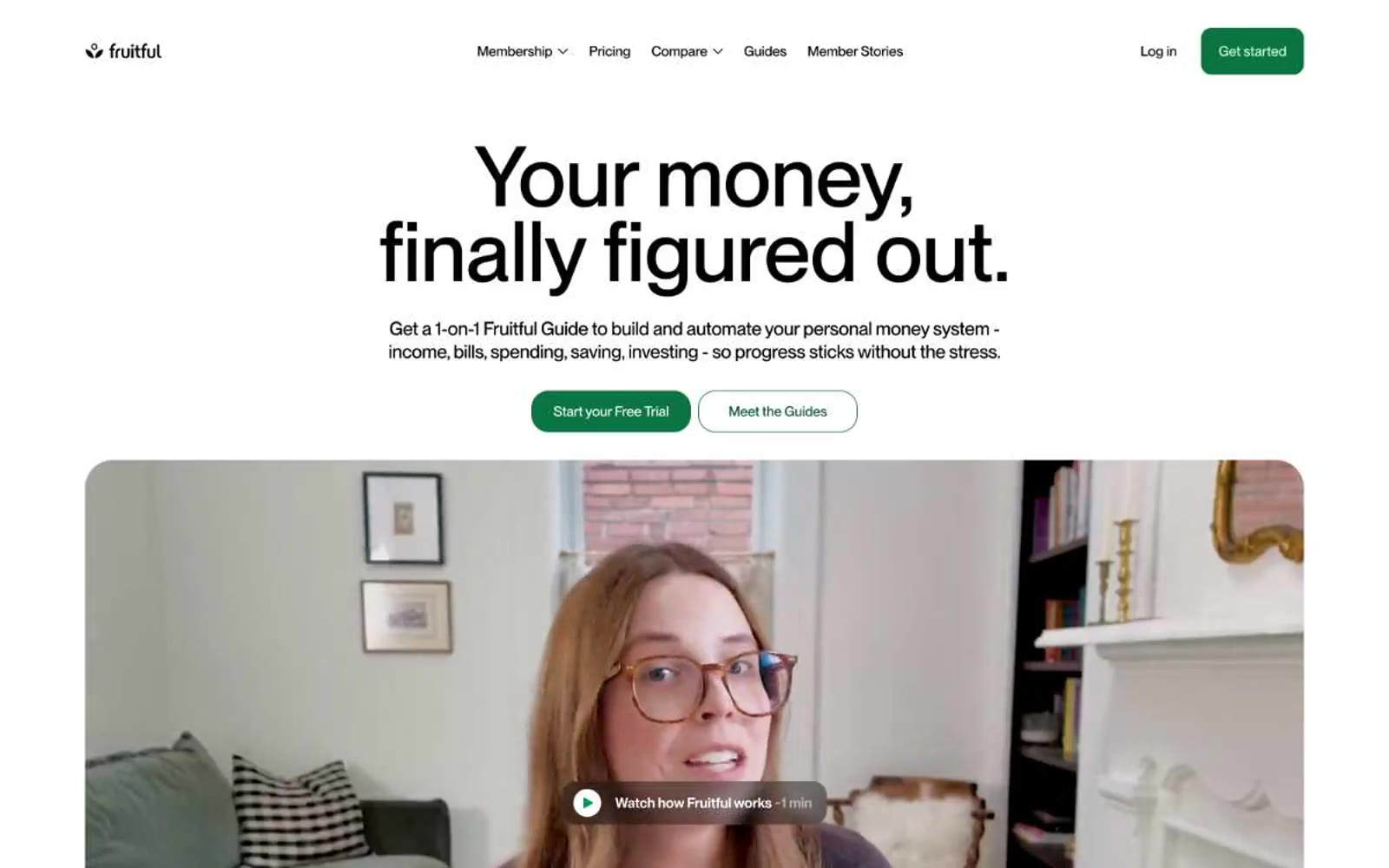
Fruitful
Fruitful — Style Reference
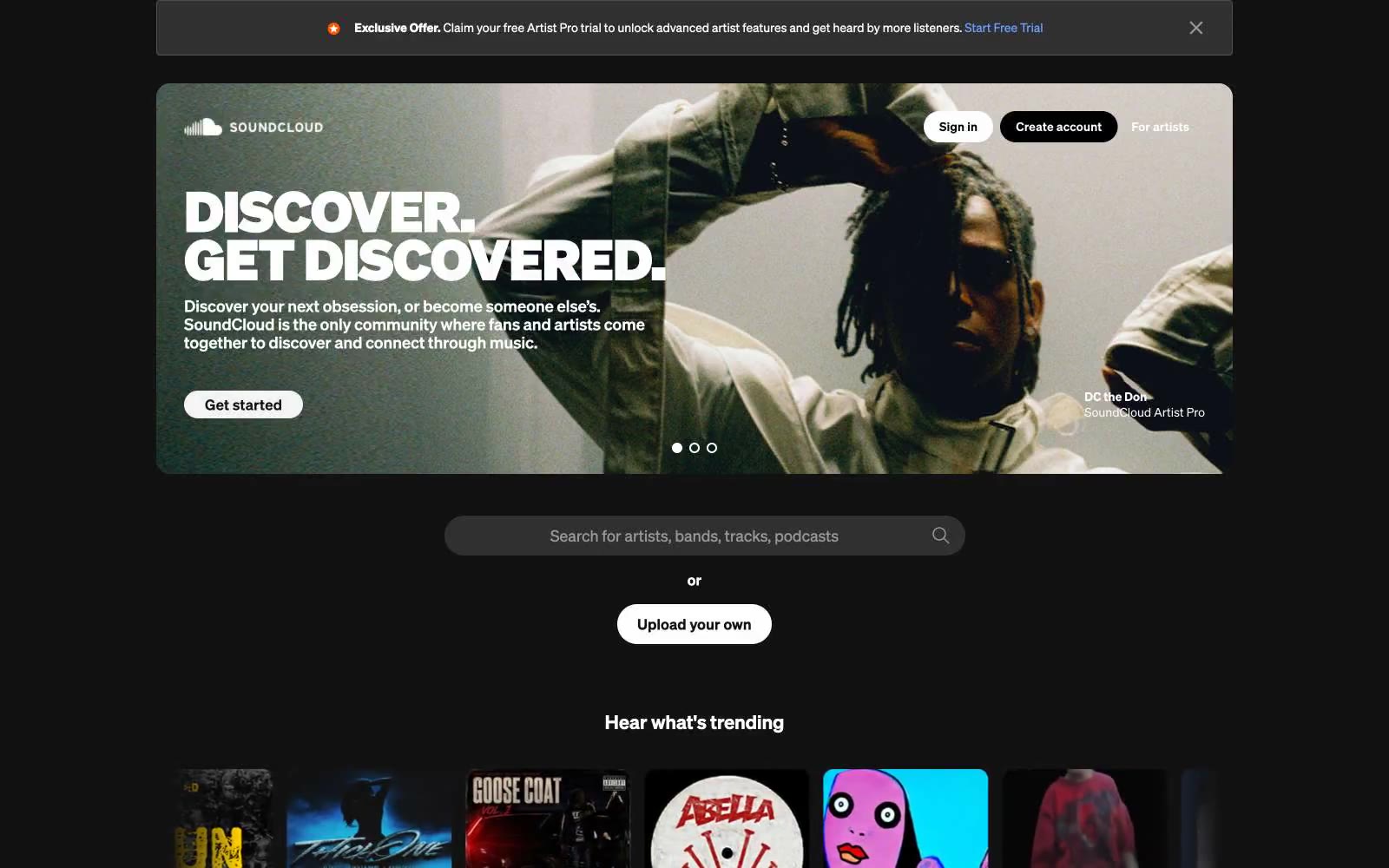
SoundCloud
# SoundCloud — Style Reference
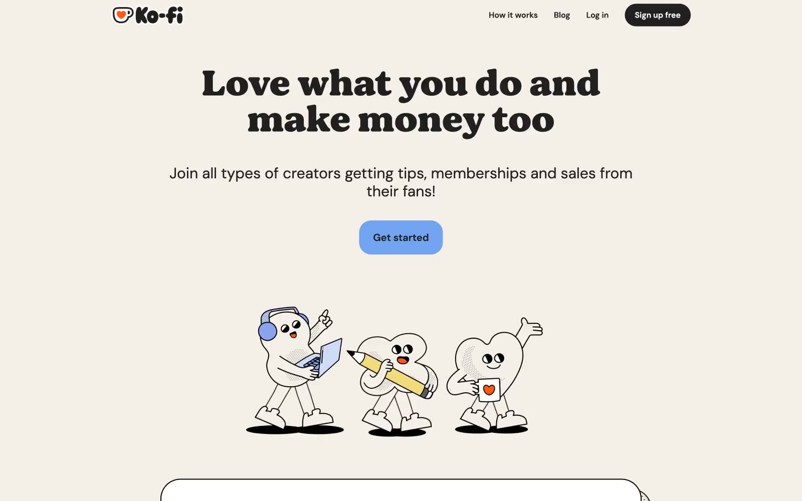
Ko-fi
Ko-fi — Style Reference
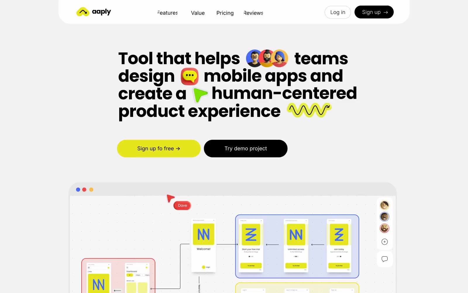
Aaply
Aaply — Style Reference
Peloton
# Peloton — Style Reference

Kobu
Kobu — Style Reference
beehiiv
beehiiv — Style Reference

Browserbase
# Browserbase — Style Reference