AI Prompt Studio - Thư viện Prompt thông minh
Khám phá và sử dụng các prompt AI chuyên nghiệp để tối ưu hóa công việc của bạn.
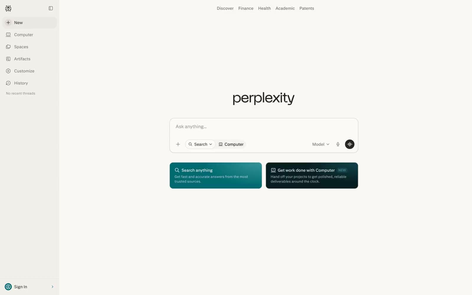
Perplexity AI
Perplexity AI — Style Reference

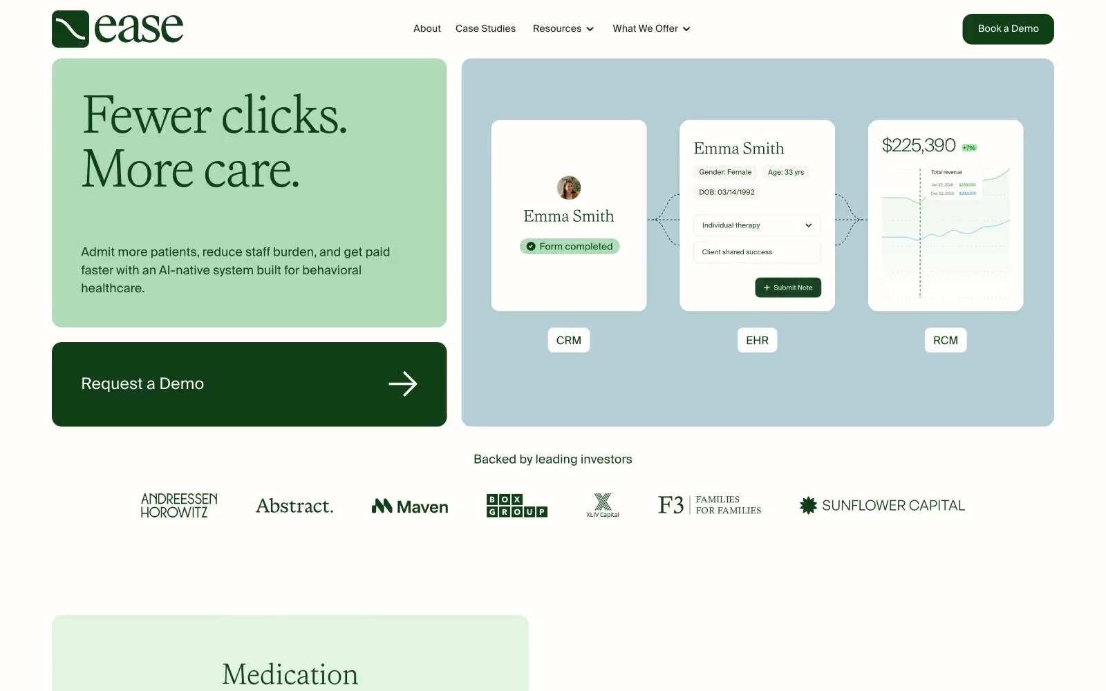
Ease Health
# Ease Health — Style Reference
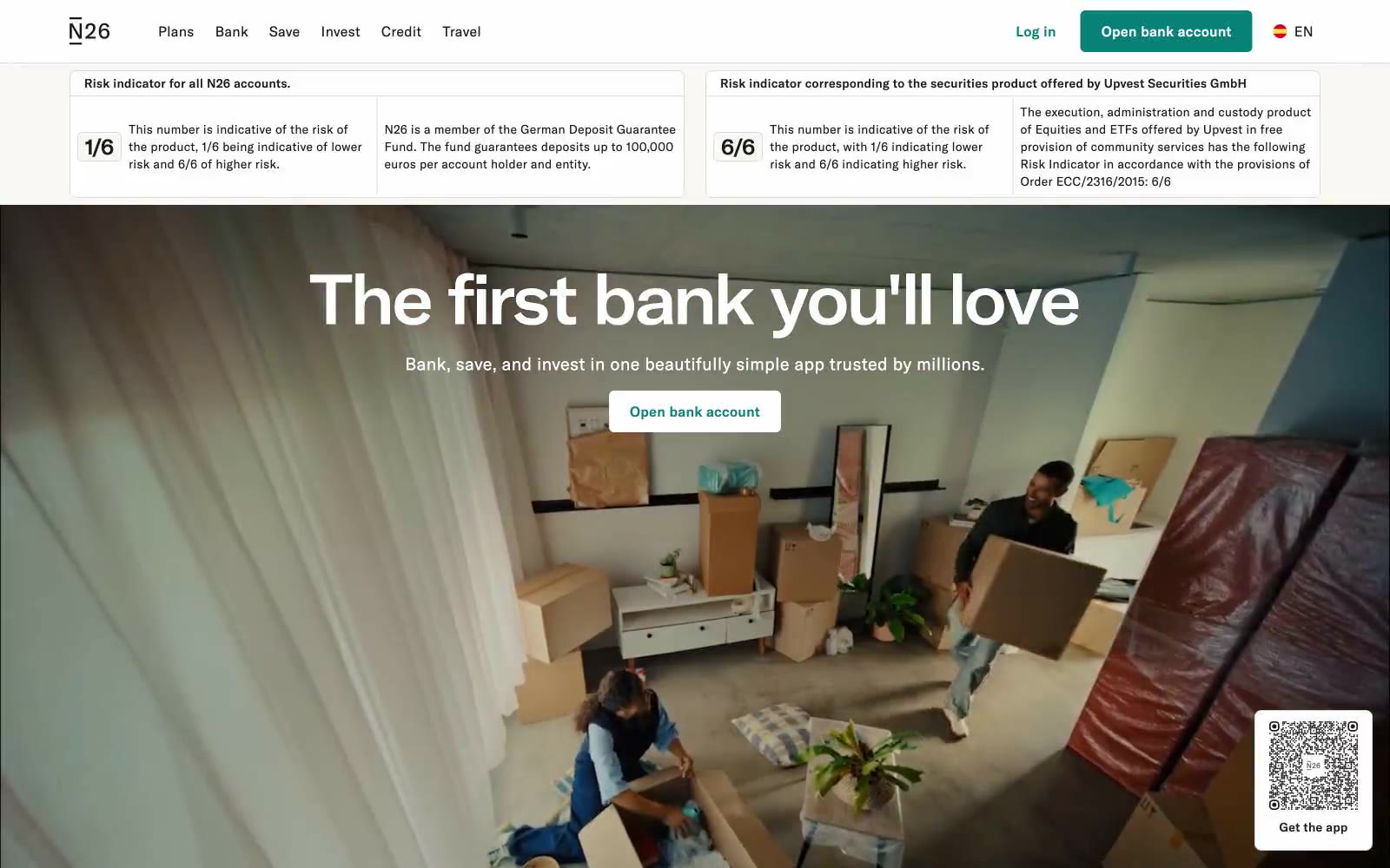
The online bank
# The Online Bank — Style Reference Ngân hàng trực tuyến — Style Reference
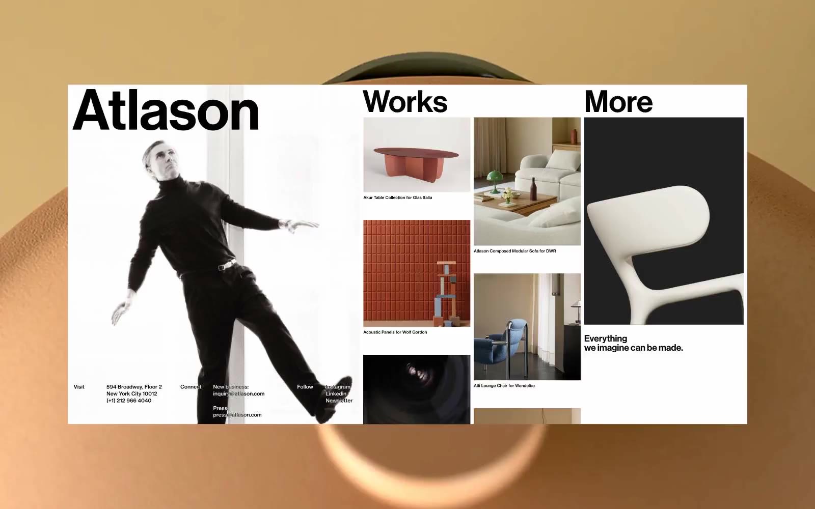
Altason
Altason — Style Reference
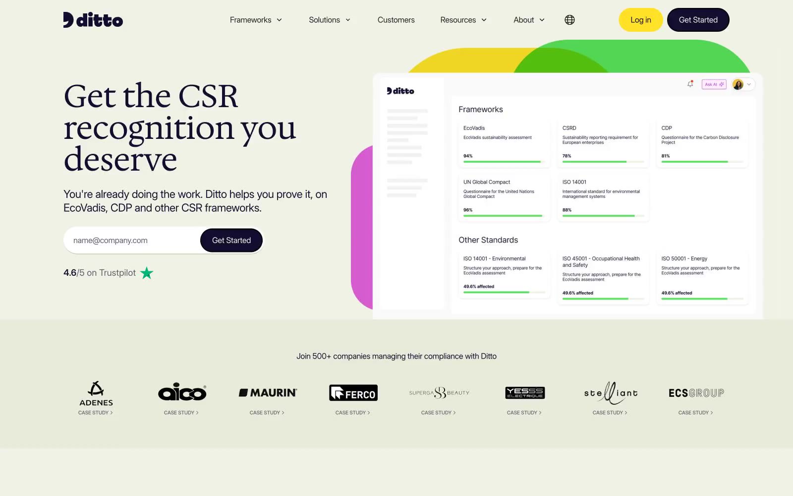
Ditto
Ditto — Style Reference
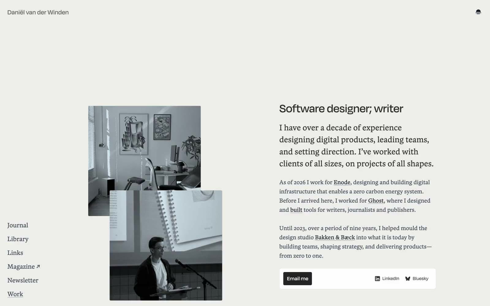
Daniël van der Winden
# Daniël van der Winden — Style Reference
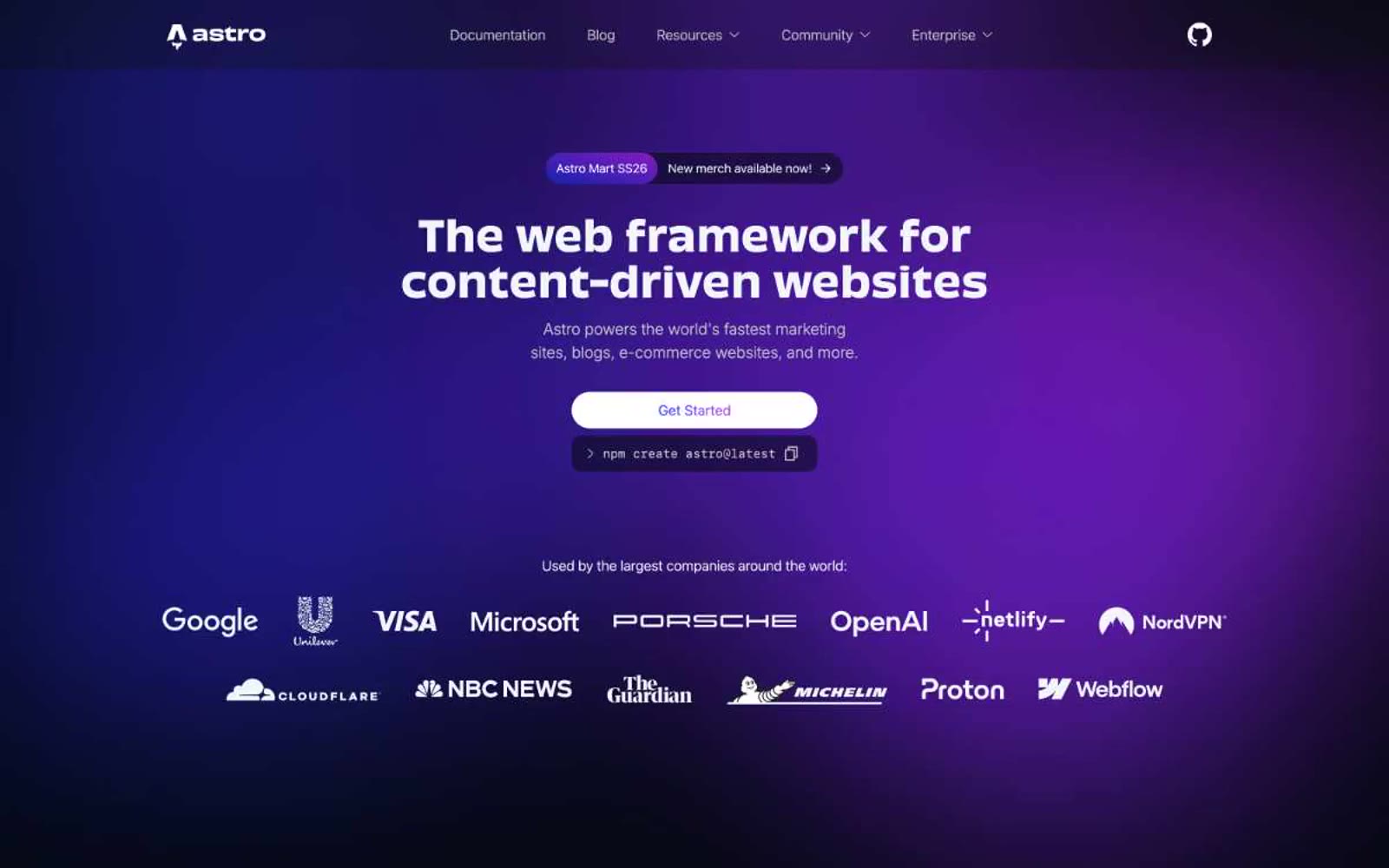
Astro
Astro — Style Reference
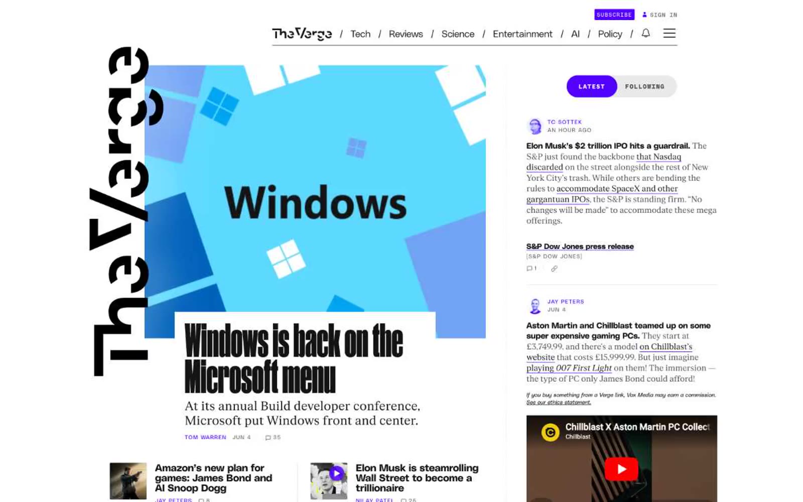
The Verge
# The Verge — Style Reference
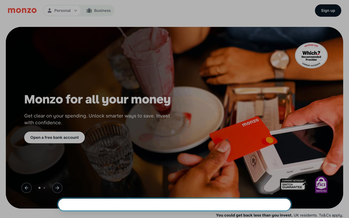
Monzo
Monzo — Style Reference
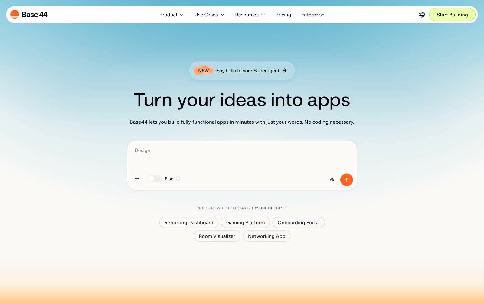
Base44
# Base44 — Style Reference
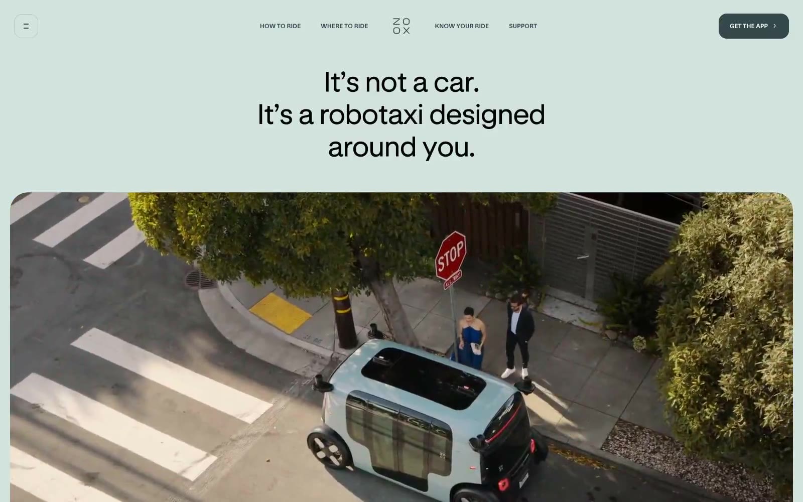
Zoox
Zoox — Style Reference
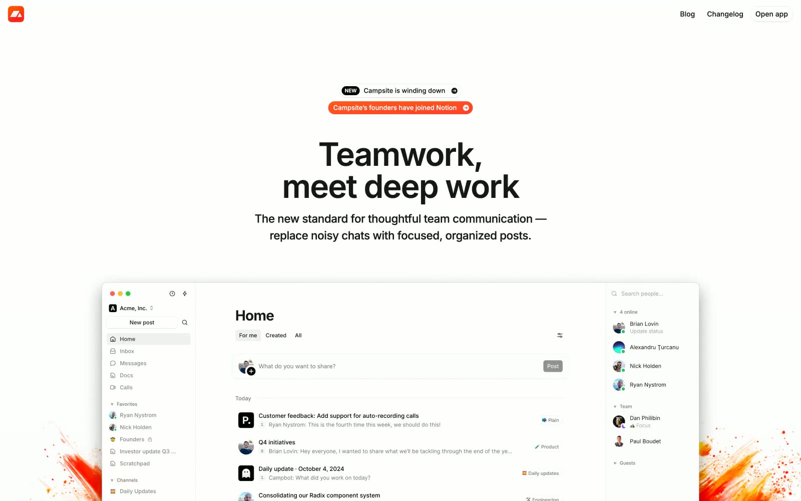
Campsite
# Campsite — Style Reference
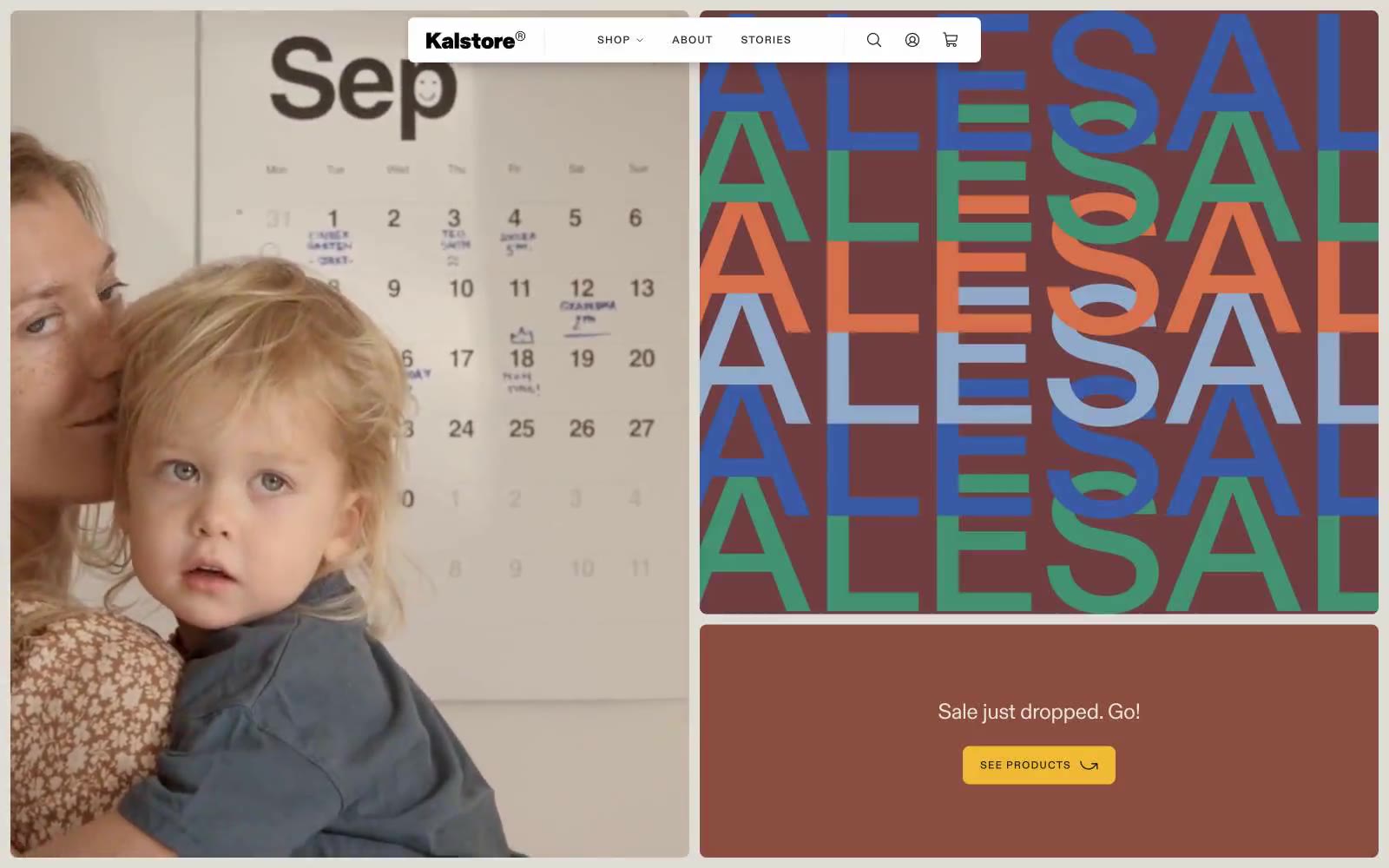
Kalstore®
# Kalstore® — Style Reference

Scale
Scale — Style Reference
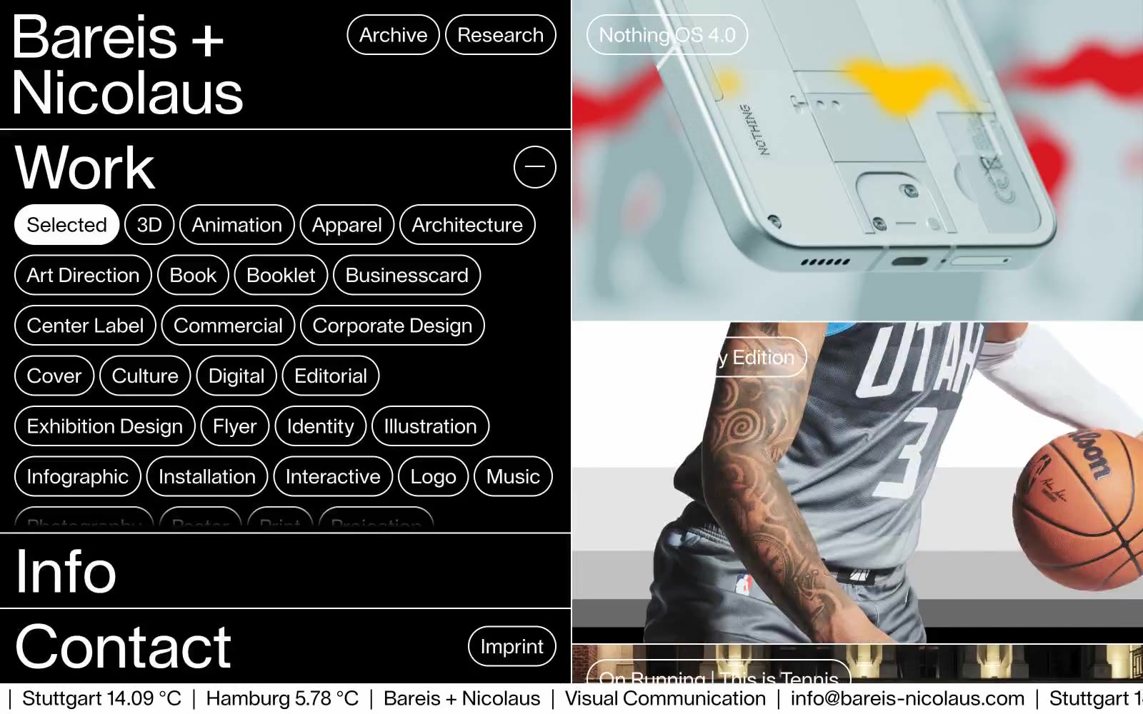
Bareis + Nicolaus
Bareis + Nicolaus — Style Reference
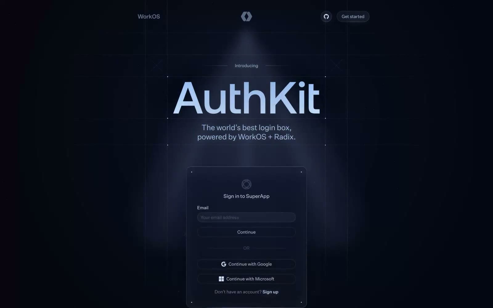
Authkit
# Authkit — Style Reference
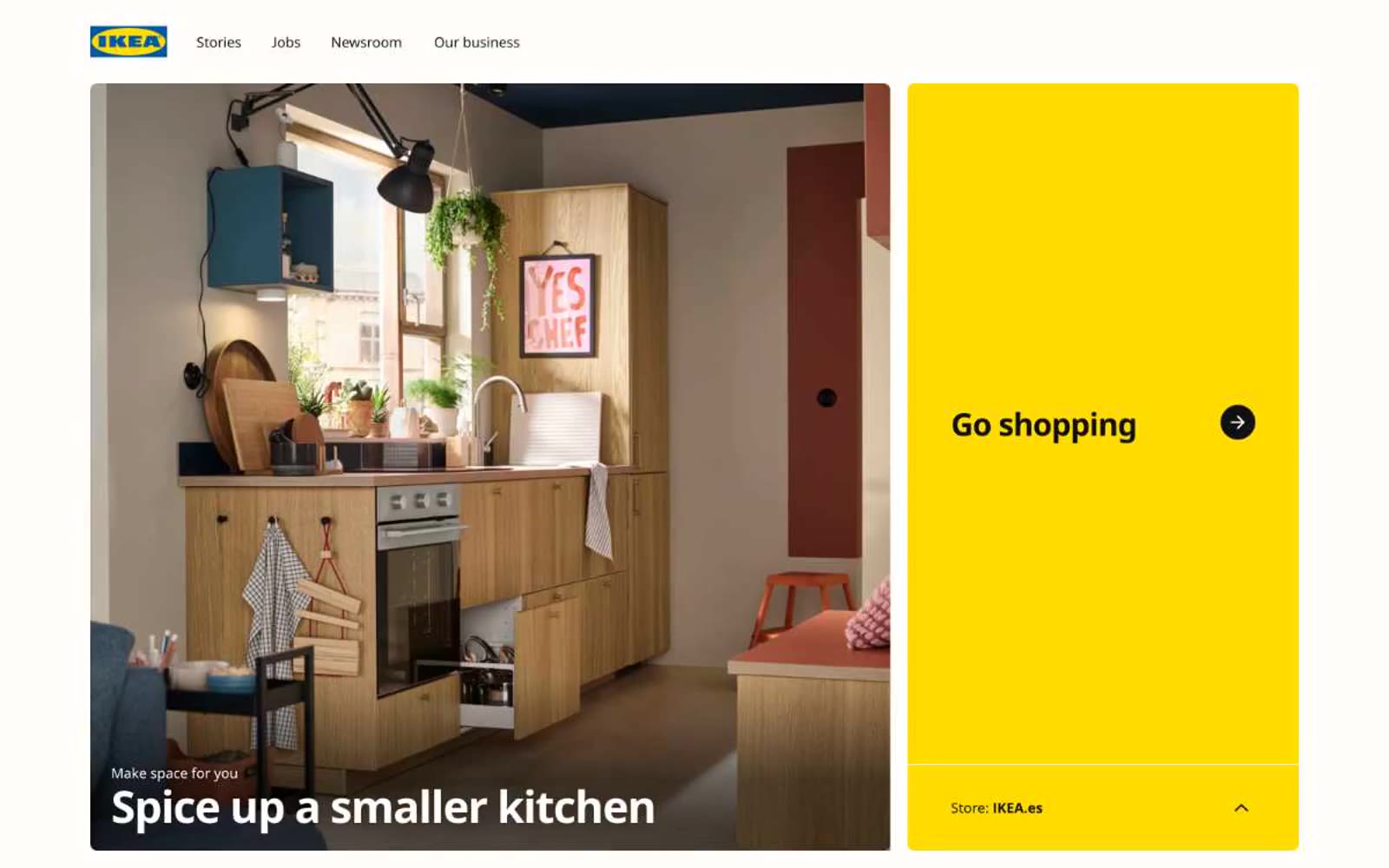
IKEA
IKEA — Style Reference
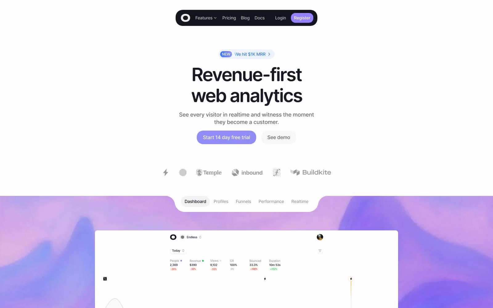
Visitors
# Visitors — Style Reference **Visitors** — Style Reference
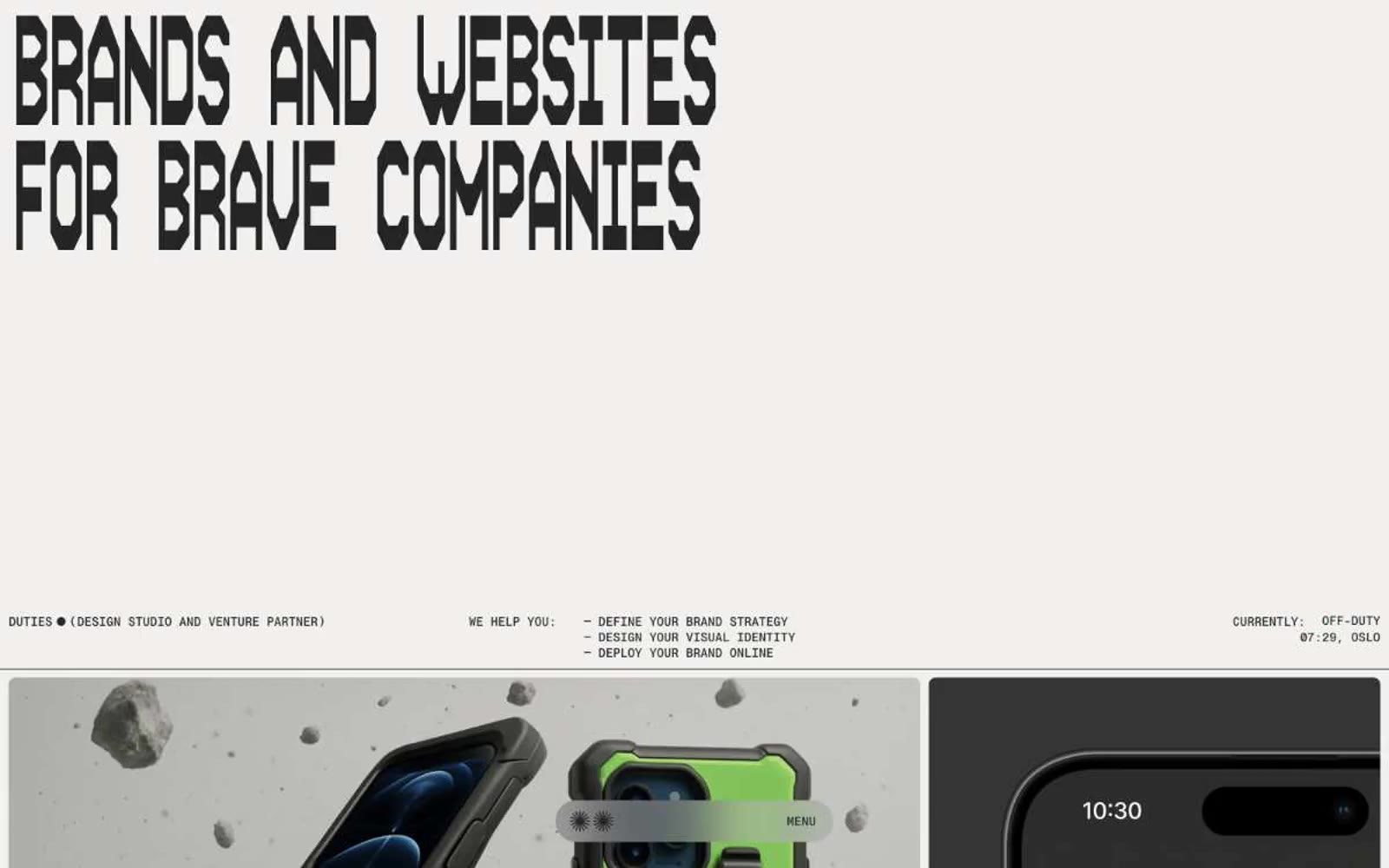
Duties.xyz
# Duties.xyz — Style Reference **Duties.xyz** — Style Reference
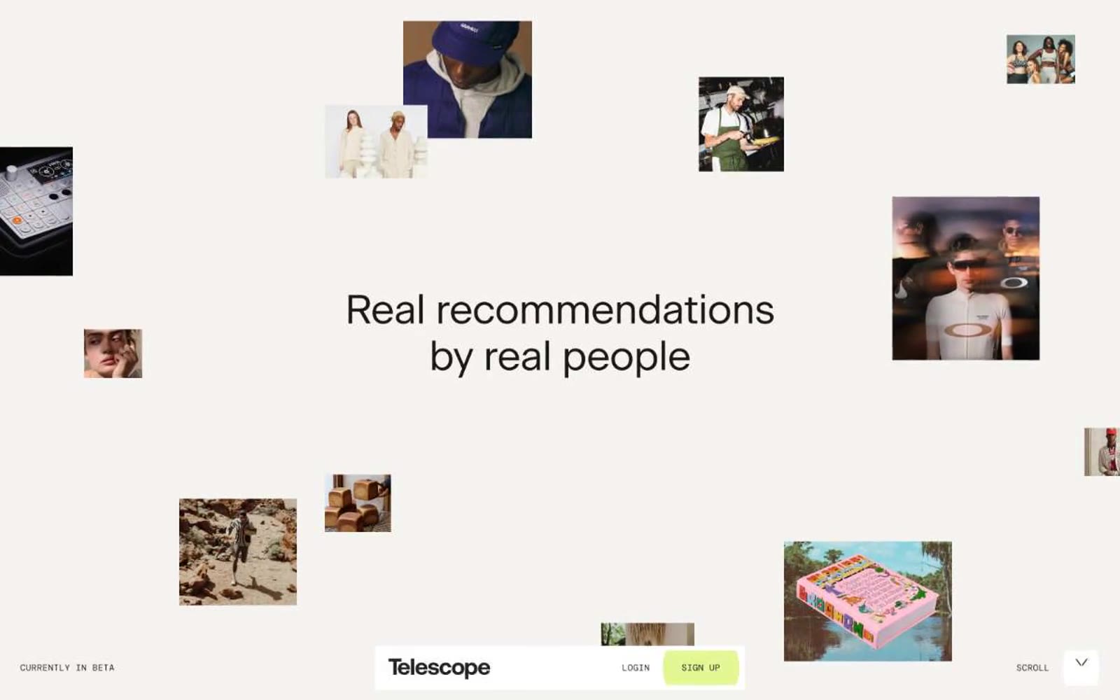
Telescope
# Kính thiên văn — Tham chiếu phong cách
Surface
Surface — Style Reference
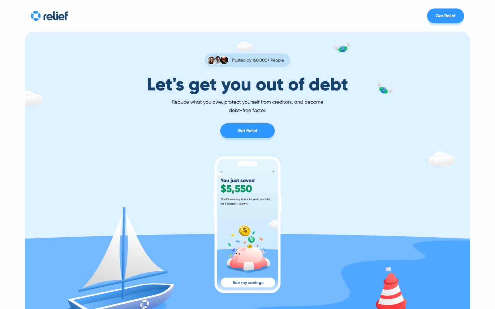
Relief
Relief — Style Reference
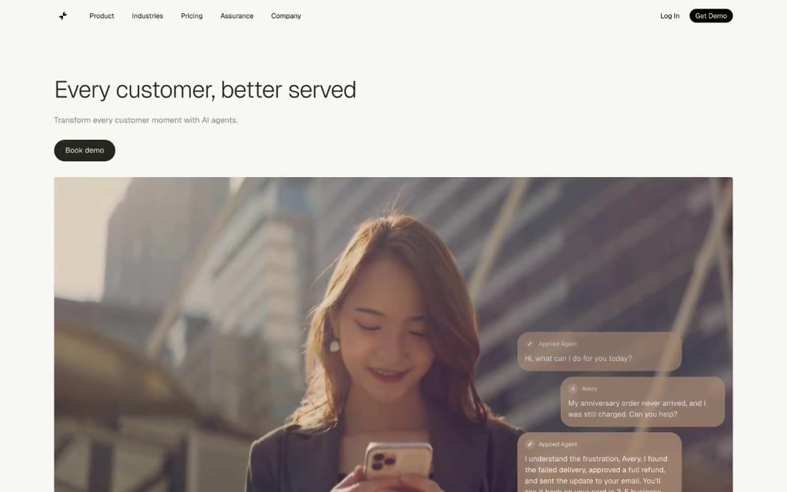
Applied Labs
# Applied Labs — Style Reference
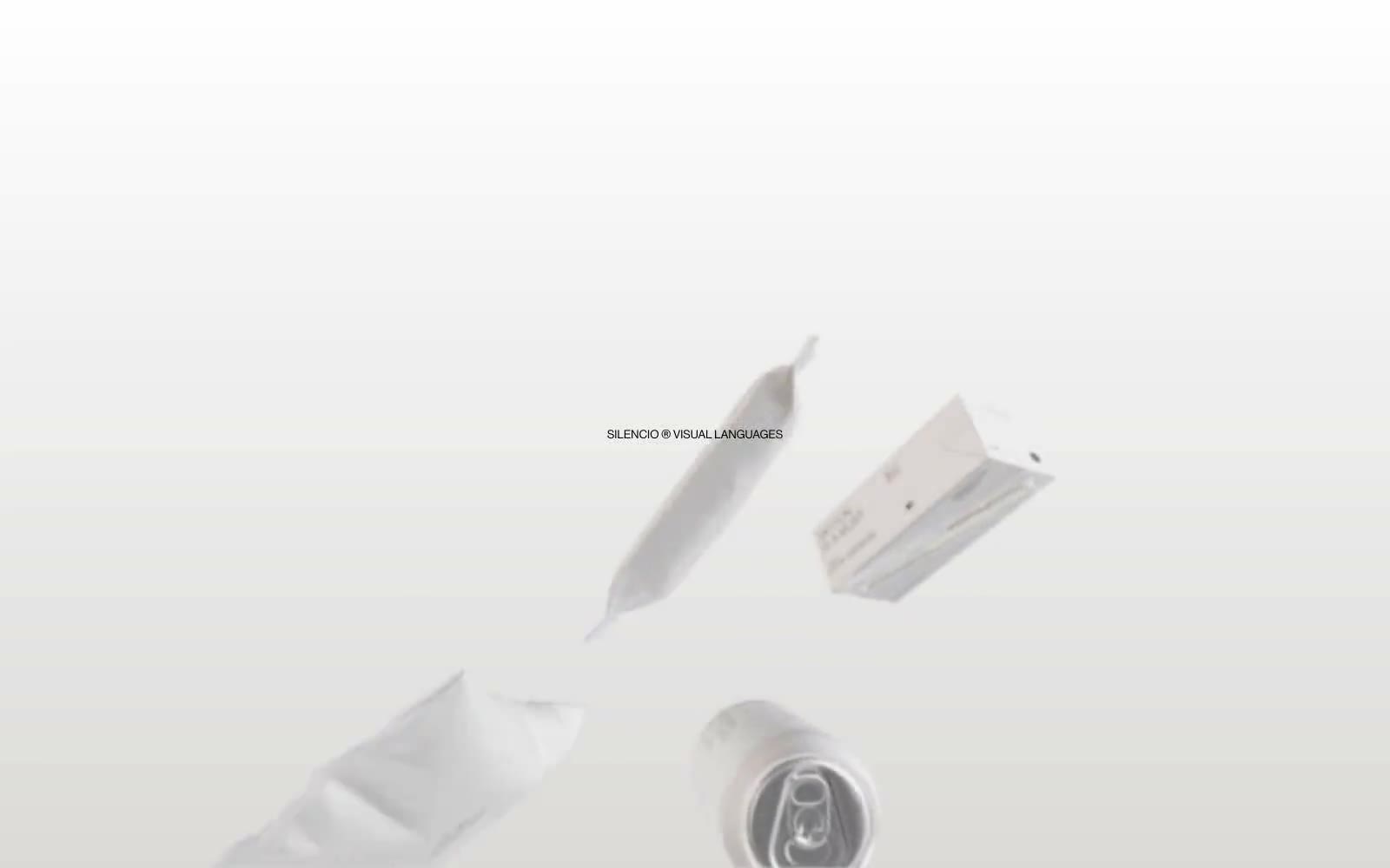
Silencio
# Silencio — Style Reference