AI Prompt Studio - Thư viện Prompt thông minh
Khám phá và sử dụng các prompt AI chuyên nghiệp để tối ưu hóa công việc của bạn.
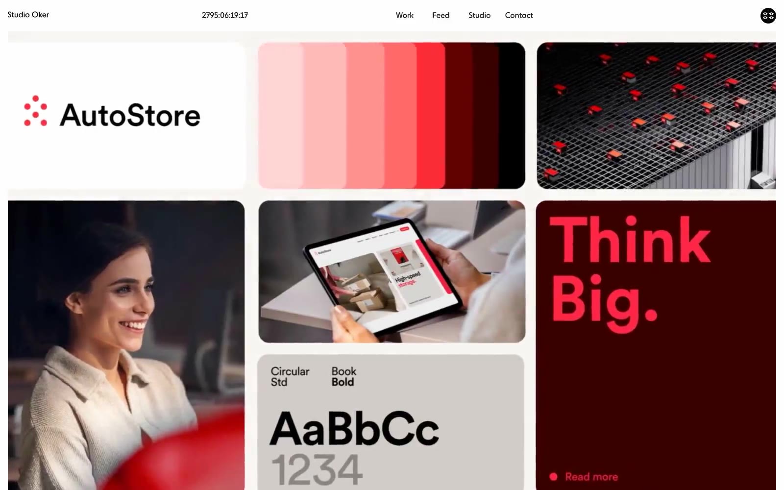
Studio Oker
# Studio Oker — Style Reference

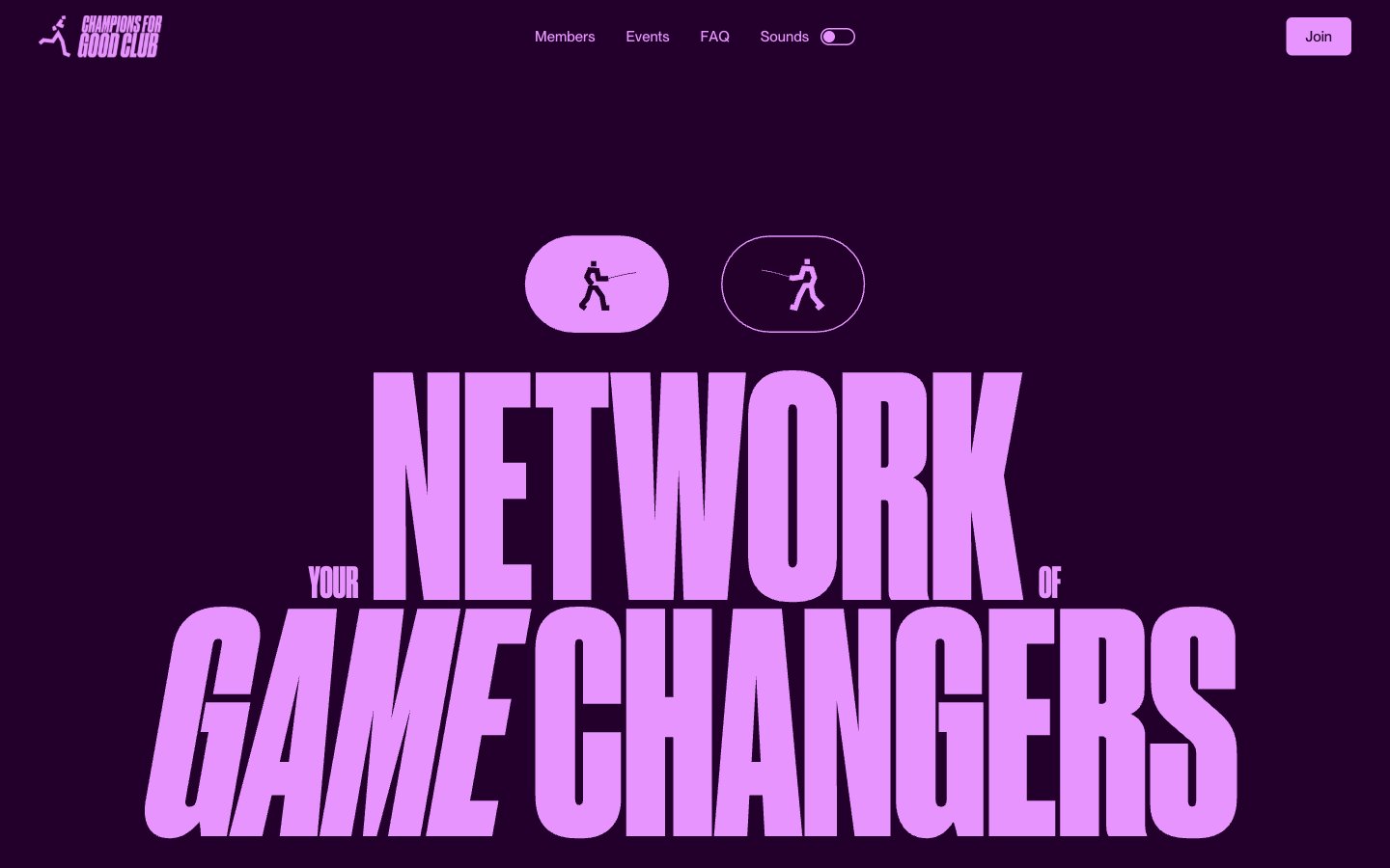
Champions4good
# Champions4good — Style Reference
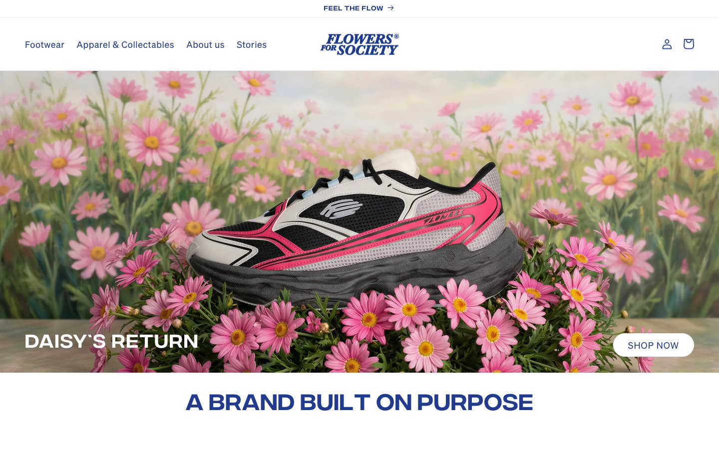
Flowers For Society
# Flowers For Society — Style Reference
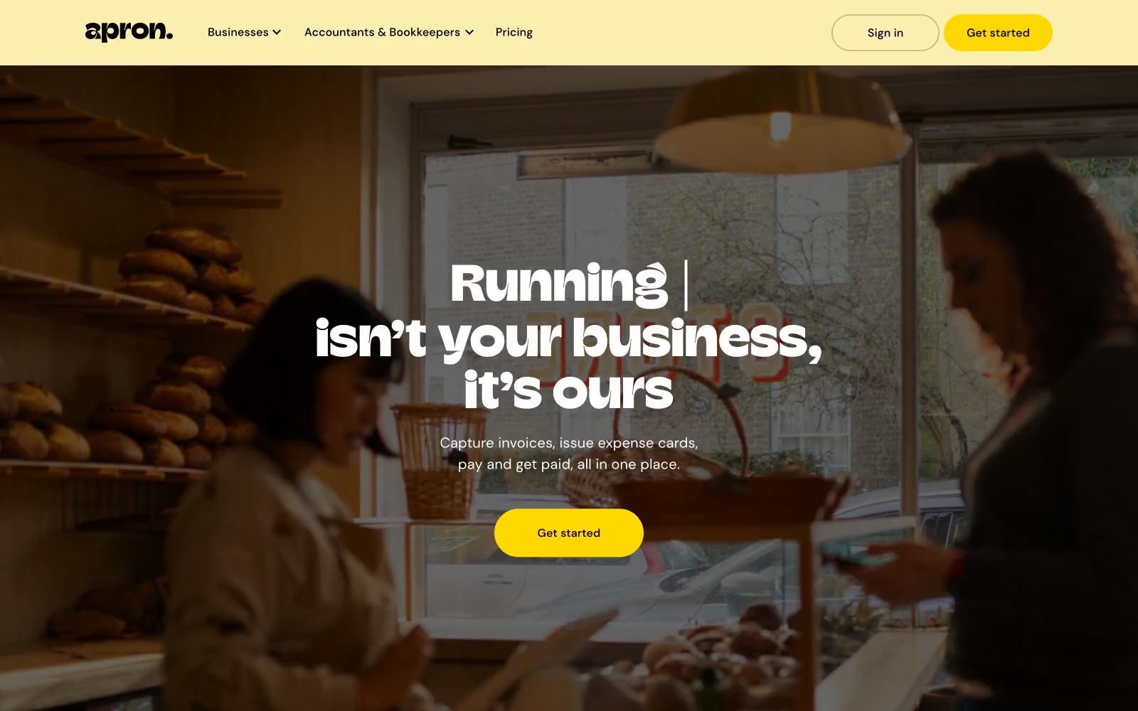
Automate Supplier Payments
# Tự động hóa Thanh toán Nhà cung cấp — Style Reference
Coinbase
Coinbase Spain — Style Reference

until
until — Style Reference
Strut
Strut — Style Reference

WRITER
WRITER — Style Reference
Jonas Pelzer
# Jonas Pelzer — Style Reference
ToDesktop
# ToDesktop — Style Reference
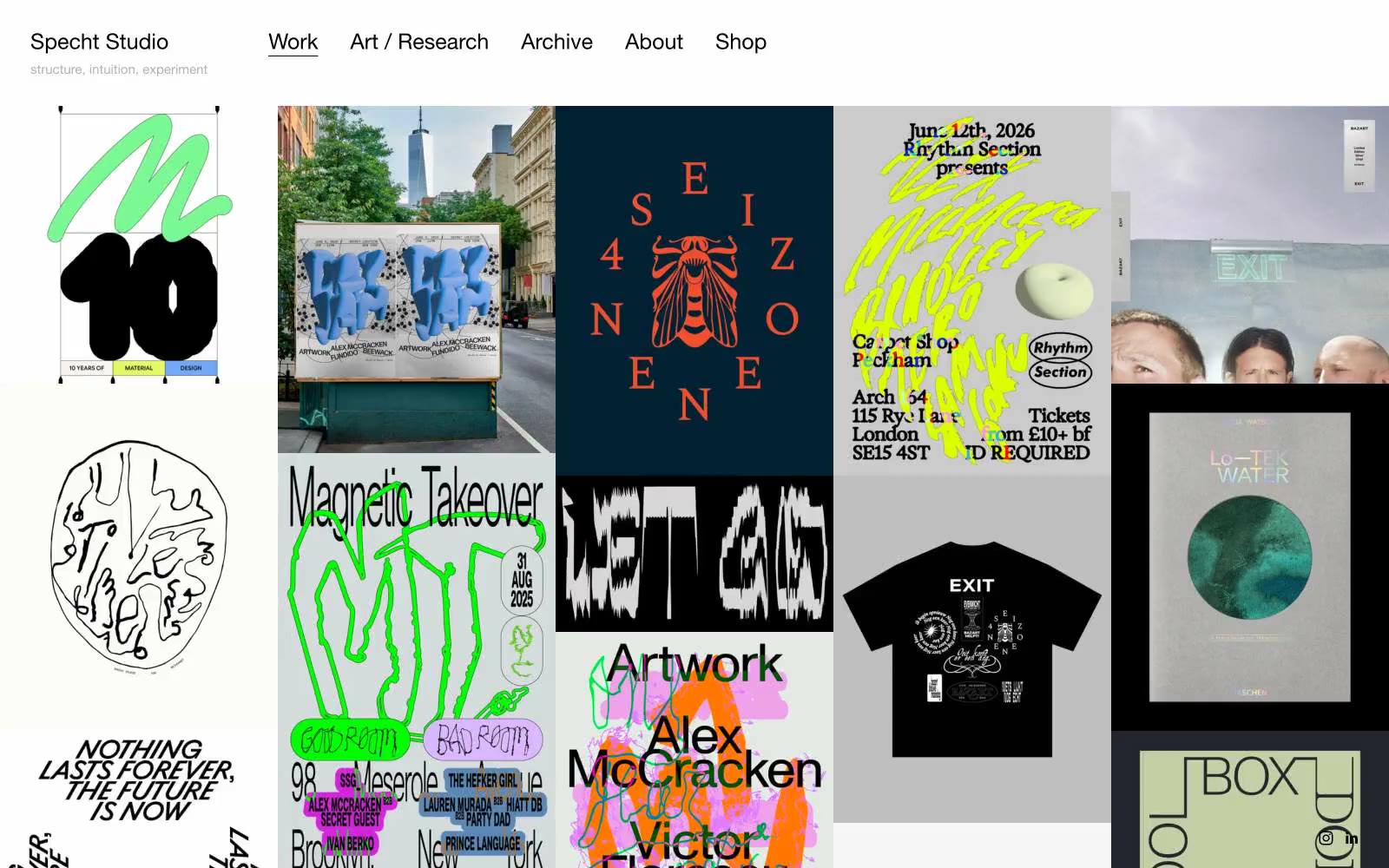
Specht Studio
Specht Studio — Style Reference
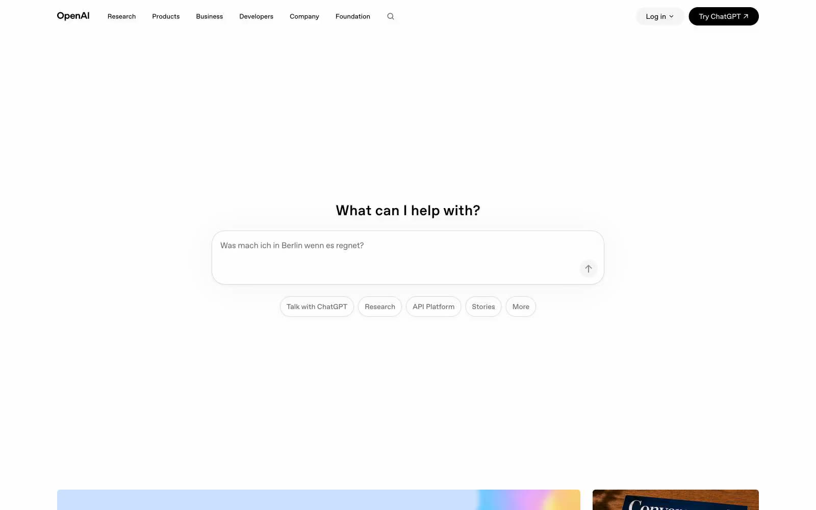
OpenAI
# OpenAI — Style Reference
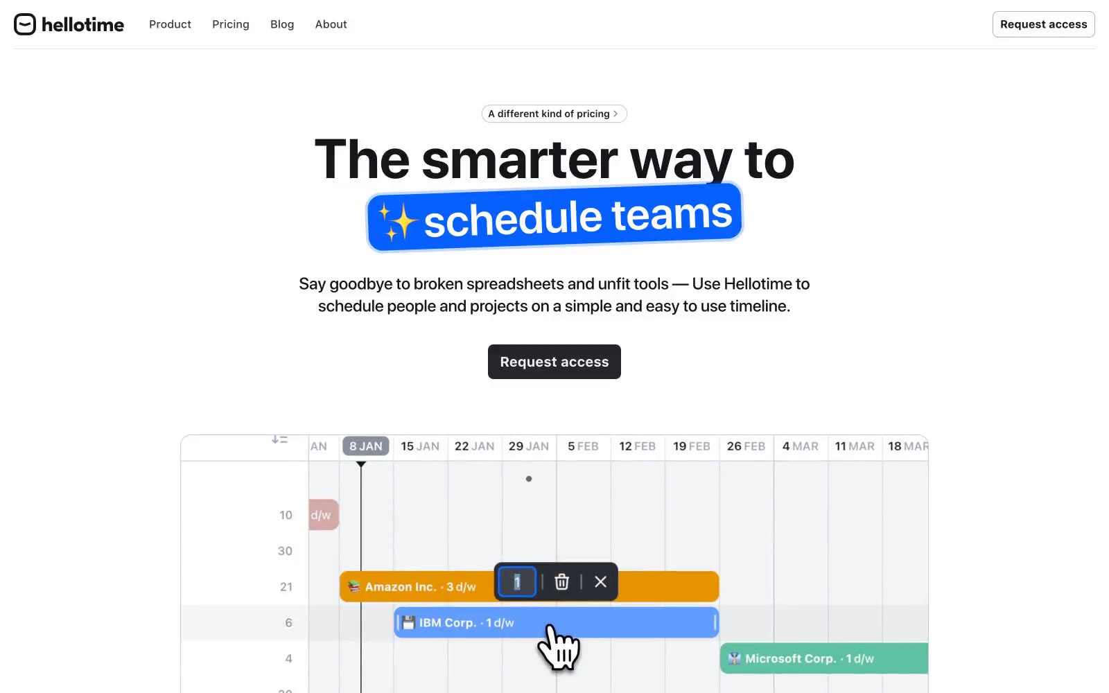
Hellotime
# Hellotime — Style Reference
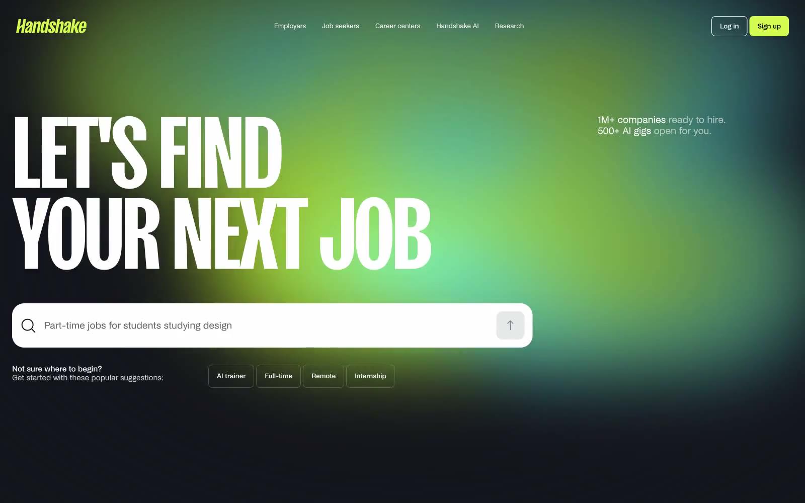
Handshake
Handshake — Style Reference
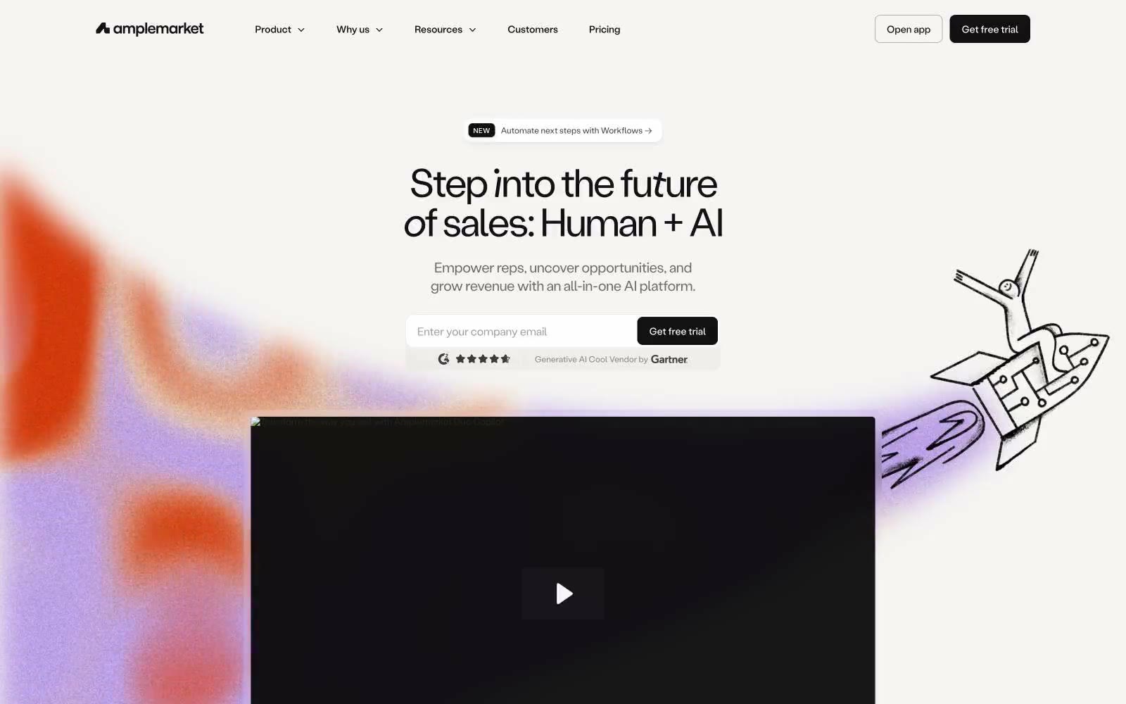
Amplemarket
# Amplemarket — Style Reference
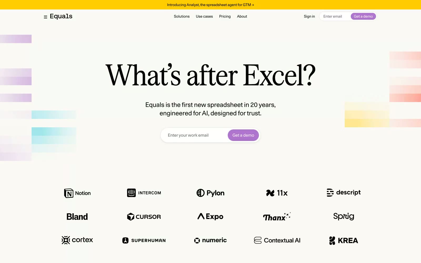
Equals
Equals — Style Reference
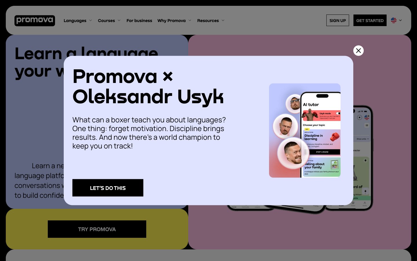
Promova
Promova — Style Reference
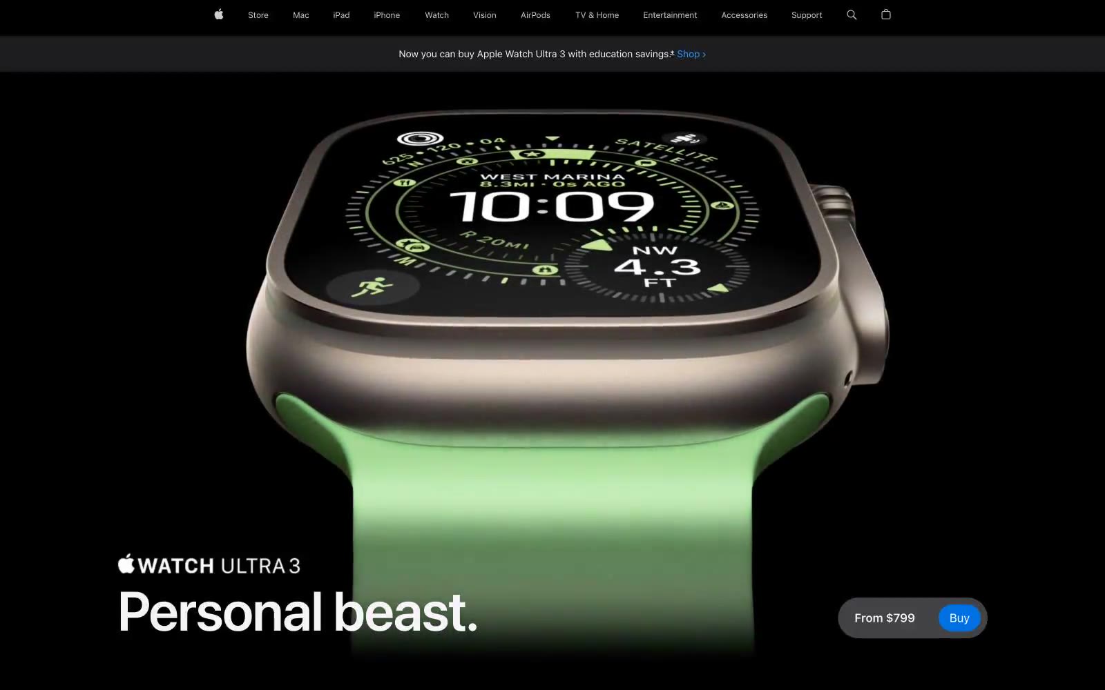
Apple (España)
Apple (España) — Style Reference

Sprout Social
# Sprout Social — Style Reference
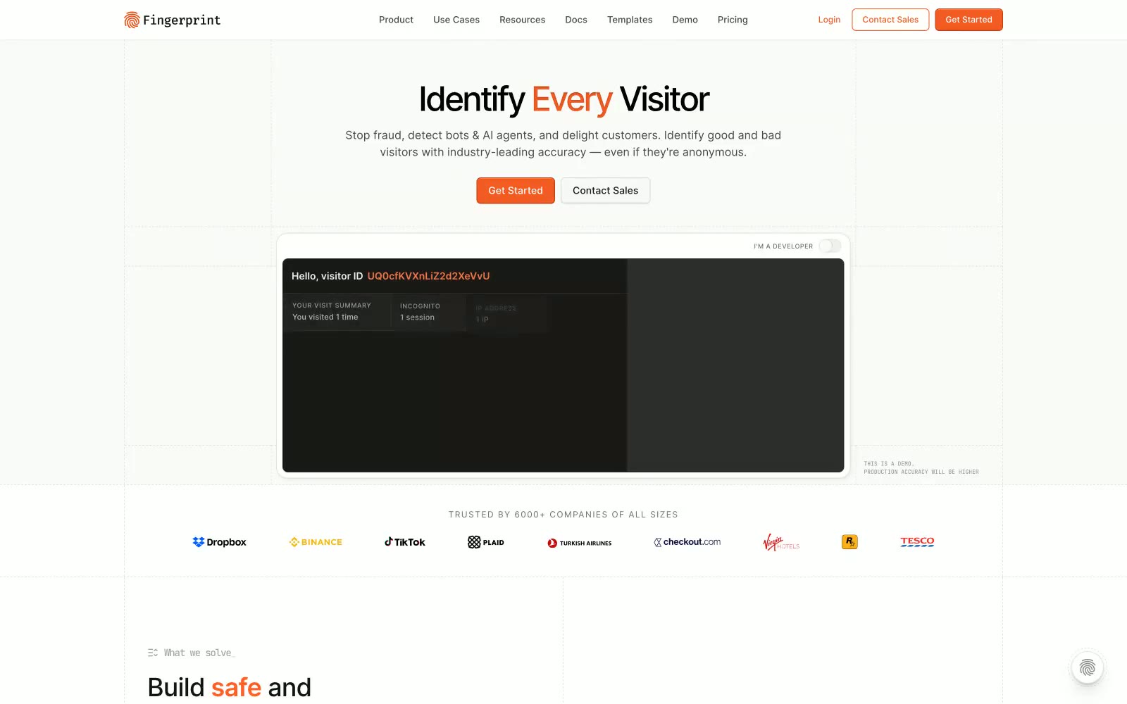
Fingerprint
Fingerprint — Style Reference
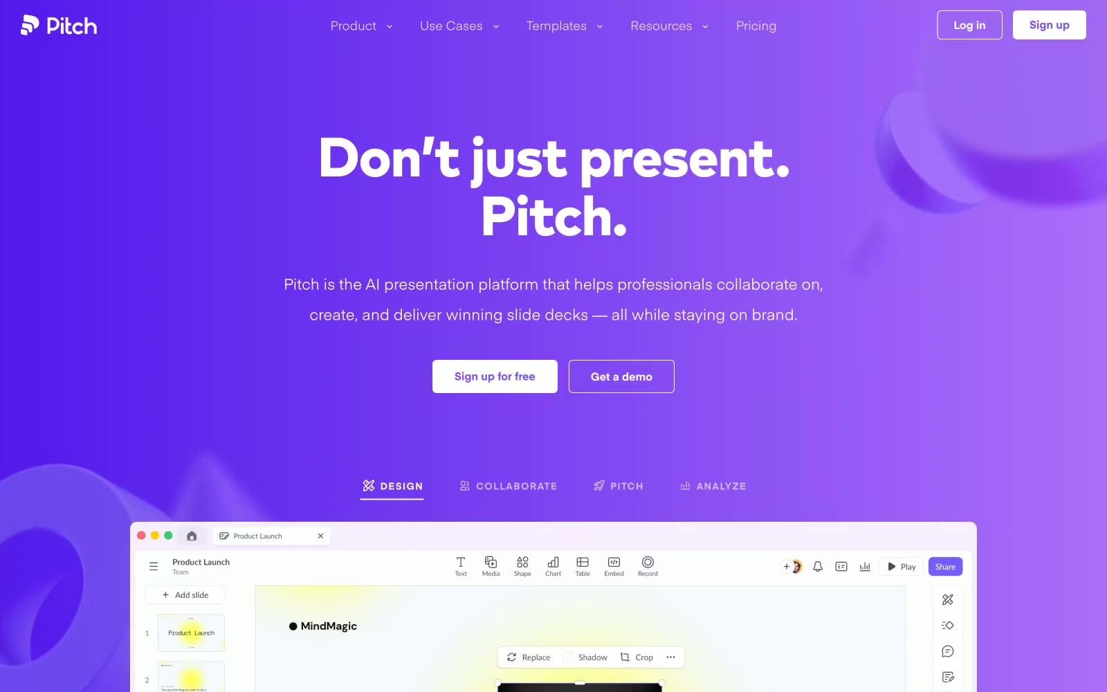
Pitch
Pitch — Style Reference

1Password
# Passwords — Style Reference
Metalab
Metalab — Style Reference
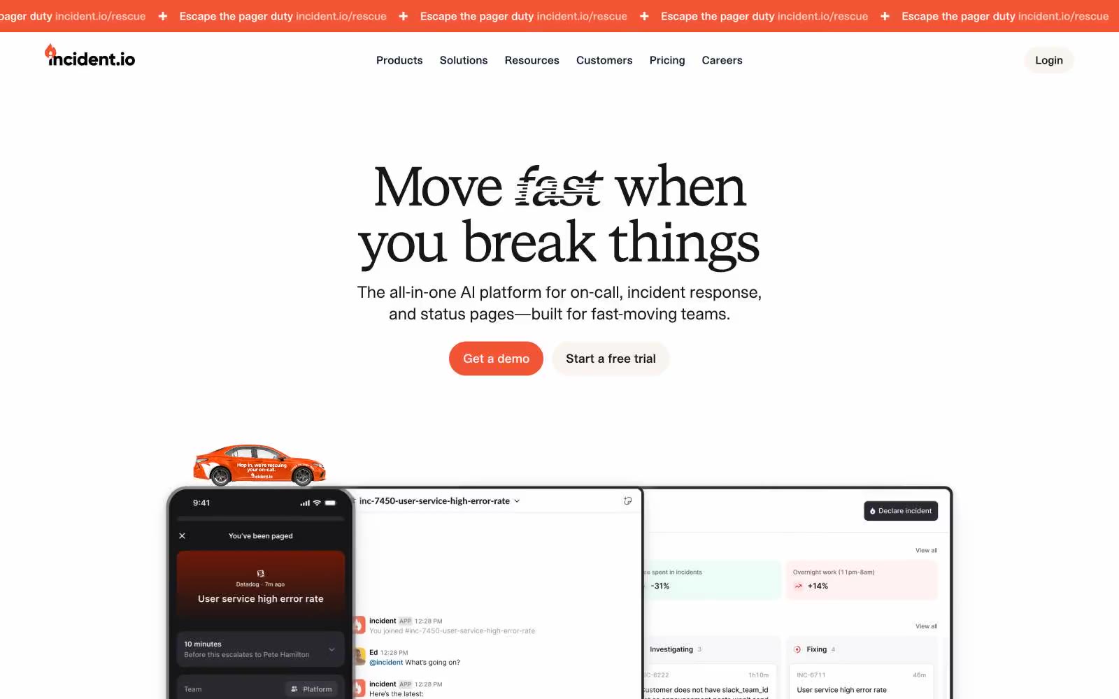
Incident
Incident — Style Reference