AI Prompt Studio - Thư viện Prompt thông minh
Khám phá và sử dụng các prompt AI chuyên nghiệp để tối ưu hóa công việc của bạn.
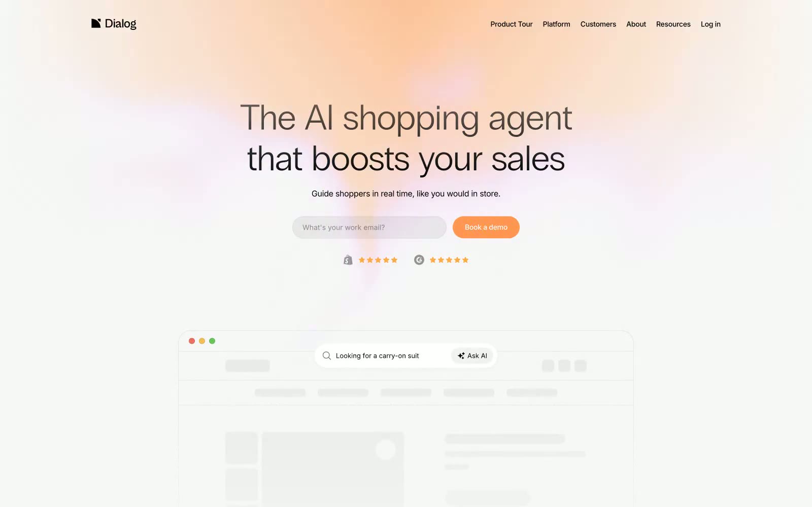
Dialog
Dialog — Style Reference

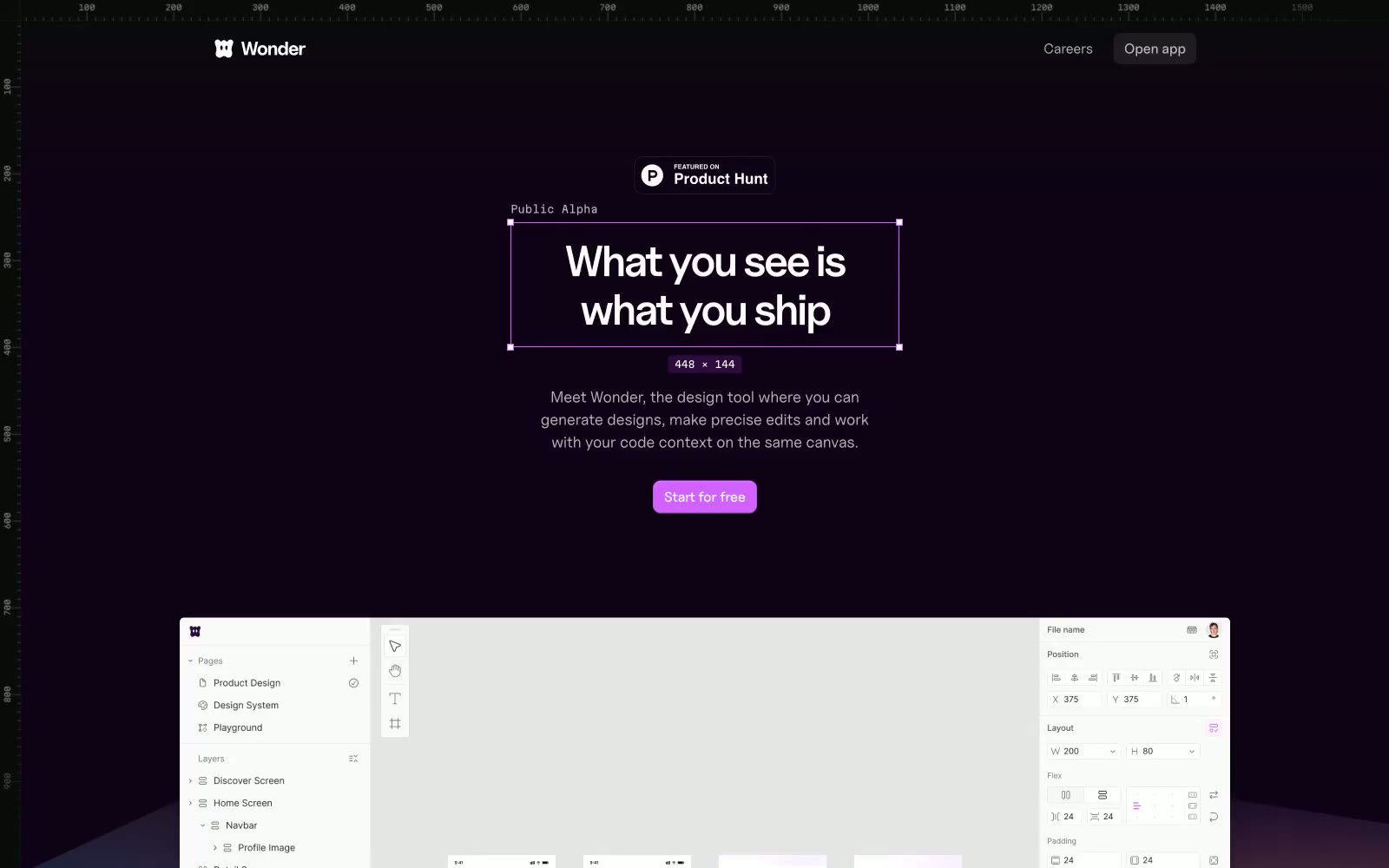
Wonder
Wonder — Style Reference
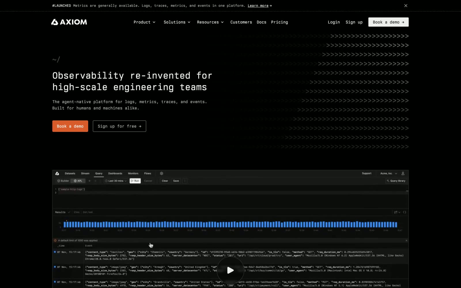
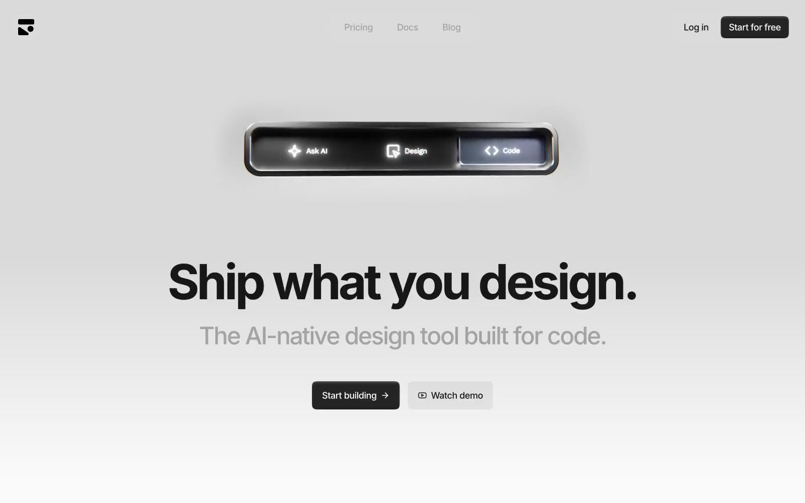
Axiom
# Axiom — Style Reference
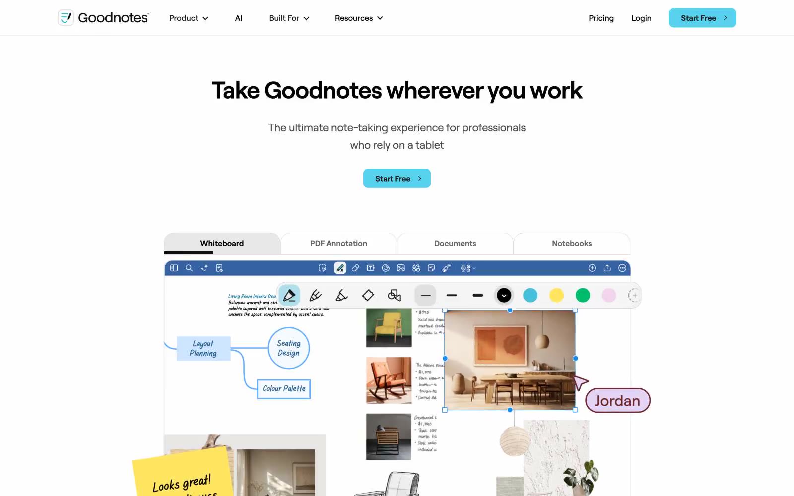
Goodnotes
# Goodnotes — Style Reference **Goodnotes** là ứng dụng ghi chú kỹ thuật số hàng đầu dành cho iPad, iPhone và Mac. Phong cách thiết kế của Goodnotes kết hợp giữa tính chân thực của ghi chú tay với độ chính xác của công cụ kỹ thuật số. Giao diện tối giản, tập trung vào nội dung, với bảng màu trung tính và typography rõ ràng, dễ đọc. Các yếu tố tương tác như bút, highlight và công cụ chỉnh sửa được thiết kế trực quan, mô phỏng trải nghiệm viết tay thực tế. Hiệu ứng chuyển động mượt mà và phản hồi haptic tinh

AngelList
AngelList — Style Reference
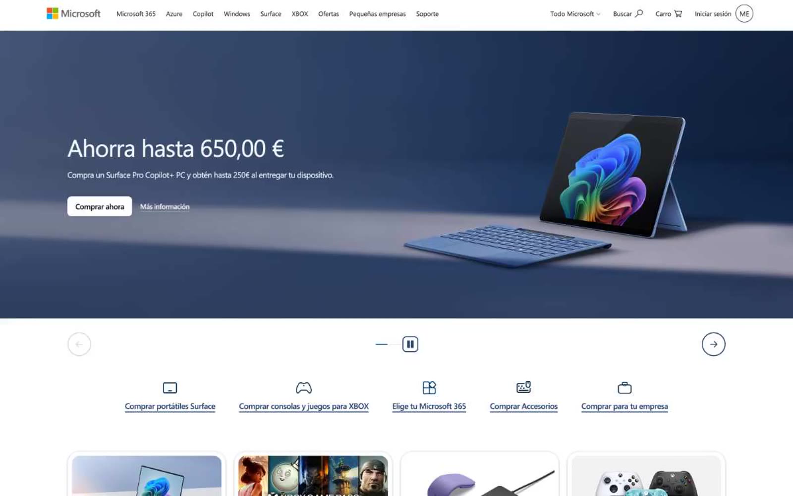
Microsoft
Microsoft — Style Reference
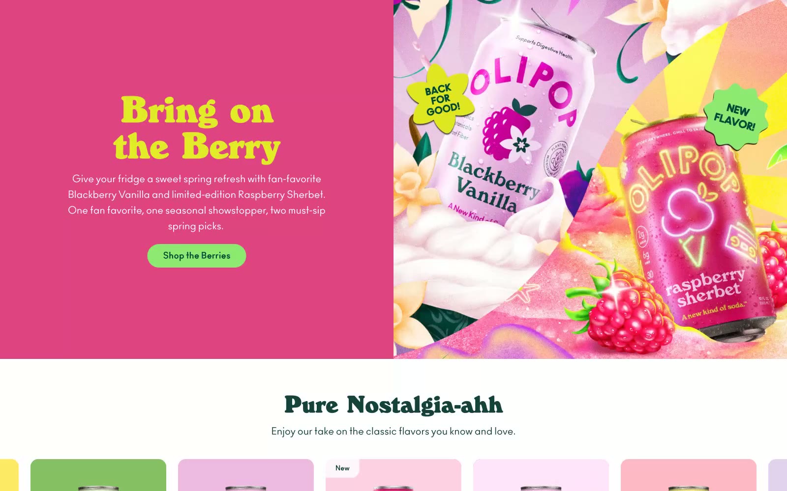
OLIPOP
# OLIPOP — Style Reference
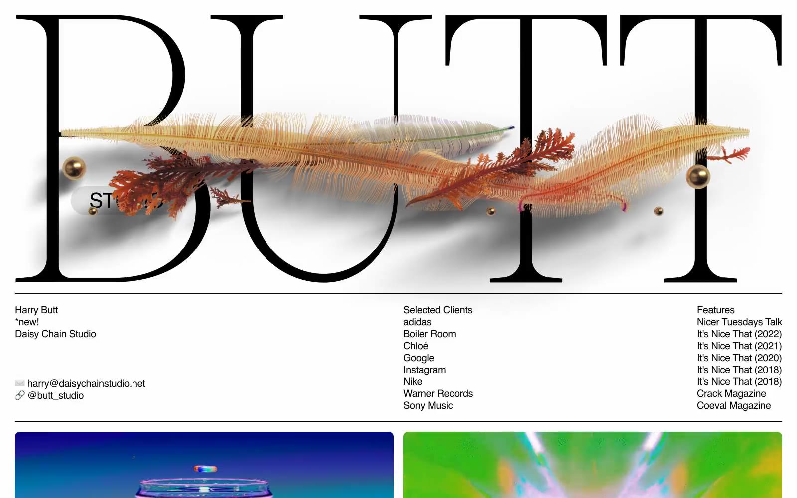
BUTT STUDIO
# BUTT STUDIO — Style Reference
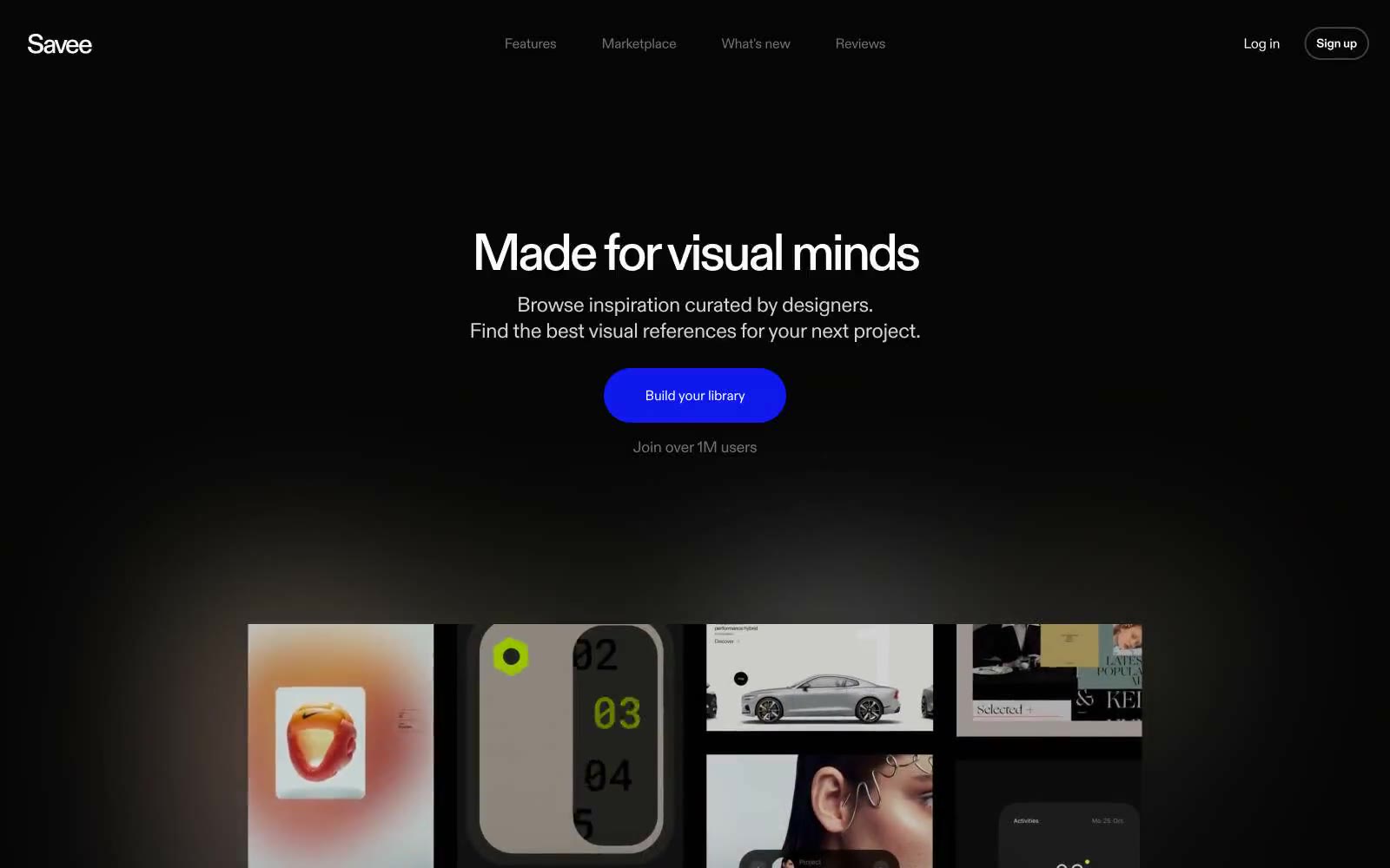
Savee
# Savee — Style Reference
Subframe
# Subframe — Style Reference
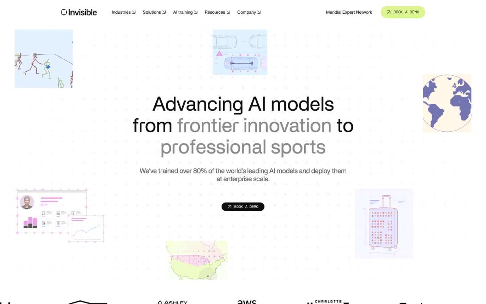
Invisibletech
# Invisibletech — Style Reference

Origin Financial
Origin Financial — Style Reference
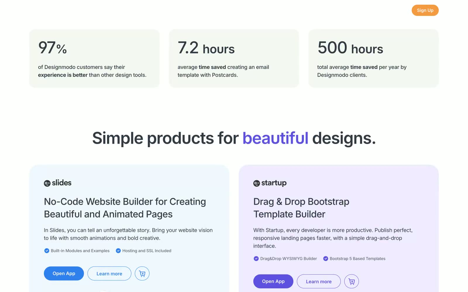
Designmodo
Designmodo — Style Reference
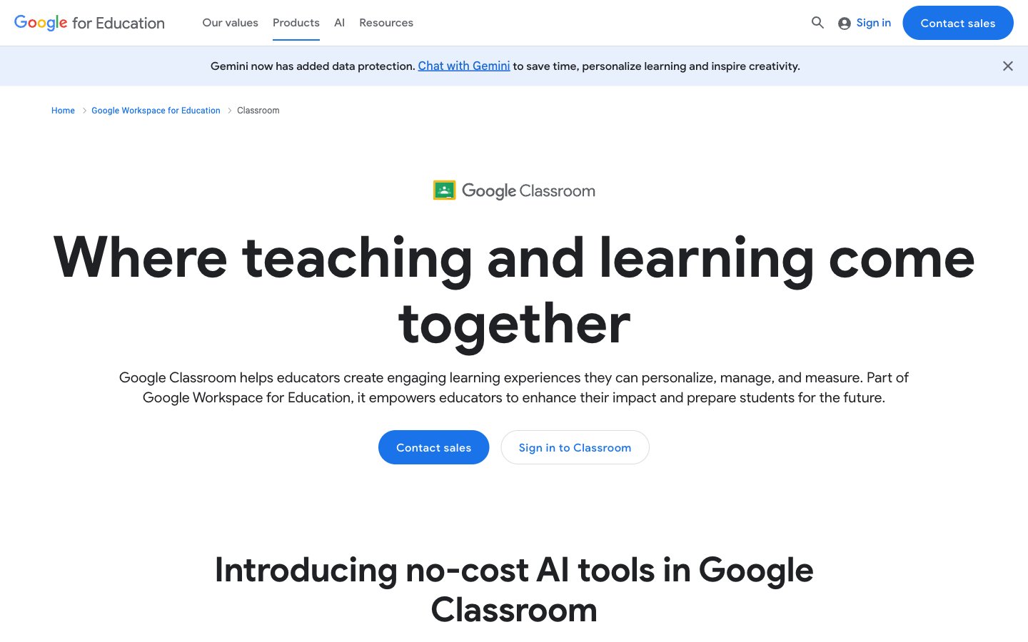
Google for Education
Google for Education — Style Reference

Codex.io
# Codex.io — Style Reference
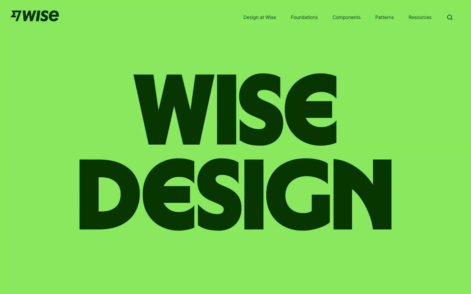
Wise Design
# Wise Design — Style Reference
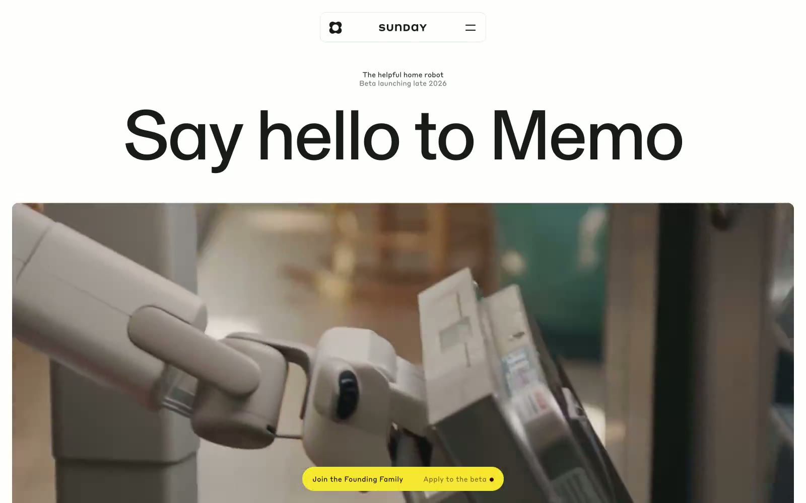
Sunday
Sunday — Style Reference
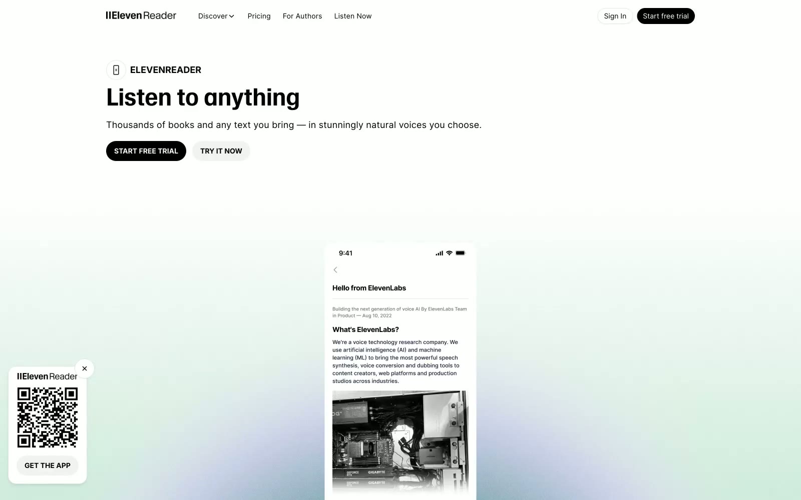
ElevenReader
ElevenReader — Style Reference
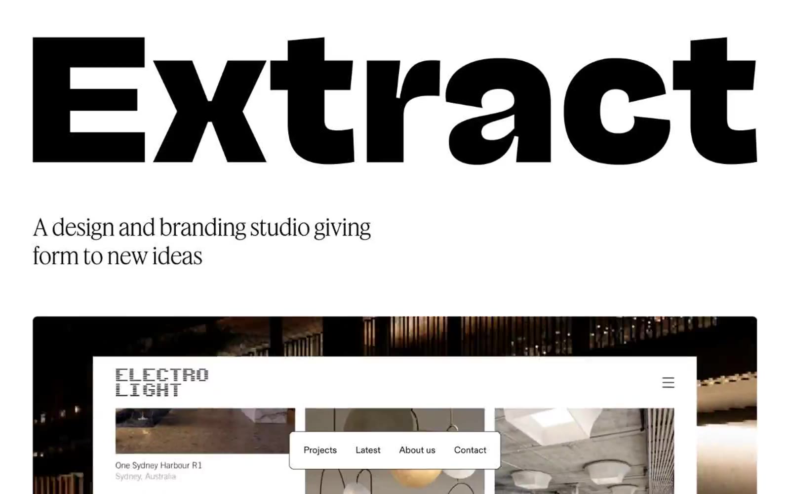
Extract
**Extract — Style Reference**
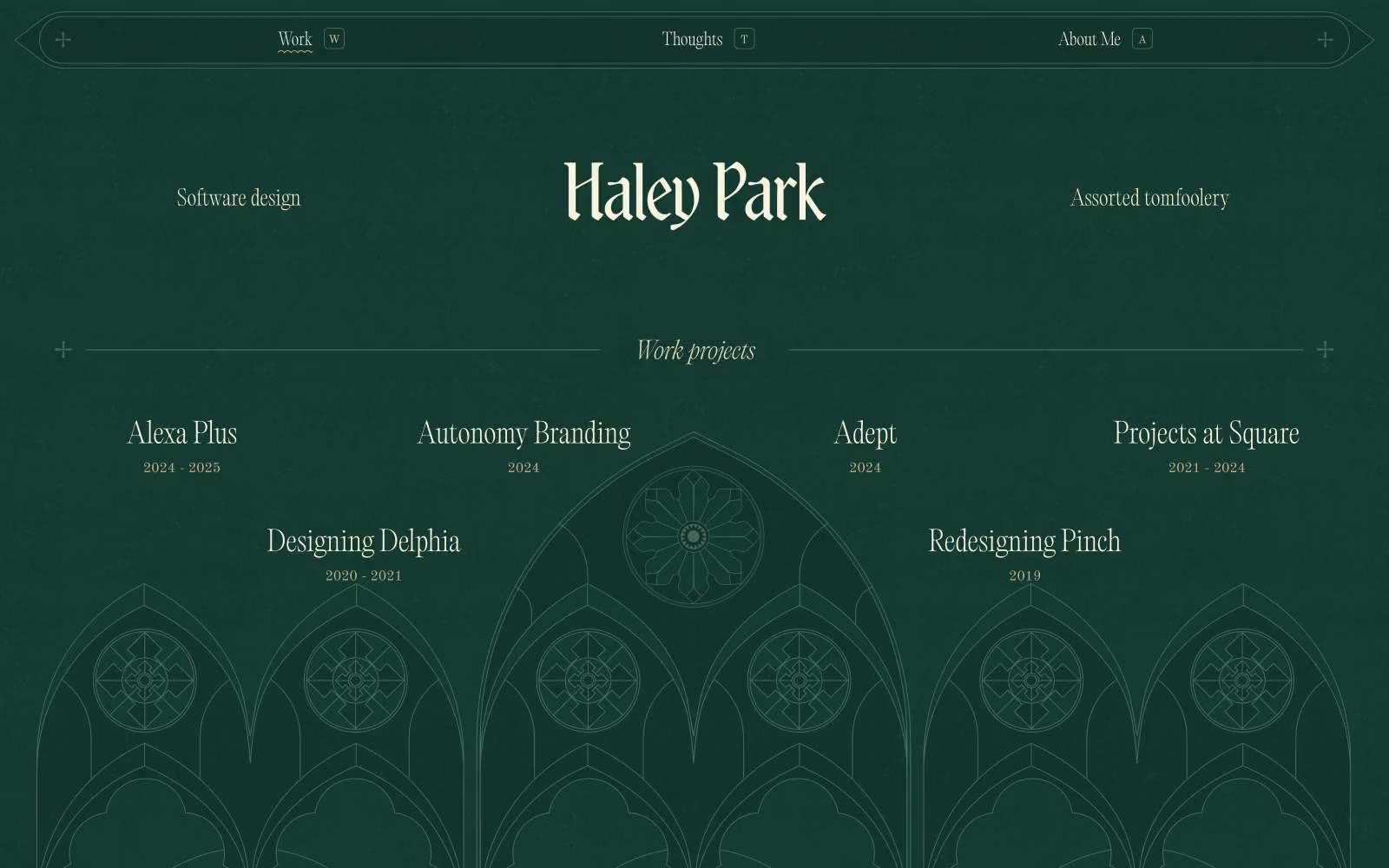
Haley Park
# Haley Park — Style Reference
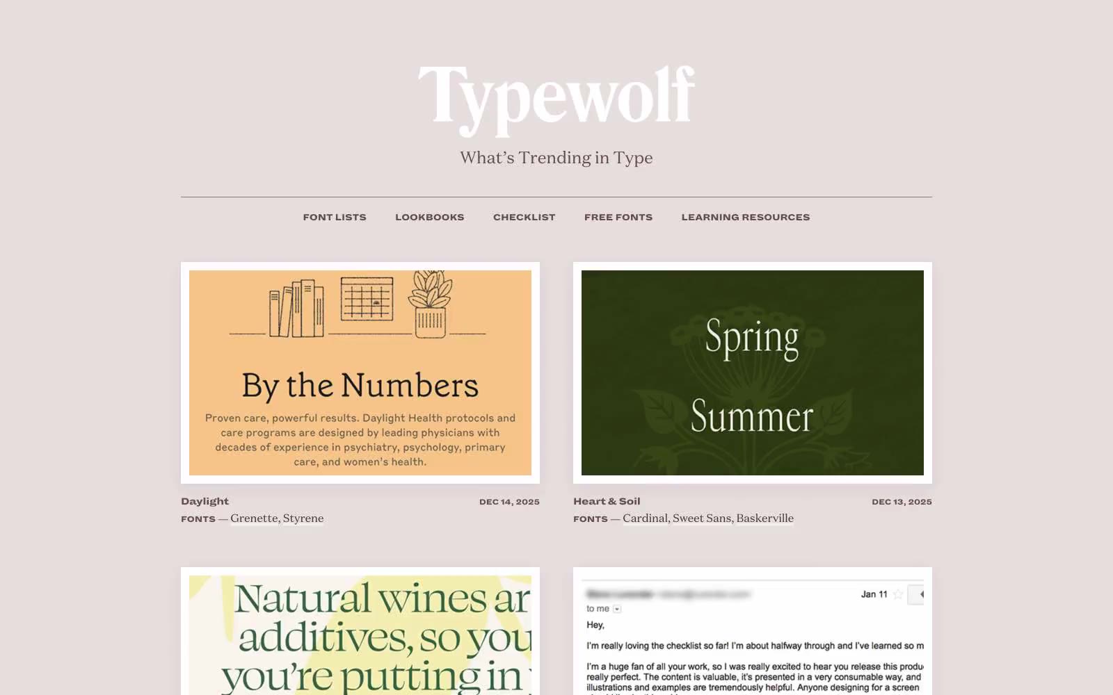
Typewolf
# Typewolf — Style Reference
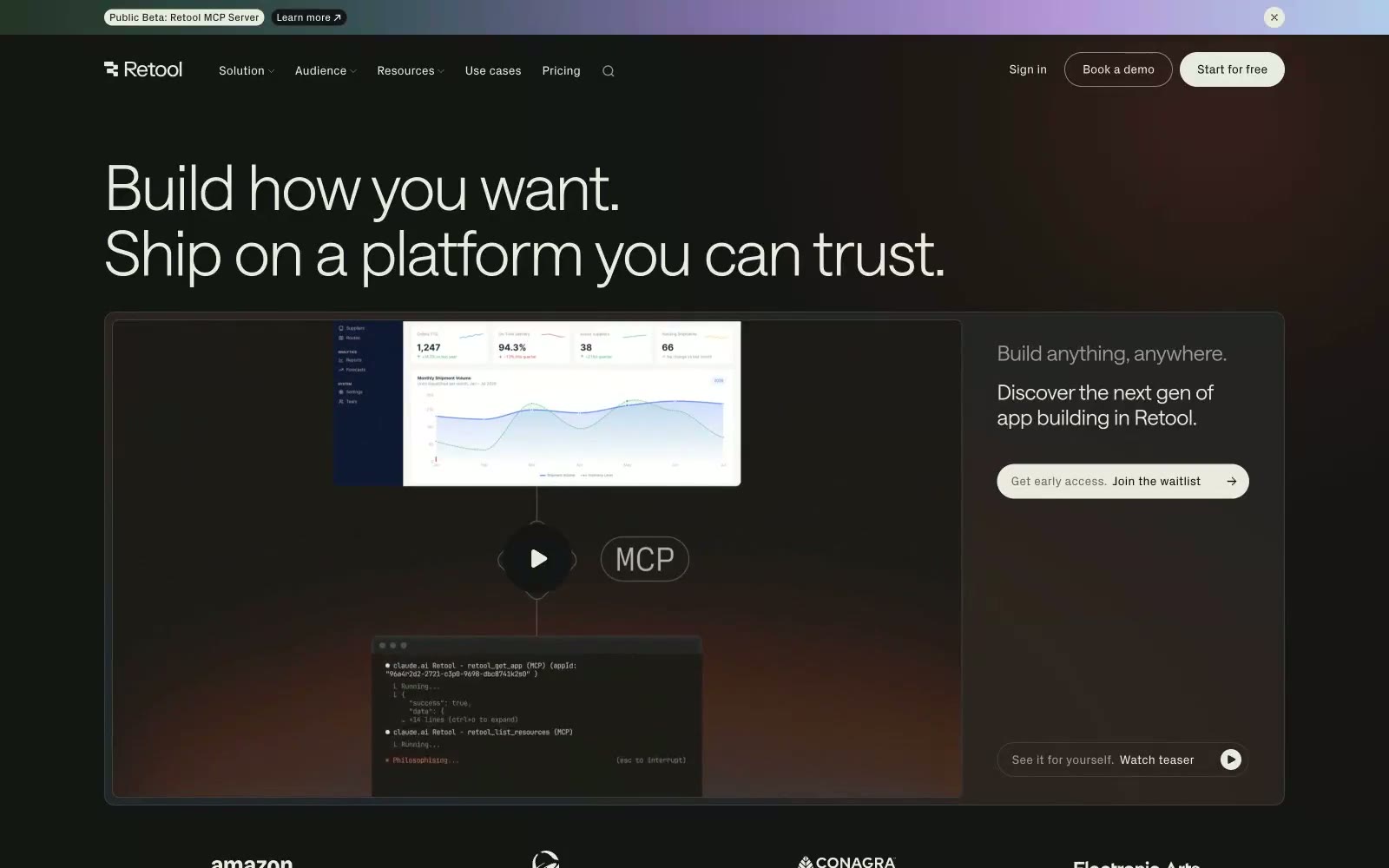
Retool
# Retool — Style Reference
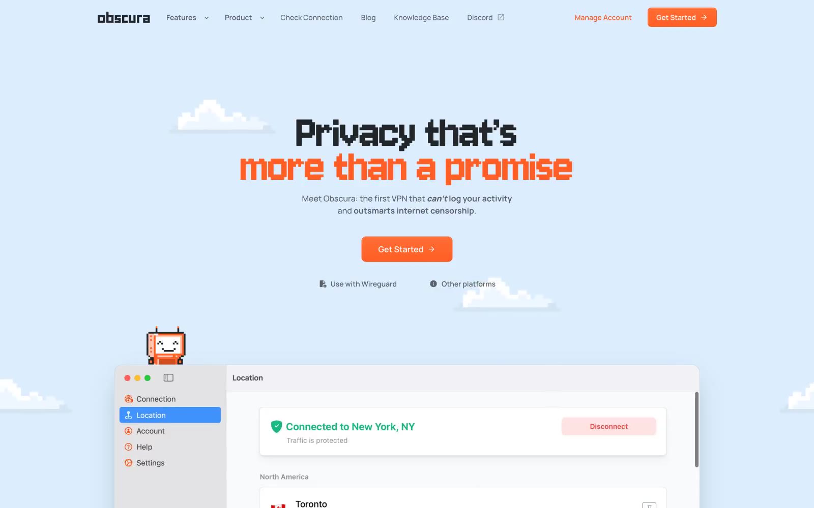
Obscura
# Obscura — Style Reference
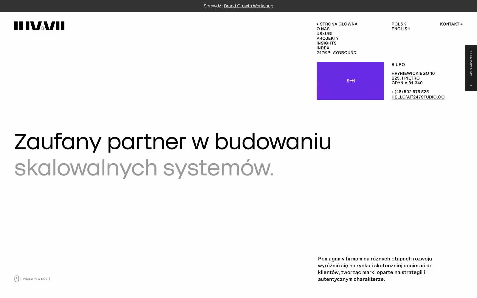
Agencja brandingowa
Agencja brandingowa — Style Reference