AI Prompt Studio - Thư viện Prompt thông minh
Khám phá và sử dụng các prompt AI chuyên nghiệp để tối ưu hóa công việc của bạn.
One-click Sử dụng
Websites
Văn bản Markdown
design-md
website-prompt
landing-page-prompt
Contrast
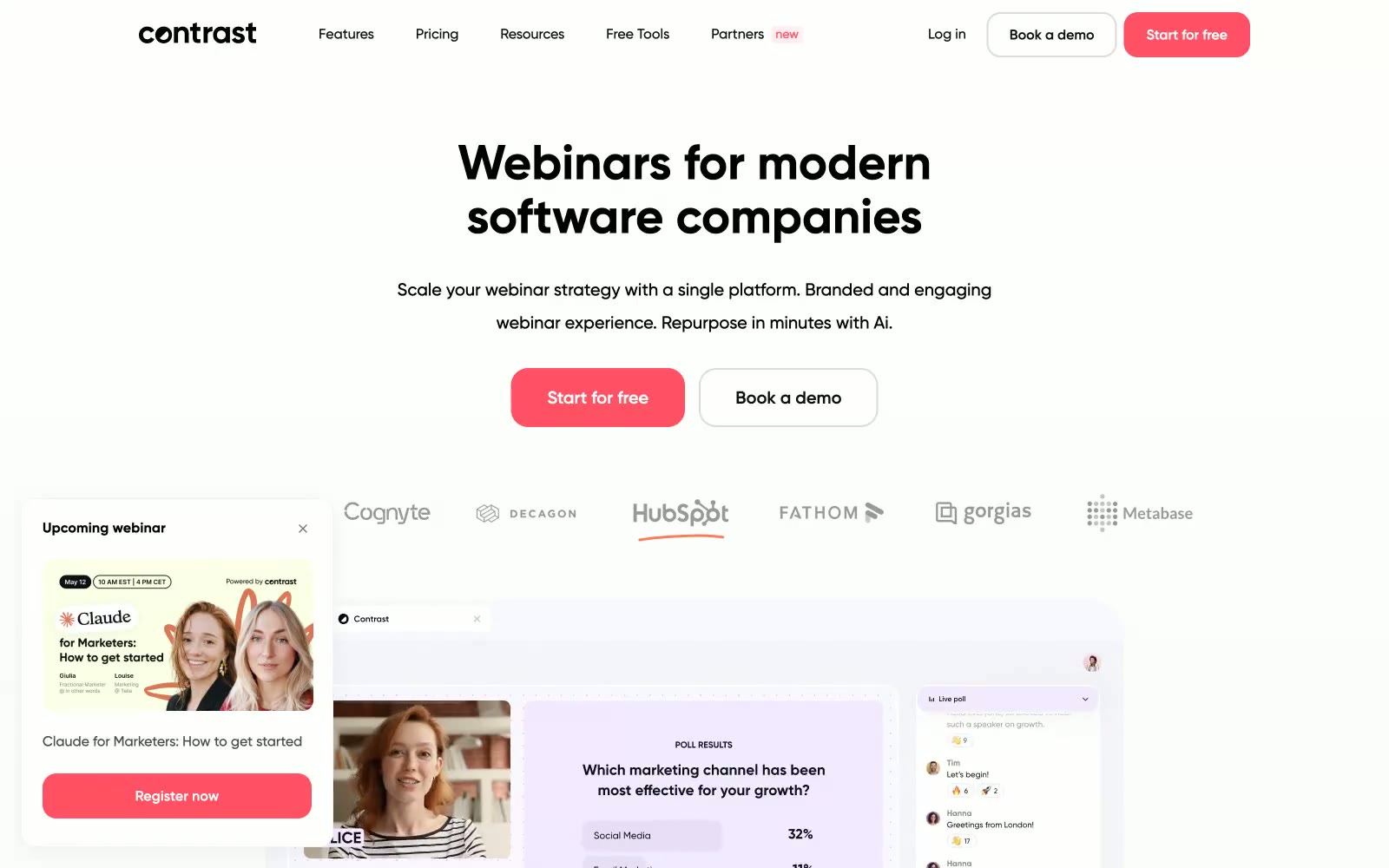
Contrast — Style Reference
# Contrast — Style Reference
> tín hiệu neon coral trên nền trắng tĩnh lặng
**Theme:** light
Contrast vận hành trên nền trắng tĩnh lặng, bị ngắt quãng bởi một tín hiệu coral rực rỡ duy nhất. Toàn bộ hệ thống thị giác được kiềm chế có chủ đích — khoảng trắng rộng rãi, bề mặt đơn sắc, geometric type dày — để một CTA đỏ-ấm duy nhất có thể đảm nhận toàn bộ nhiệm vụ tạo cảm xúc. Các card nổi trên những đổ bóng gần như vô hình (alpha 0.06), bo góc rộng rãi và thiên về pill, và accent coral lặp lại như một hệ thống: button, border, icon, badge, mảng màu trang trí. Chữ đen gần như thuần (#0e0f10) thay vì xám làm mềm, mang lại cho headline trọng lượng và uy lực mà phần chrome mỏng manh kia sẽ thiếu nếu không có. Layout xen kẽ giữa hero stack full-bleed canh giữa và lưới card nhiều cột dày đặc, với một floating webinar widget cố định ở góc dưới-bên trái.
## Tokens — Colors
| Tên | Giá trị | Token | Vai trò |
|-----|---------|-------|---------|
| Signal Coral | `#ff5065` | `--color-signal-coral` | Primary action buttons, active links, icon accents, decorative badges — yếu tố màu sắc duy nhất được phép lấp đầy không gian |
| Ember Wash | `#ff7a59` | `--color-ember-wash` | Accent ấm phụ cho icon borders, decorative fills và illustration strokes khi coral cần một sắc độ nhẹ hơn đi kèm |
| Persimmon | `#ff5c35` | `--color-persimmon` | Accent ấm đậm nhất cho icon borders, decorative fills và hero illustration strokes |
| Coral Mist | `#ffe9eb` | `--color-coral-mist` | Mảng màu hồng nhạt mềm mại cho accent backgrounds, hover surfaces và decorative bands |
Websites
Văn bản Markdown
design-md
website-prompt
landing-page-prompt
Strava
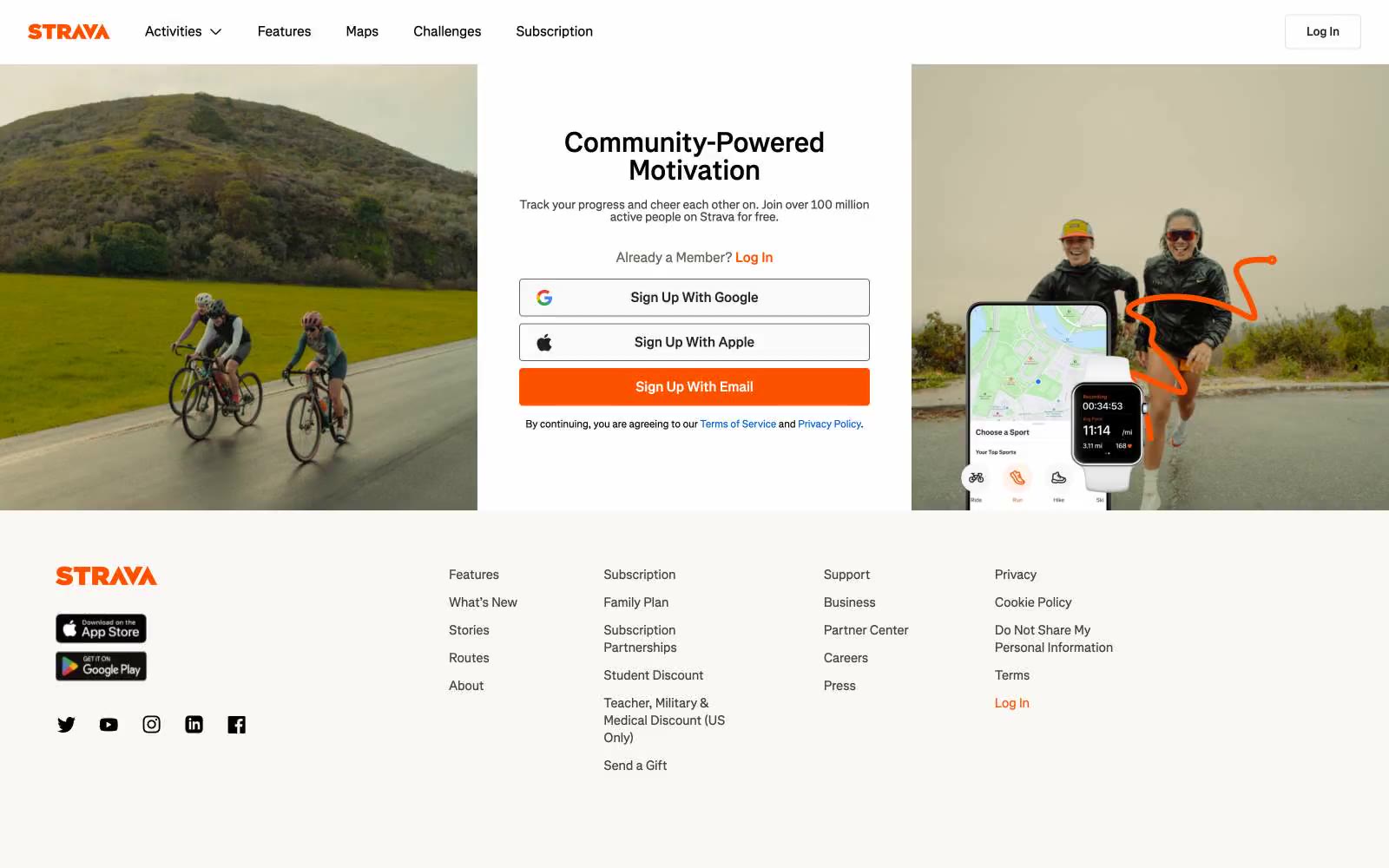
# Strava — Style Reference
# Strava — Style Reference
> athlete's logbook on warm paper — a single orange highlighter mark against black-and-white print
**Theme:** light
Strava's design reads like an athlete's logbook printed on warm paper: a stark white canvas warmed by off-white surfaces and a disciplined near-black text palette, with one bolt of vivid orange that signals every primary action. The interface is deliberately flat — no gradients, no shadows, no decorative chrome — letting full-bleed photography of cyclists, runners, and hikers in motion carry all the emotional weight. The custom Boathouse typeface and tight, slightly humanist letterforms give the system a print-publication quality rather than a typical SaaS feel. Sharp 4px corners on every interactive element, warm-toned grays instead of cool ones, and an almost monastic restraint with color (one orange, one link blue) create a visual hierarchy where the orange CTA always wins attention without ever needing elevation or glow.
## Tokens — Colors
| Name | Value | Token | Role |
|------|-------|-------|------|
| Strava Orange | `#fc5200` | `--color-strava-orange` | Orange supporting accent for decorative details and low-frequency emphasis. Do not promote it to the primary CTA color |
| Link Blue | `#0060d0` | `--color-link-blue` | Inline text links and policy references; the only secondary chromatic color and reserved strictly for navigational links |
| Paper White | `#ffffff` | `--color-paper-white` | Light supporting surface for subtle backgrounds and section separation. Do not promote it to the primary CTA color |
| Warm Linen | `#f9f8f5` | `--color-warm-linen` | Footer background, secondary surface elevation, subtle banding beneath white |
Websites
Văn bản Markdown
design-md
website-prompt
landing-page-prompt
Glossier
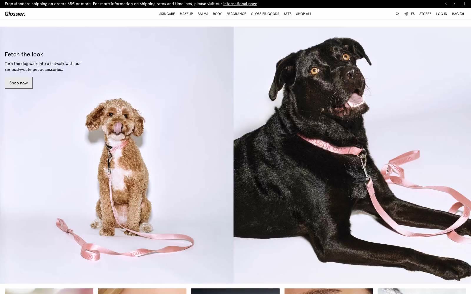
# Glossier — Style Reference
# Glossier — Style Reference
> Sunlit beauty editorial — trắng giấy, đen mực, một tia vàng
**Theme:** light
Glossier hoạt động như một tạp chí làm đẹp kỹ thuật số: một canvas gần như đơn sắc với trắng giấy và đen mực, bị phá vỡ bởi một điểm nhấn vàng điện duy nhất — vừa là brand wordmark vừa là lời kêu gọi hành động duy nhất. Hệ thống mang tính editorial ở sự tiết chế — headline Apercu cỡ lớn, khoảng thở rộng rãi, ảnh lifestyle full-bleed đảm nhận phần lớn trọng lượng cảm xúc — và mang tính thực dụng trong thực thi, với flat product cards, đường viền mảnh (hairline borders), và hoàn toàn không có chi tiết trang trí. Màu vàng không phải là màu phụ của thương hiệu; nó CHÍNH LÀ thương hiệu, được sử dụng một cách dè xẻn để mỗi lần xuất hiện đều như một tia sáng lóe. Mọi thứ khác phải lùi lại: các màu trung tính là xám ấm với một chút hồng nhẹ (blush undertone), đường viền gần như vô hình, chữ thì chặt và nén. Kết quả là một storefront mang phong cách tự tin, tinh tế, và hiện đại không hề nao núng.
## Tokens — Colors
| Tên | Giá trị | Token | Vai trò |
|------|-------|-------|------|
| Glossier Yellow | `#fff116` | `--color-glossier-yellow` | Điểm nhấn vàng hỗ trợ cho chi tiết trang trí và nhấn mạnh tần suất thấp. Không nâng cấp nó thành màu CTA chính |
| Ink | `#000000` | `--color-ink` | Văn bản chính, nav links, body copy, footer text, icon strokes, hairline borders; màu chủ đạo về typographic và cấu trúc |
| Paper | `#ffffff` | `--color-paper` | Bề mặt product card, input fills, elevated panels; mức bề mặt sáng nhất trong hệ thống phân cấp |
| Fog | `#f7f7f7` | `--color-fog` | Page canvas, nền section, chuyển tiếp ảnh sang trang; bề mặt nền mà toàn bộ trang web nằm trên đó |
Websites
Văn bản Markdown
design-md
website-prompt
landing-page-prompt
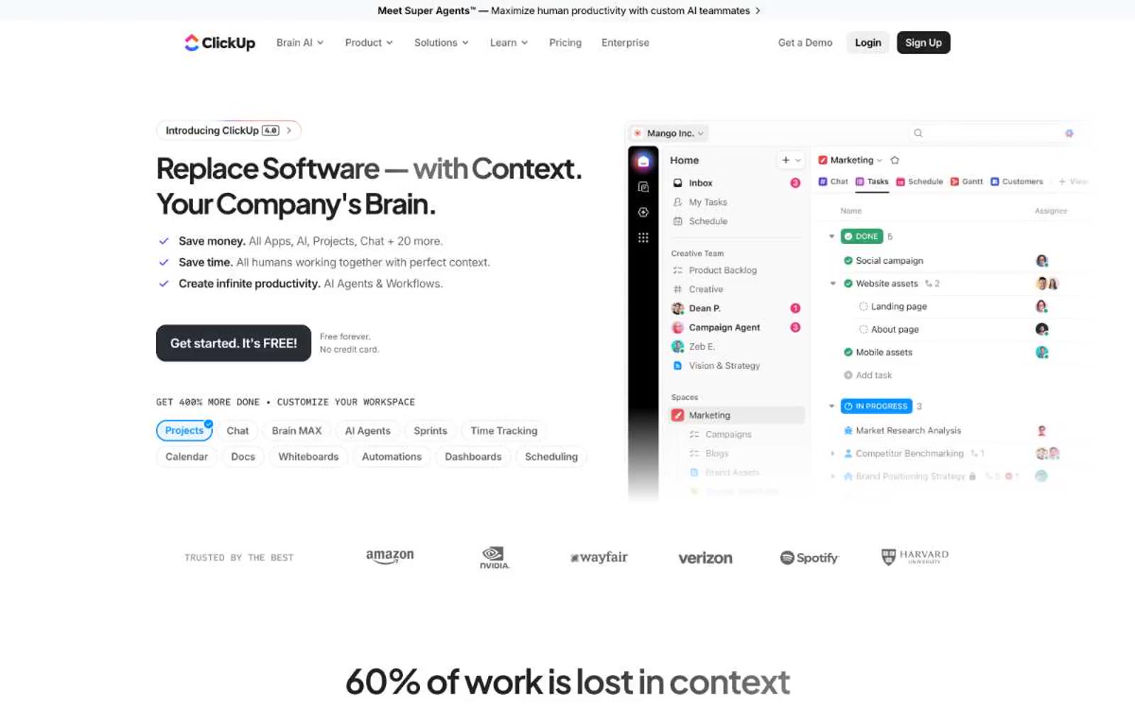
ClickUp™
ClickUp™ — Style Reference
# ClickUp™ — Style Reference
> Buồng lái năng suất ánh tím trên nền trắng
**Theme:** light
ClickUp trình bày một trung tâm chỉ huy năng suất trên nền canvas trắng tinh — một thương hiệu SaaS dùng một màu tím rực rỡ duy nhất làm giọng nói chính, đặt trên giao diện gần như không màu. Nhịp điệu thị giác dày đặc và giàu thông tin: headline display cỡ lớn, tự tin (Plus Jakarta Sans ở 60-76px, weight 800) chiếm khoảng trắng rộng rãi, kết hợp với body text nhỏ gọn và UI sản phẩm được xếp chặt chẽ, đóng vai trò chính trong hero. Các bề mặt phẳng với bóng đổ pha xanh lam nhẹ thay vì độ nâng cao rõ rệt, và màu tím thương hiệu (#7b68ee) xuất hiện tiết kiệm trên các hành động chính, logo, và một vài điểm nhấn. Tổng thể mang cảm giác thực dụng nhưng cao cấp — một buổi trình diễn sản phẩm nơi phần mềm CHÍNH LÀ ngôi sao, được đóng khung bởi hệ thống phân cấp kiểu chữ sạch sẽ và bảng màu hạn chế, điểm xuyết bằng màu tím đặc trưng duy nhất đó.
## Tokens — Colors
| Tên | Giá trị | Token | Vai trò |
|-----|---------|-------|---------|
| Brand Violet | `#7b68ee` | `--color-brand-violet` | Màu thương hiệu chính cho logo, CTA chính, trạng thái active, và điểm nhấn thương hiệu — một màu tím duy nhất này mang 90% bản sắc sắc độ |
| Signal Blue | `#0091ff` | `--color-signal-blue` | Điểm nhấn phụ cho badge, icon, và các điểm nổi bật của tính năng Agents/Brain — một điểm đối lập mát mẻ với tím, thường xuất hiện trong các dải conic-gradient |
| Ultra Violet | `#6647f0` | `--color-ultra-violet` | Biến thể tím đậm hơn cho trạng thái hover và bề mặt selected/active — tạo chiều sâu tối hơn cho thương hiệu khi cần |
| Muted Violet | `#514b81` | `--color-muted-violet` | Tím bão hòa thấp cho secondary text, border nhẹ, và nền có tông màu khi cần sự hiện diện của thương hiệu mà không cần bão hòa hoàn toàn |
Websites
Văn bản Markdown
design-md
website-prompt
landing-page-prompt
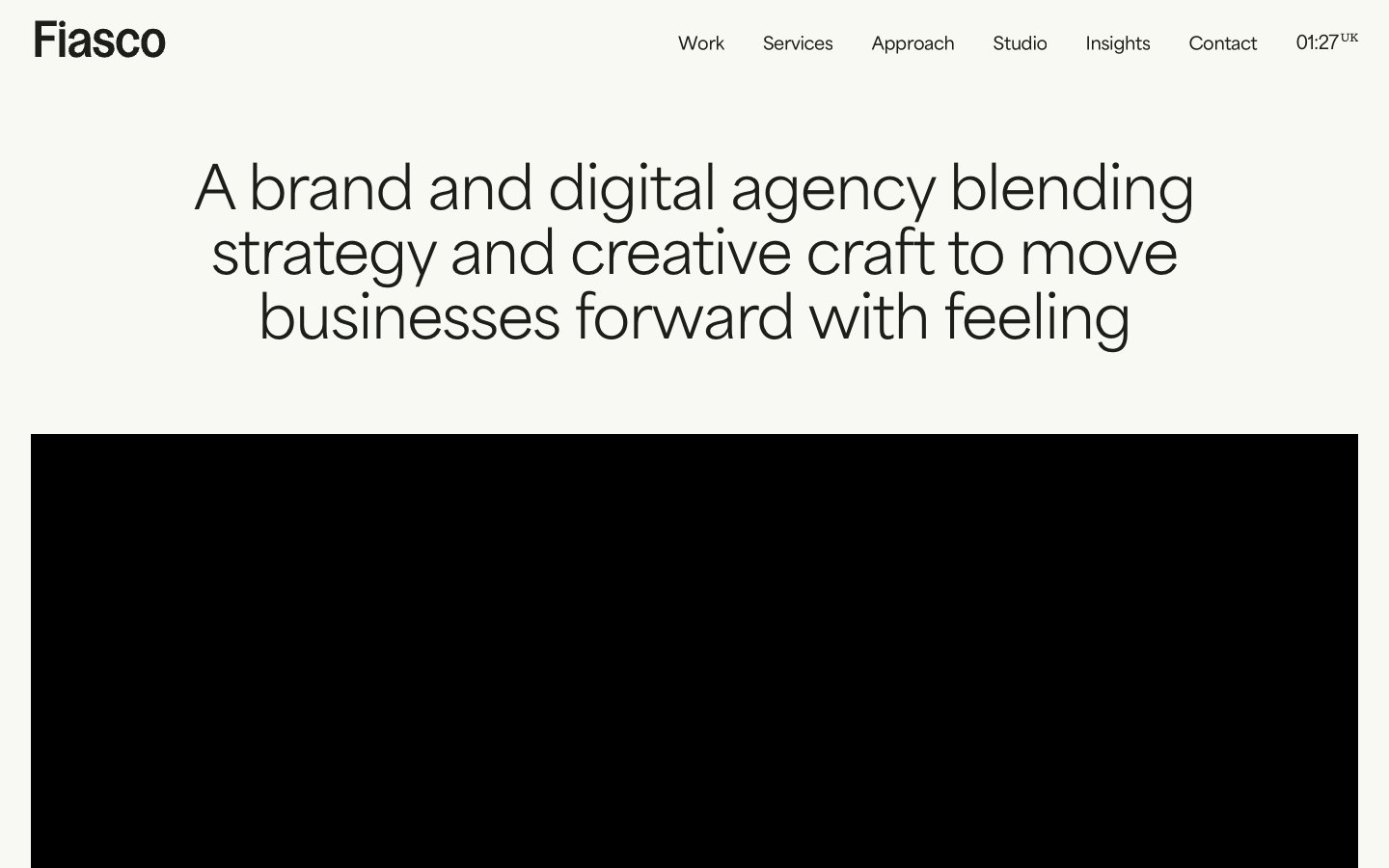
Fiasco
# Fiasco — Style Reference
# Fiasco — Style Reference
> "editorial gallery on cream paper" — warm off-white canvas with confident black type and single-color project cards.
**Theme:** light
Fiasco operates in an editorial, gallery-like register: a warm off-white canvas (#f8f9f3) with near-black text (#1d1e19) creates a hushed paper feel, while every project card introduces a single vivid color field that acts as wayfinding rather than decoration. The type system pairs a geometric sans (area-normal) for body and interface with a more characterful display family (Gooper) for headlines, giving the page an italic, magazine-like confidence. Components are deliberately unembellished — pill-shaped buttons (800px radius), 8px-cornered cards, 3px input fields, and a 40px radius reserved for hero and feature surfaces. Color appears as sparse, deliberate punctuation: yellow, pink, blue, orange, green blocks behind work, while the rest of the system stays in warm neutrals so the colored surfaces read as the loudest thing in the room.
## Tokens — Colors
| Name | Value | Token | Role |
|------|-------|-------|------|
| Canvas Cream | `#f8f9f3` | `--color-canvas-cream` | Page background, button borders, soft surface |
| Ink Black | `#1d1e19` | `--color-ink-black` | Primary text, nav borders, link borders, all structural outlines |
| Stone Mist | `#e9eae2` | `--color-stone-mist` | Nav borders, icon strokes, subtle dividers, secondary borders |
| Shadow Stone | `#d0d1cc` | `--color-shadow-stone` | Card and hero box-shadow base, low-contrast elevation |
Websites
Văn bản Markdown
design-md
website-prompt
landing-page-prompt
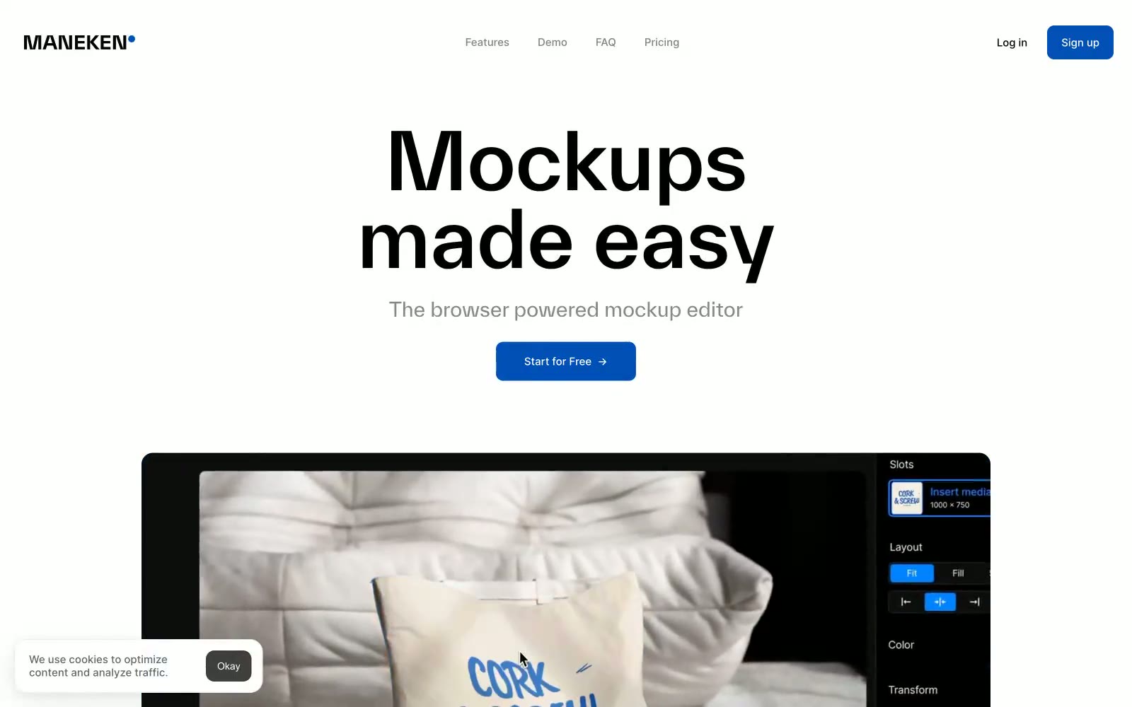
Mockups made easy
Mockups dễ dàng — Style Reference
# Mockups made easy — Style Reference
> Editorial design studio trên nền giấy trắng
**Theme:** light
Hệ thống thị giác của Maneken mang phong cách gallery-first: nền gần như trắng giúp ảnh mockup chiếm ưu thế, trong khi một tông xanh bão hòa duy nhất đóng vai trò là giọng nói màu sắc duy nhất trong giao diện. Typography đảm nhận phần nặng nhất — một display face tùy chỉnh (TWKEverett) chiếm không gian trang với headline cỡ lớn 77–110px, leading dày 1.0–1.2, tạo cảm giác tạp chí editorial thay vì dashboard SaaS thông thường. Inter xử lý mọi chức năng ở kích thước compact 14–18px, tạo sự đối lập có chủ đích giữa display type sân khấu và UI tiện dụng. Các bề mặt giữ phẳng với border-radius 10px, đường viền chủ yếu là hairline đen tuyền, và độ nâng (elevation) chỉ dành riêng cho nội dung ảnh thông qua soft drop shadow nhiều lớp.
## Tokens — Colors
| Tên | Giá trị | Token | Vai trò |
|------|-------|-------|------|
| Signal Blue | `#0050b7` | `--color-signal-blue` | Primary action buttons, logo dot accent, active nav strokes — màu sắc duy nhất trong hệ thống tạo điểm nhấn rõ ràng trên nền đơn sắc |
| Ink | `#000000` | `--color-ink` | Primary text, icon fills, hairline borders, image outlines — đen tuyền neo cấu trúc đơn sắc với độ tương phản tối đa (21:1 trên nền trắng) |
| Paper | `#ffffff` | `--color-paper` | Card surfaces, button text trên nền tối, image backgrounds — bề mặt sáng giúp nội dung ảnh nổi bật |
| Carbon | `#10151c` | `--color-carbon` | Dark surface backgrounds, body text trên card sáng, nav bar fills — gần như đen với sắc xanh nhẹ khó thấy, làm ấm tông trung tính đậm |
Websites
Văn bản Markdown
design-md
website-prompt
landing-page-prompt
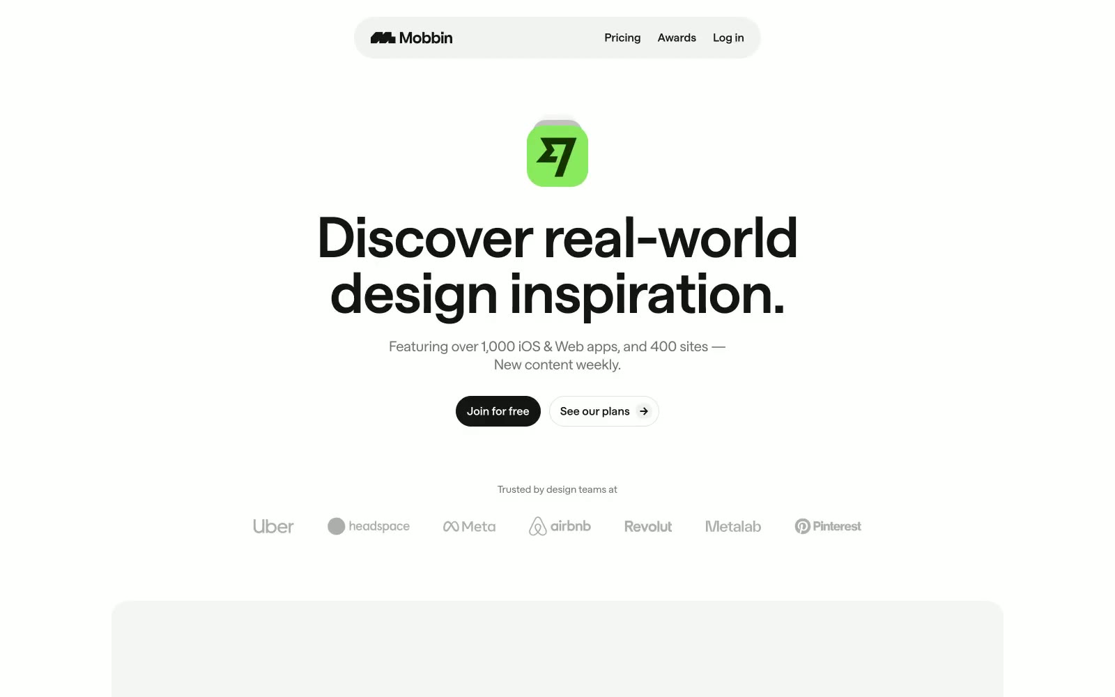
Mobbin
Mobbin — Style Reference
# Mobbin — Style Reference
> Bảng mẫu grayscale — một tờ in thử của thợ in nơi trọng lượng typography CHÍNH LÀ màu sắc.
**Theme:** light
Mobbin vận hành dựa trên sự kiềm chế achromatic thuần túy — zero chroma trên toàn bộ bảng màu, buộc hệ thống phân cấp chỉ dựa vào weight, kích thước và tông màu. Trang là khoảng trắng bị ngắt quãng bởi mực gần-đen (#141414) ở kích thước display và xám ấm (#707070, #adadad) cho text phụ. Typeface tùy chỉnh 'saans' là yếu tố khác biệt duy nhất: các weight phân số (440, 456, 652) không tồn tại trong bất kỳ system font nào, tạo ra khối lượng headline nằm giữa regular và semibold — typography đảm nhận công việc của màu sắc. Hình dạng pill 9999px xuất hiện trên mọi phần tử tương tác trong khi nội dung card nằm trên các hình chữ nhật bo tròn 16–24px, khiến các button trông như badge trong một biển thumbnail được đóng khung. Bản thân nội dung — ảnh chụp màn hình app mobile trong các card grayscale — CHÍNH LÀ kết cấu thị giác của trang.
## Tokens — Colors
| Tên | Giá trị | Token | Vai trò |
|------|-------|-------|------|
| Midnight Ink | `#141414` | `--color-midnight-ink` | Primary text, headings, filled CTA buttons, nav items, icon strokes — con ngựa thồ màu sắc duy nhất của một hệ thống achromatic |
| Pure Canvas | `#ffffff` | `--color-pure-canvas` | Nền trang, bề mặt card, text button trên nền tối |
| Graphite | `#707070` | `--color-graphite` | Body copy, secondary links, descriptive text |
| Ash | `#adadad` | `--color-ash` | Tertiary text, viền button disabled/muted, placeholder icons |
Websites
Văn bản Markdown
design-md
website-prompt
landing-page-prompt
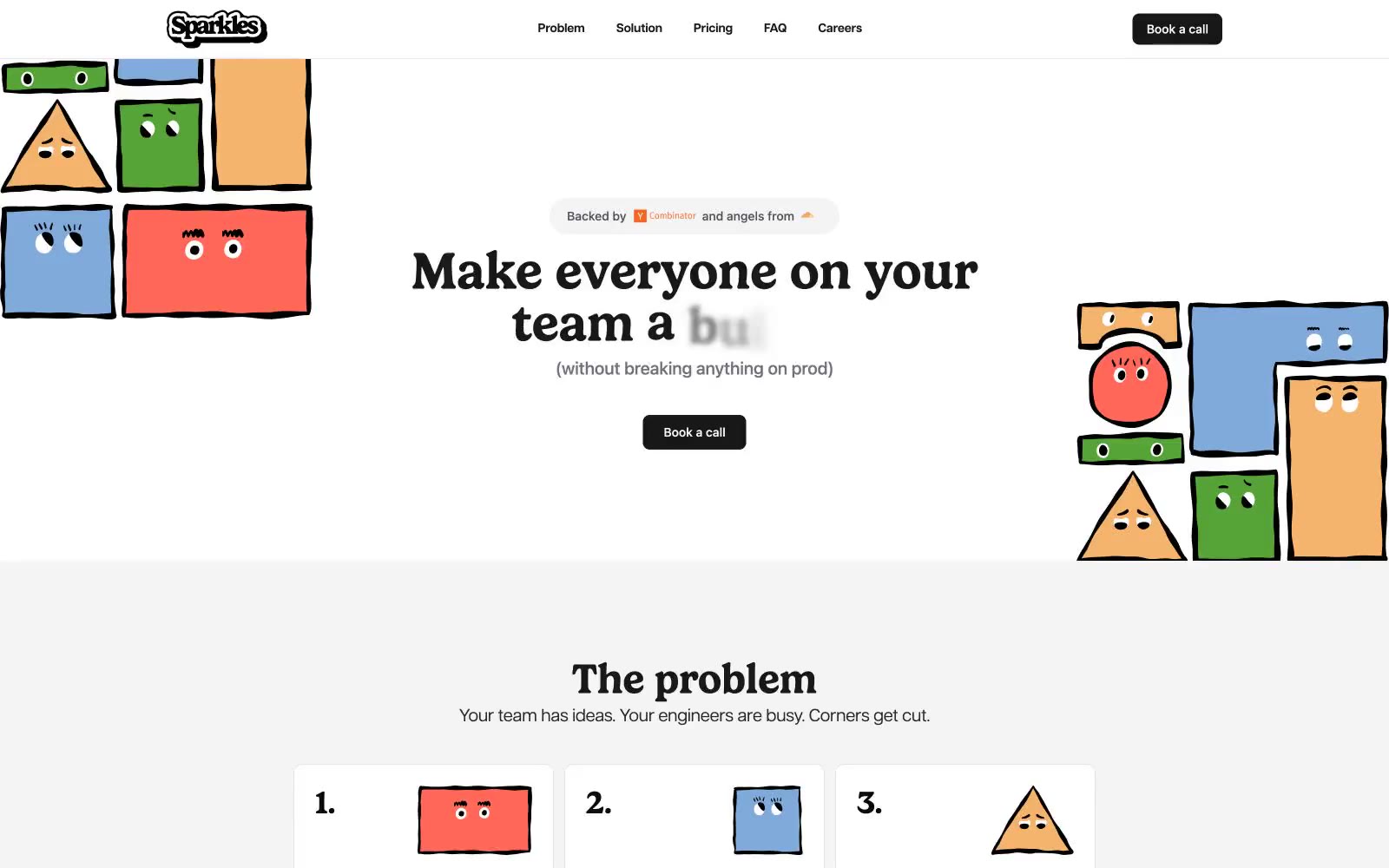
Sparkles
# Sparkles — Style Reference
# Sparkles — Style Reference
> Tờ broadsheet mực-in-trên-giấy được canh giữ bởi các linh vật bút chì màu
**Theme:** light
Sparkles vận hành trên bảng màu gần như đơn sắc, chỉ bị ngắt quãng bởi một khối màu xanh lá duy nhất ở footer — một sự kiềm chế có chủ đích, mang phong cách editorial, khiến các minh họa nhân vật vẽ tay ngộ nghĩnh phải gánh vác toàn bộ trọng trách màu sắc. Gelica (một display serif dày dặn) đảm nhận mọi headline ở weight 600 với line-height gần như bằng 0, tạo ra những khoảnh khắc editorial chặt chẽ, dứt khoát, tương phản với sans-serif thân chữ và UI text dãn rộng của Articulat CF. Giao diện phẳng, dựa trên đường viền, và sử dụng #18181b làm 'mực' phổ quát — cho heading, nav text, icon, và nút filled duy nhất — nhờ đó mắt người đọc nhìn trang như một tờ broadsheet in ấn. Cards và input nằm trên nền trắng (#ffffff) với đường kẻ tóc #e5e5e5 và góc bo 10px; elevation gần như không tồn tại. Dấu ấn thị giác là sự va chạm giữa typesetting khắc khổ và các nhân vật hoạt hình màu bút chì sáp ẩn mình ở lề trang.
## Tokens — Colors
| Name | Value | Token | Role |
|------|-------|-------|------|
| Ink Black | `#0a0a0a` | `--color-ink-black` | Primary text, foreground sâu nhất — mực tuyệt đối cho body copy và legal/footer type |
| Zinc Ink | `#18181b` | `--color-zinc-ink` | Headlines, nav text, icons, nền nút filled — mực tương tác phổ quát |
| Slate 700 | `#27272a` | `--color-slate-700` | Body text emphasis, nền input fill cho dark/inverted inputs |
| Slate 600 | `#3f3f46` | `--color-slate-600` | Secondary body text, input borders, subtle button borders |
Websites
Văn bản Markdown
design-md
website-prompt
landing-page-prompt
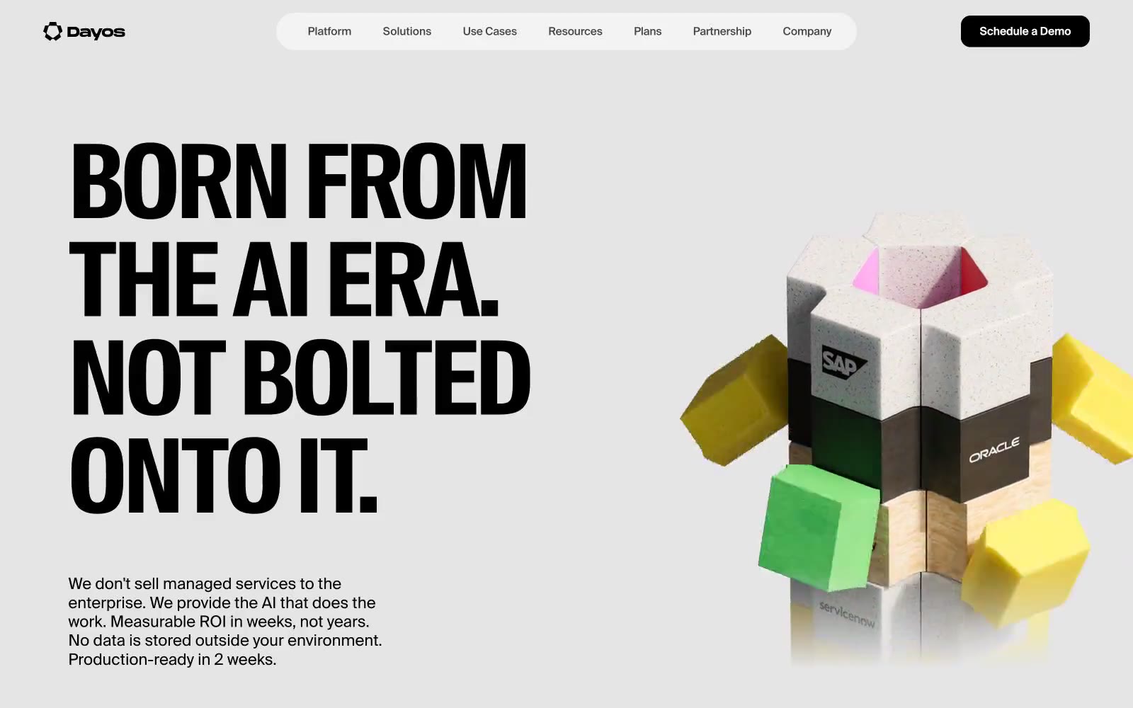
AI for Business
# AI for Business — Style Reference
# AI for Business — Style Reference
> Swiss editorial spread trên nền giấy lạnh
**Theme:** light
Dayos vận hành một hệ thống thị giác Swiss-editorial: nền canvas xám nhạt, display headline siêu đặc (ultra-condensed) cỡ lớn, body text grotesque tiết chế, và một giọng mono nhỏ xíu dành cho tag và micro-label. Trang hoạt động như một spread in ấn — mỗi section chỉ có một tuyên bố typography khổng lồ, set tight (line-height 0.90, tracking -3%), được hỗ trợ bởi khoảng trắng rộng rãi thay vì divider hay rule. Màu sắc gần như vắng bóng trong chrome và gần như bùng nổ trong 3D illustration; UI accent chỉ có một mint nhẹ và một vàng điện, được dùng như highlight wash một cách có chủ đích. Bề mặt phẳng — không shadow, không gradient — và dựa vào 5-level tonal stack (canvas → white card → mist → mint → yellow) để phân tách layer. Component nhỏ gọn và tự tin: nav bar hình pill màu trắng, button tối gần vuông, card bo tròn cỡ lớn. Cảm giác là sự tiết chế có tính toán, với một object vui tươi ở trung tâm trang.
## Tokens — Colors
| Tên | Giá trị | Token | Vai trò |
|-----|---------|-------|---------|
| Canvas Mist | `#e5e7eb` | `--color-canvas-mist` | Nền trang, section canvas, hairline divider và UI border — mặt phẳng tĩnh lặng làm nền cho mọi display type |
| Pure White | `#ffffff` | `--color-pure-white` | Bề mặt card, navigation pill background, elevated panel, button và nav text |
| Surface Mist | `#f3f3f3` | `--color-surface-mist` | Secondary surface nhẹ, button hover wash, low-emphasis panel cách canvas một bước |
| Ink Black | `#000000` | `--color-ink-black` | Heading chính, body text, icon fill trên nền sáng. Không dùng làm primary CTA color |
Websites
Văn bản Markdown
design-md
website-prompt
landing-page-prompt
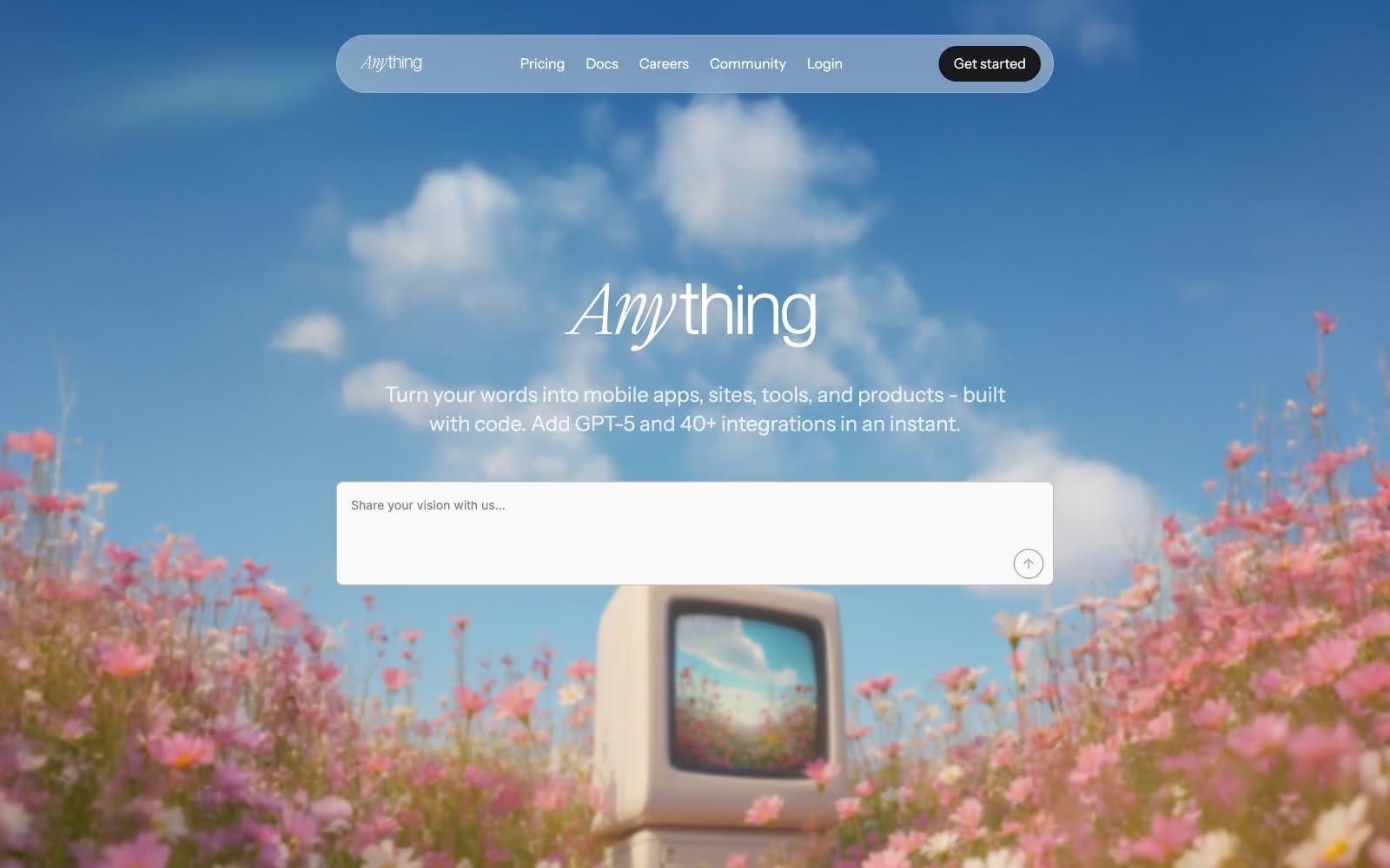
Anything
Anything — Style Reference
# Anything — Style Reference
> afternoon daydream over a wildflower field. Soft, floating, a little surreal — white UI plates drifting above a photograph that feels half-remembered.
**Theme:** light
Anything speaks in a daylight reverie: white canvas overlaid on dreamy photography, pill-shaped translucent navigation floating above the imagery, and one soft green accent that surfaces only as decorative punctuation. The wordmark is set in Instrument Serif italic — handwritten, not corporate — paired with Inter for UI and Instrument Sans for headlines, replacing the typical bold sans wordmark with something more personal. Components round generously at 20px on cards and images, 9999px on buttons, with shadows kept whisper-soft. Color is rationed: most surfaces are white or the faintest off-white; #448f52 appears sparingly on text and shimmer gradients, never as a filled CTA.
## Tokens — Colors
| Name | Value | Token | Role |
|------|-------|-------|------|
| Ink Black | `#000000` | `--color-ink-black` | Primary headings, body text, and icon fills on light surfaces. Do not promote it to the primary CTA color |
| Charcoal | `#18191b` | `--color-charcoal` | Secondary text, heading color, deep UI surfaces — slightly warmer than pure black |
| Slate Mid | `#6a6a6c` | `--color-slate-mid` | Body text, helper copy, muted descriptions |
| Steel | `#7d7f80` | `--color-steel` | De-emphasized headings, inactive labels |
Websites
Văn bản Markdown
design-md
website-prompt
landing-page-prompt
Volume
Volume — Style Reference
# Volume — Style Reference
> gallery wall with whispers — editorial restraint on paper-white canvas, the chrome is invisible, the imagery is the only color
**Theme:** light
Volume reads as an editorial gallery for design publications: full-bleed photographic campaigns with whisper-light Messina Sans headlines floating over image backgrounds. The chrome itself is nearly invisible — paper-white canvas, charcoal type, hairline borders, and a small set of pill-shaped status tags that carry the only chromatic punctuation. The extreme light weights (300/350) and tight negative tracking create a refined, magazine-page atmosphere where negative space and imagery do the heavy lifting. Every surface favors restraint and breathing room, letting the projects — not the interface — command attention.
## Tokens — Colors
| Name | Value | Token | Role |
|------|-------|-------|------|
| Ink | `#272727` | `--color-ink` | Primary text, nav, footer text, dark pill tags (funded, successful) — the workhorse near-black that grounds every layout |
| Graphite | `#717171` | `--color-graphite` | Secondary text, hairline borders on cards, images, and inputs — the quiet structural neutral |
| Ash | `#949494` | `--color-ash` | Tertiary text, subtle borders, disabled or muted states |
| Fog | `#cdcccc` | `--color-fog` | Light placeholder text, decorative dividers on dark surfaces |
Websites
Văn bản Markdown
design-md
website-prompt
landing-page-prompt
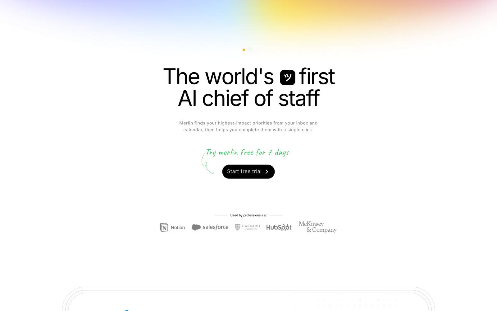
Merlin
Merlin — Style Reference
# Merlin — Style Reference
> Handwritten margin notes on white paper. A calm off-white page where one vivid green dot says yes, soft pastel light bleeds in from the edges, and Inter does the heavy talking.
**Theme:** light
Merlin uses a hushed, paper-like productivity language: a warm off-white canvas, flat white surfaces, a single vivid green accent that makes the primary action feel like a green light turning on, and soft pastel atmospheric gradients reserved for the page's top and the product backdrop. Type is bold and confident at display sizes but quiet at body sizes — Inter carries the entire voice in one family, letting weight and tracking do all the work. The system feels hand-touched: handwritten green annotations in a script style sit beside machine-clean sans-serif, bridging warmth and product precision. Components stay close to the page — thin hairlines replace heavy elevation, pills replace boxes, and the nav floats as a capsule rather than anchoring as a bar.
## Tokens — Colors
| Name | Value | Token | Role |
|------|-------|-------|------|
| Paper White | `#f5f5f4` | `--color-paper-white` | Page canvas — the warm off-white ground the entire page sits on |
| Card Snow | `#ffffff` | `--color-card-snow` | Card surfaces, product mockup backgrounds, floating nav capsule |
| Blush Mist | `#fdf8f7` | `--color-blush-mist` | Subtle warm-tinted surface for accent cards or highlighted zones |
| Ink Black | `#000000` | `--color-ink-black` | Primary headings, strong borders, icon strokes — maximum contrast |
Websites
Văn bản Markdown
design-md
website-prompt
landing-page-prompt
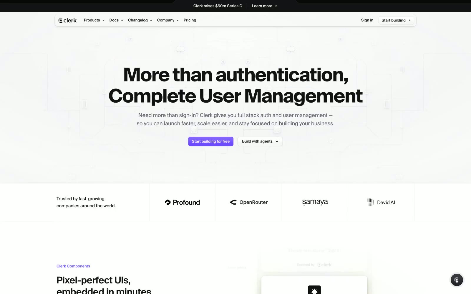
Clerk
Clerk — Style Reference
# Clerk — Style Reference
> Developer dashboard ẩn sau lớp kính tím mờ — các bề mặt mang cảm giác như bản xem trước live IDE: thẻ sản phẩm tối nổi trên lớp vỏ tài liệu sáng, với một xung tím điện duy nhất đánh dấu đường đi phía trước.
**Theme:** pha trộn
Clerk sử dụng canvas hai tính cách: lớp vỏ marketing gần trắng (#f7f7f8) với đường viền siêu mảnh và khoảng trắng rộng rãi, trong khi các bề mặt demo sản phẩm rơi vào thẻ tối gần đen (#212126) để trưng bày UI components trong ngữ cảnh thực tế. Màu thương hiệu duy nhất — tím trung tính (#6c47ff) — xuất hiện với độ chính xác phẫu thuật: chỉ trên primary CTA và thỉnh thoảng làm điểm nhấn heading, khiến mỗi lần xuất hiện đều có chủ đích. Typography mặc định là Geist, một custom face tối ưu cho số với negative tracking chặt (-0.035em), tạo cho headline mật độ kỹ thuật dày đặc, báo hiệu tư duy developer-first mà không cần weight nặng. Hệ thống gradient xếp lớp tím với các quầng vàng (#fff963) và cyan (#5de3ff) ở độ mờ thấp, tạo hiệu ứng lấp lánh không khí phía sau hero content thay vì nhiễu trang trí.
## Tokens — Colors
| Tên | Giá trị | Token | Vai trò |
|-----|---------|-------|---------|
| Void Black | `#131316` | `--color-void-black` | Primary text, heading và body copy tương phản cao trên bề mặt sáng |
| Fog White | `#f7f7f8` | `--color-fog-white` | Page canvas và nền section sáng |
| Pure White | `#ffffff` | `--color-pure-white` | Bề mặt card, nền modal, form input trên section sáng |
| Graphite | `#5e5f6e` | `--color-graphite` | Secondary body text, muted labels, icon fills trên bề mặt sáng |
Websites
Văn bản Markdown
design-md
website-prompt
landing-page-prompt
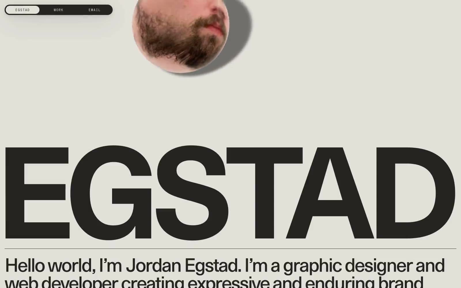
Egstad
Egstad — Style Reference
# Egstad — Style Reference
> editorial broadside in warm ink — monumental type, one paper color, zero decoration
**Theme:** light
Egstad hoạt động như một editorial broadside một màu: mực ấm (#252422) in trên nền giấy kem ấm (#e2e0d9), không có màu trang trí, không gradient, và gần như không có UI chrome. Toàn bộ nhận diện thị giác được gánh bởi ba typeface — một custom monumental display face (EG Metaphor) phủ kín trang từ mép này sang mép kia, system Times cho body copy, và một micro-display tracking rộng (S85) cho navigation. Các component được tước bỏ đến tận xương: một navigation bar hình pill tối màu, hairline horizontal rules, và circular image masks đè lên type mà không có container. Kết quả mang phong cách giống một tấm poster in hoặc magazine masthead hơn là một portfolio site điển hình — sự tiết chế chính là bản sắc, typography chính là kiến trúc.
## Tokens — Colors
| Name | Value | Token | Role |
|------|-------|-------|------|
| Press Ink | `#252422` | `--color-press-ink` | Primary text, heading strokes, borders, dark surface cho navigation bar và các khối tối — warm near-black với undertone nâu, mềm hơn pure black trên nền cream canvas |
| Bone Paper | `#e2e0d9` | `--color-bone-paper` | Page canvas, card và container backgrounds, inverted text trên dark surface — warm off-white với chút sắc olive/khaki, khiến mực tối trông như in chứ không phải digital |
| Pure Carbon | `#000000` | `--color-pure-carbon` | Hairline borders và các điểm nhấn đen tuyền hiếm hoi khi cần độ tương phản cạnh tối đa trên nền cream canvas |
Websites
Văn bản Markdown
design-md
website-prompt
landing-page-prompt
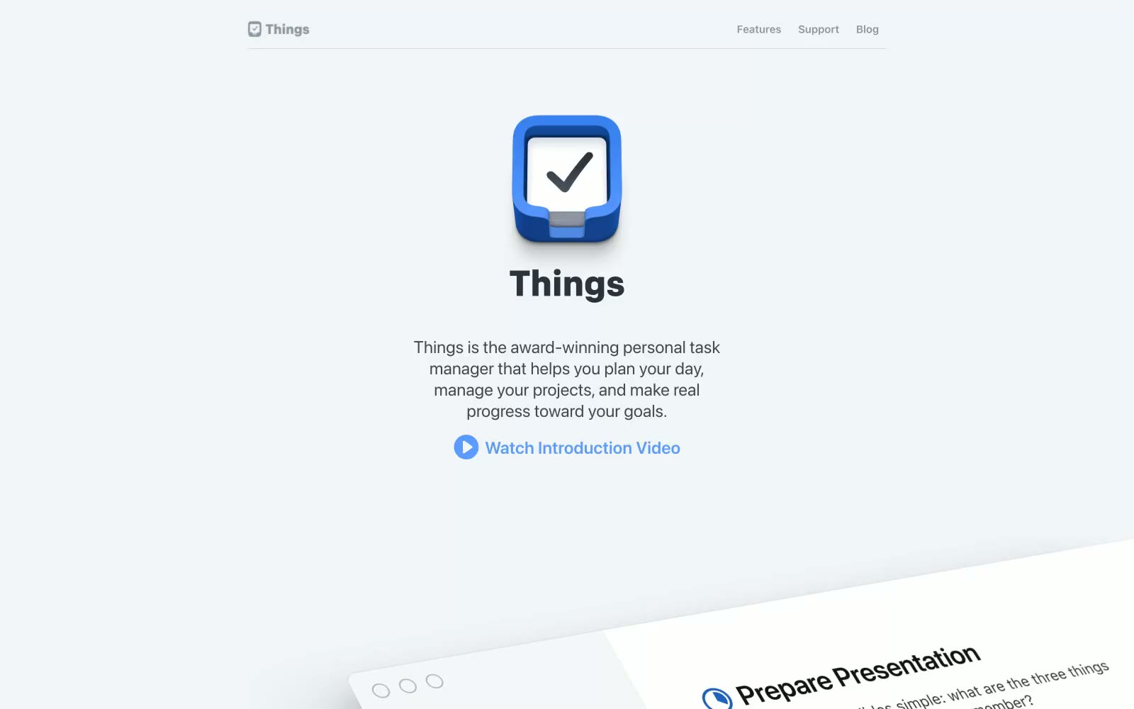
Things
Things — Style Reference
# Things — Style Reference
> Apple keynote ở âm lượng vừa phải — một bức tường gallery với các khung sản phẩm nghiêng nổi trên nền canvas xám lạnh tĩnh lặng, với một chấm xanh dương rực rỡ kéo mắt người xem đến mọi khoảnh khắc tương tác.
**Theme:** light
Things tạo ra một trang sản phẩm kiểu gallery nơi ứng dụng tự kể chuyện qua khoảng trắng rộng rãi, các mockup sản phẩm nghiêng, và một điểm nhấn xanh dương duy nhất đầy tự tin. Phong cách thẩm mỹ vay mượn từ sự kiềm chế editorial của Apple — system fonts, gam màu trung tính gần như xám, độ nâng tinh tế, và các card bo tròn với bán kính 18px tạo cảm giác cao cấp mà không hề lạnh lẽo. Màu sắc xuất hiện một cách tiết kiệm và có chức năng: xanh dương rực cho link, icon và nút play tròn; xanh dương nhạt hơn cho heading phụ; và gần như đen (#303336) cho body text trên nền canvas hơi lạnh (#f2f5f7). Các section thở với khoảng cách dọc 40-80px, và hệ thống phân cấp được thể hiện qua type weight (600-800 cho heading) và line-height rộng rãi thay vì các chi tiết trang trí.
## Tokens — Colors
| Tên | Giá trị | Token | Vai trò |
|------|-------|-------|---------|
| Ink | `#303336` | `--color-ink` | Primary text, body copy, heading text — gần như đen với một chút ánh lạnh nhẹ, không bao giờ là #000 thuần, giữ cho trang không bị chói |
| Paper | `#ffffff` | `--color-paper` | Bề mặt card, mockup sản phẩm được nâng lên, input fields — trắng tinh khiết trên nền canvas lạnh hơn tạo cảm giác nổi, không phẳng |
| Mist | `#f2f5f7` | `--color-mist` | Canvas trang, các dải nền full-width — màu trắng ngà pha lạnh, mềm hơn trắng thuần nhưng vẫn đọc là sáng |
| Fog | `#838b96` | `--color-fog` | Secondary body text, helper copy, mô tả mờ — neutral được dùng nhiều nhất sau Ink, tạo nên mid-tone chủ đạo của trang |
Websites
Văn bản Markdown
design-md
website-prompt
landing-page-prompt
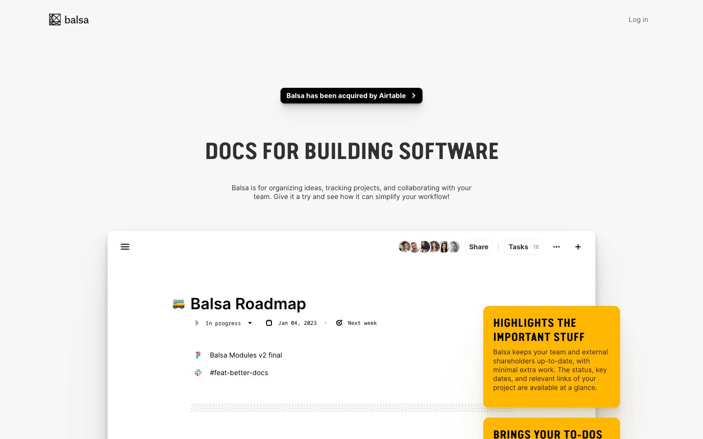
Balsa
Balsa — Style Reference
# Balsa — Style Reference
> engineering notebook on white drafting paper
**Theme:** light
Balsa's design language is an engineering notebook on white drafting paper: an almost exclusively achromatic canvas interrupted only by amber highlighter-pen annotations and one deep purple accent. The hero voice is Van Condensed Pro Bold set uppercase at extreme negative tracking (-0.047em at 48px) — industrial, compressed, shouting in a whisper. Inter handles every secondary voice at compact sizes (11–18px), with the entire interface reading as product-first: a large embedded product screenshot is the real hero, flanked by floating yellow callout cards that explain the screenshot like margin notes. Black filled buttons with 6px radius and 12px-radius flat white cards with hairline borders carry the entire component vocabulary. Shadows are barely there (0.5px black at 10% or a single 1px line at 5%), the palette does almost no decorative work, and the layout breathes with generous 60–80px section gaps so each annotation card and product crop can do its job.
## Tokens — Colors
| Name | Value | Token | Role |
|------|-------|-------|------|
| Carbon Black | `#000000` | `--color-carbon-black` | Primary text, filled action buttons, icons — the only assertive color in the system carries all interactive and typographic weight |
| Paper White | `#ffffff` | `--color-paper-white` | Card surfaces, product screenshot backgrounds, button labels on filled buttons |
| Drafting Gray | `#f7f7f7` | `--color-drafting-gray` | Page canvas, the base surface every component sits on; sets the off-white tone that makes cards read as elevated without shadow |
| Graphite | `#313131` | `--color-graphite` | Secondary headings and body emphasis, slightly softer than pure black for hierarchical depth |
Websites
Văn bản Markdown
design-md
website-prompt
landing-page-prompt
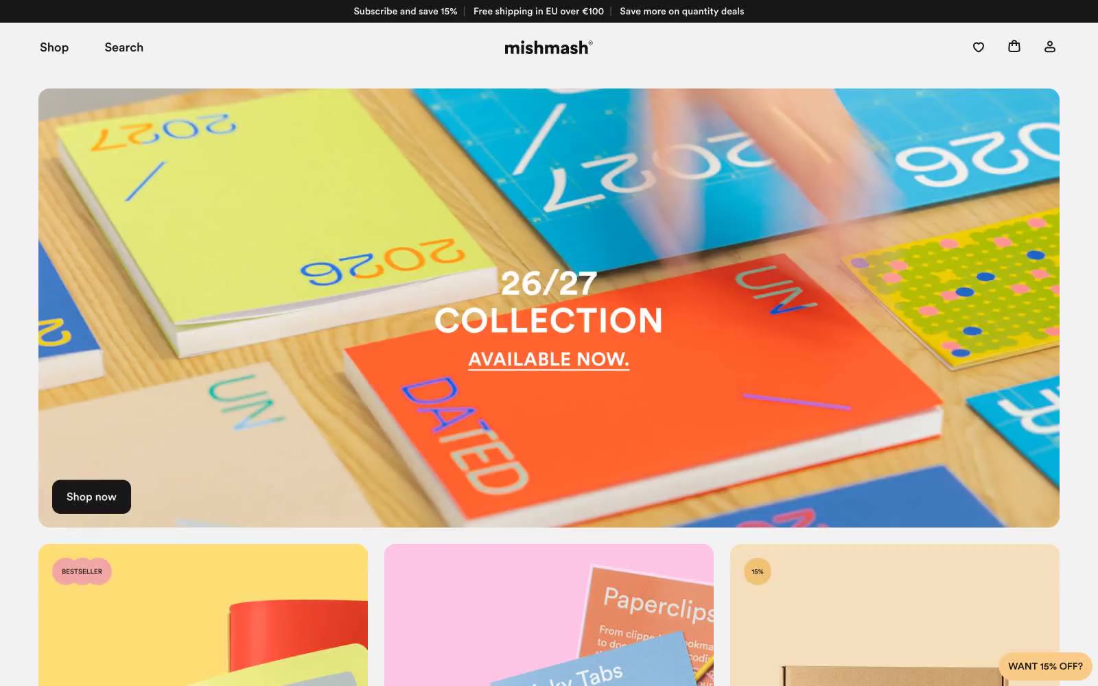
mishmash®
mishmash® — Style Reference
# mishmash® — Style Reference
> paper boutique, black frame, vivid contents.
**Theme:** light
mishmash® vận hành như một phòng trưng bày đồ giấy: chrome (type, border, button, card) gần như hoàn toàn achromatic, để ảnh sản phẩm bão hòa màu đảm nhận mọi khoảnh khắc màu sắc. Bố cục là một grid nhỏ gọn, thiên về hình ảnh, nơi các editorial photo cỡ lớn làm phần việc nặng nhọc và các UI element giữ vai trò yên lặng, nhỏ gọn và tự tin. Chỉ có hai token màu tồn tại trong giao diện — một màu vàng bơ nhạt (butter yellow) và một màu hổ phách ấm hơn (amber) — và cả hai đều xuất hiện như những dấu chấm câu nổi nhỏ (sale badges, persistent discount chip) thay vì là filled buttons hay background. Type là nơi duy nhất hơi ấm đi vào hệ thống: Circular ở kích thước vừa phải với line-height thoải mái, đặt sát vào grid. Kết quả mang cảm giác như một cửa hàng văn phòng phẩm được tuyển chọn — vỏ ngoài kiềm chế, nội dung sống động.
## Tokens — Colors
| Tên | Giá trị | Token | Vai trò |
|------|-------|-------|---------|
| Ink | `#171717` | `--color-ink` | Primary text, nav links, button text, card borders, footer dividers — gần đen nhưng pha chút ấm, không phải #000 thuần |
| Paper White | `#ffffff` | `--color-paper-white` | Page canvas, card surface, product card background |
| Bone | `#f2f2f2` | `--color-bone` | Subtle body borders, secondary text, input borders, hairline dividers giữa các section |
| Ash | `#e3e3e3` | `--color-ash` | Button borders, card surface variant, footer separator lines — tối hơn Bone một chút dùng cho elevated borders |
Websites
Văn bản Markdown
design-md
website-prompt
landing-page-prompt
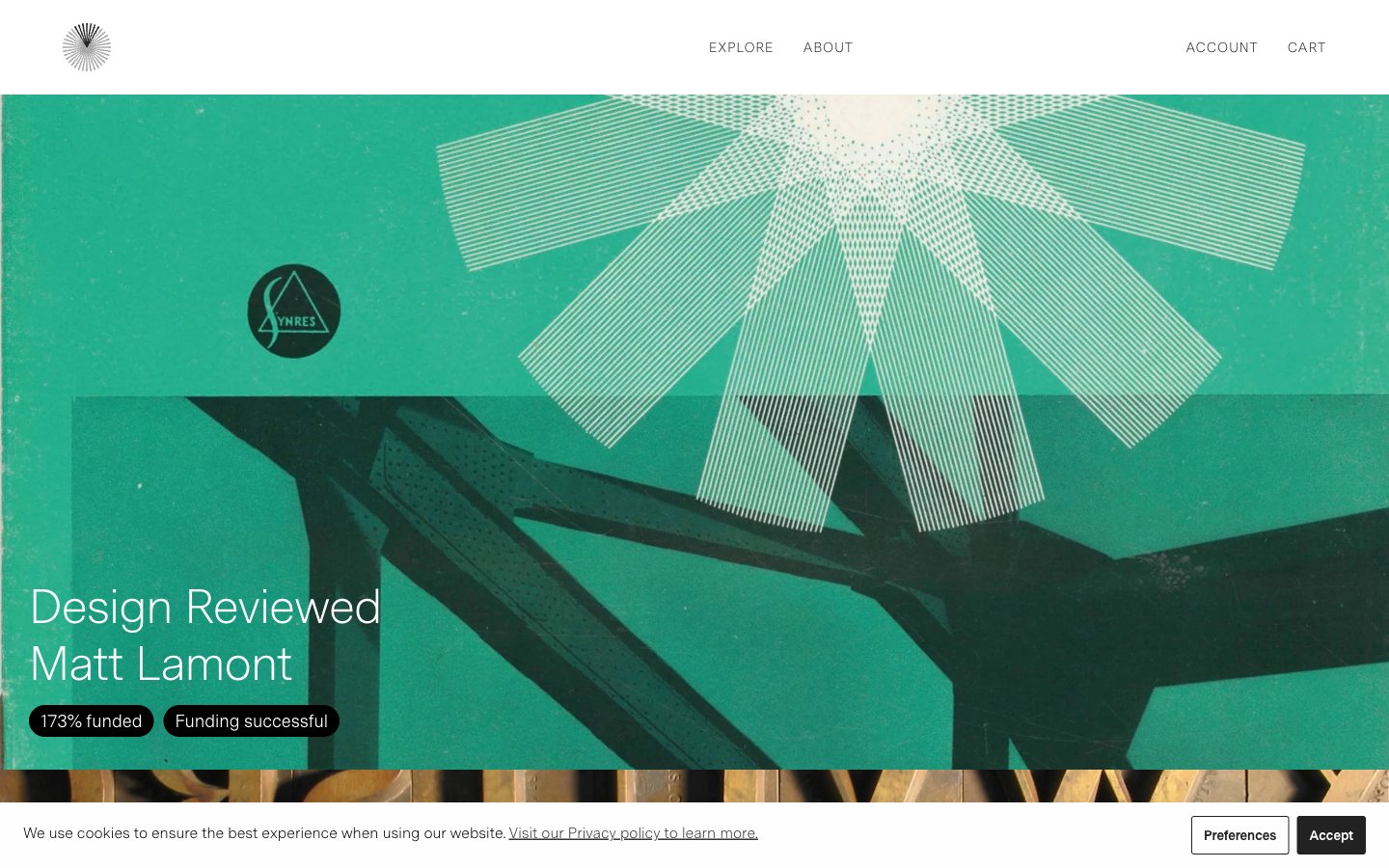
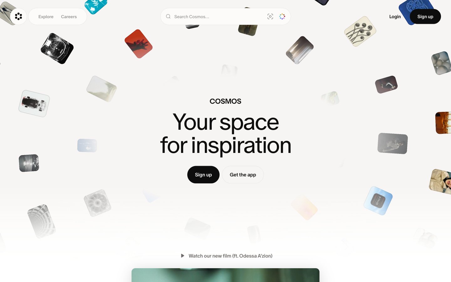
Cosmos
# Cosmos — Style Reference
# Cosmos — Style Reference
> Linen gallery wall với floating polaroids
**Theme:** light
Cosmos là một canvas bọc gallery dành cho khám phá hình ảnh: nền kem ấm (#f7f5f3) mang phong cách vải linen chưa xử lý, typography mực đen, và giao diện monochrome nghiêm ngặt — nơi màu sắc chỉ xuất hiện qua hình ảnh do người dùng tuyển chọn. Sản phẩm tin vào sự kiềm chế — chrome vô hình để hình ảnh có thể lên tiếng. Typeface là một custom serif-influenced face duy nhất (cosmosOracle) được kéo chặt với negative tracking, dùng weight 350 cho hero copy để tạo độ mềm mại editorial thay vì sự hung hăng marketing. Các bề mặt phẳng với một signature radius duy nhất (16px) lặp lại trên cards, inputs và video containers. Hero rải các image tile trong một collage tự do bao quanh centered copy, và phần còn lại của trang dàn vào grid ba cột gồm các feature card lấy hình ảnh làm chủ đạo. Không có gradients, không có shadow ngoài shadow tự nhiên của các collage cards, và không có chromatic accents trong chính giao diện.
## Tokens — Colors
| Name | Value | Token | Vai trò |
|------|-------|-------|---------|
| Linen Canvas | `#f7f5f3` | `--color-linen-canvas` | Nền trang — off-white ấm, không bao giờ là #ffffff tinh khiết ở root, tạo cho giao diện nền giống giấy, gallery-wall |
| Ink Black | `#0d0d0d` | `--color-ink-black` | Neutral tối hỗ trợ cho text, icons và độ tương phản mạnh. Không nâng lên làm màu CTA chính; Borders, dividers, outlined button strokes — dùng ở độ mờ thấp để tạo đường cấu trúc tinh tế, luôn là Ink Black thay vì một gray riêng |
| Paper White | `#ffffff` | `--color-paper-white` | Bề mặt sáng hỗ trợ cho nền nhẹ và phân cách section. Không nâng lên làm màu CTA chính |
| Stone | `#6e6a69` | `--color-stone` | Body text, secondary icons, inactive UI — mid-gray ấm cho body copy và metadata hỗ trợ |
Websites
Văn bản Markdown
design-md
website-prompt
landing-page-prompt
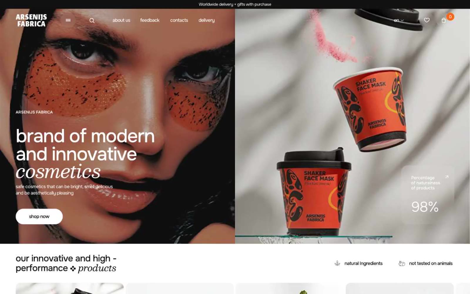
Arsenijs Fabrica
Arsenijs Fabrica — Style Reference
# Arsenijs Fabrica — Style Reference
> Editorial beauty spread under gallery lights. Pure-white gallery walls, a single warm strobe pulsing orange against the monochrome, type set thin as glass and hung with generous negative space.
**Theme:** light
Arsenijs Fabrica operates as an editorial beauty spread: expansive white surfaces, whisper-weight display type that floats across the canvas, and a single vivid orange that cuts through monochrome like a studio strobe. The brand voice in type is restrained and continental — weights 200-300 at hero scale, near-black text on pure white, generous breathing room between sections. Orange appears as functional punctuation: filled CTAs, modal backgrounds, card borders, and link accents — never as a wash or gradient field. Components feel fashion-magazine lightweight: hairline 1px borders, 10px card corners, 600px pill buttons, and a deliberate absence of shadows across the structural layer.
## Tokens — Colors
| Name | Value | Token | Role |
|------|-------|-------|------|
| Ember Orange | `#f15730` | `--color-ember-orange` | Filled CTA buttons, primary action backgrounds — deep saturated orange that reads as confident rather than playful, the only color with enough chroma to anchor a click target against the white field |
| Tangerine Blaze | `#f7651a` | `--color-tangerine-blaze` | Promotional surface fills (email capture modal, featured product cards, stat callout backgrounds) — slightly brighter and more luminous than Ember, used where orange must own an entire region of the layout |
| Apricot Whisper | `#ff8562` | `--color-apricot-whisper` | Borders on outlined cards, link underlines, icon strokes, accent hairlines — the lightest orange, functioning as a warm-tinted structural color rather than a fill |
| Graphite Black | `#111111` | `--color-graphite-black` | Body text, default borders, the dominant structural color — a true near-black, not warm, used for the bulk of hairline rules and paragraph copy |
Websites
Văn bản Markdown
design-md
website-prompt
landing-page-prompt
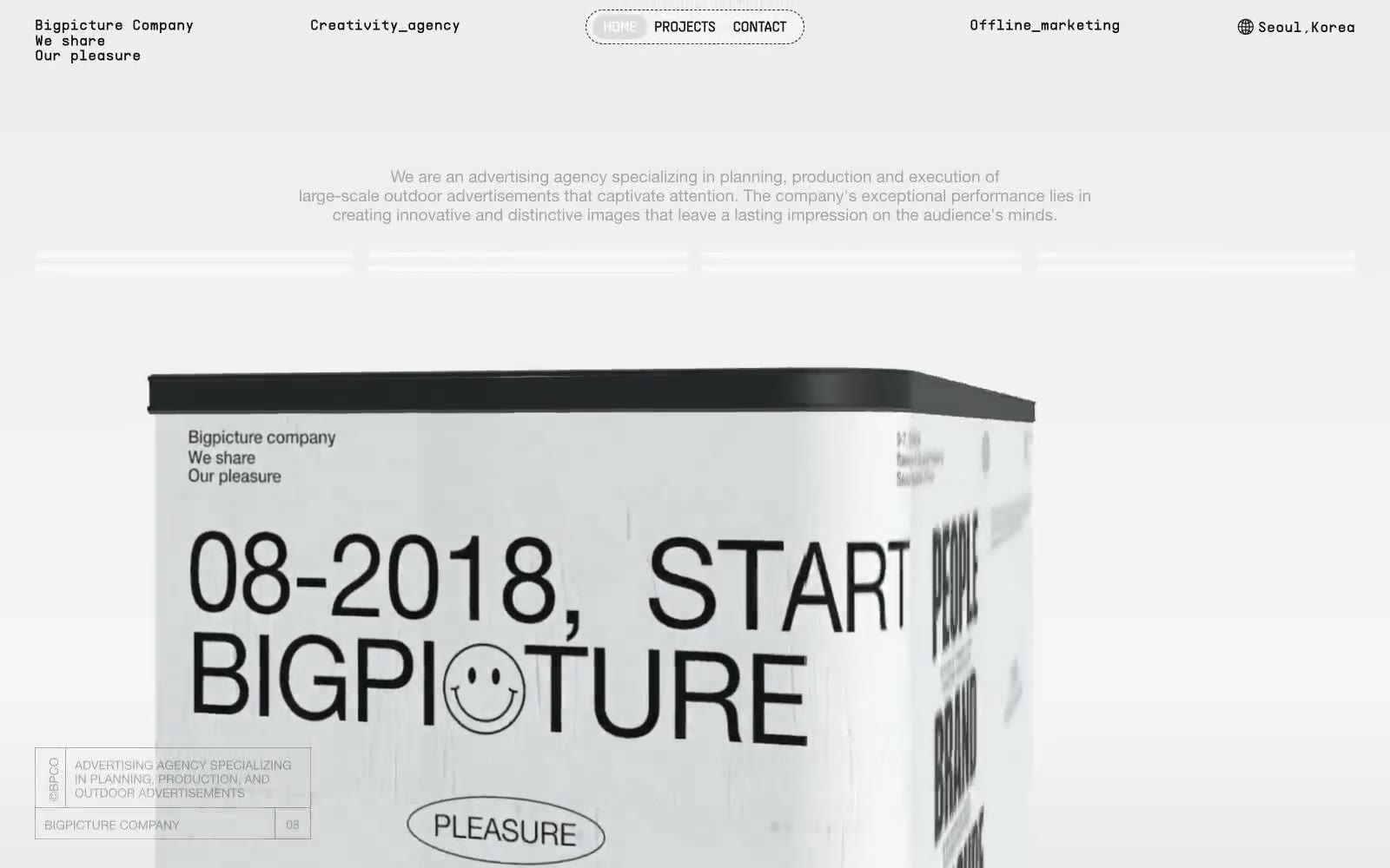
큰그림컴퍼니
큰그림컴퍼니 — Style Reference
# 큰그림컴퍼니 — Style Reference
> Tuyên ngôn typographic trên nền bê tông. Một press kit đen-trên-trắng, nơi Helvetica cỡ lớn đảm nhiệm vai trò của nhiếp ảnh, và kết cấu duy nhất là một tờ giấy nhàu duy nhất nằm dưới body type.
**Theme:** light
Bigpicture Company là một hệ thống editorial đơn sắc, xử lý trang web như một press kit in ấn được trải trên giấy thô. Giao diện loại bỏ mọi màu sắc và hoàn toàn dựa vào mực đen, khoảng trắng, đường kẻ mảnh (hairline rules) và một kết cấu giấy nhàu duy nhất để tạo bầu không khí. Typography chính là sản phẩm: display headlines đạt tới 274px với Helvetica Neue 700 và negative tracking mạnh, biến chữ thành khối thị giác chủ đạo trên mọi màn hình. Monospace labels ([01-N INTRODUCTION], CREATIVE/AGENCY) hoạt động như caption kiểu in ấn, trong khi các biểu tượng sparkle bốn cánh là vật trang trí duy nhất giữa các section. Layout rộng rãi, mang phong cách zine — section gap 72px, horizontal padding 144–250px, và các khối ảnh full-bleed với góc bo 288px giúp trang thở như một bức tường gallery thay vì một sản phẩm phần mềm.
## Tokens — Colors
| Tên | Giá trị | Token | Vai trò |
|------|-------|-------|------|
| Press Ink | `#121212` | `--color-press-ink` | Primary text, hairlines, section borders, icon strokes, footer text — sắc thái tối duy nhất mang 95% toàn bộ thông tin foreground |
| Paper White | `#ffffff` | `--color-paper-white` | Page canvas, card surfaces, nav pill background, heading-bordered surfaces |
| Newsprint | `#f1f1f1` | `--color-newsprint` | Surface fills nhẹ, soft borders, hairline dividers, tông màu nền cho kết cấu giấy nhàu |
| Foil Gray | `#e1e1e1` | `--color-foil-gray` | Light borders, icon stroke accents, secondary dividers |
Websites
Văn bản Markdown
design-md
website-prompt
landing-page-prompt
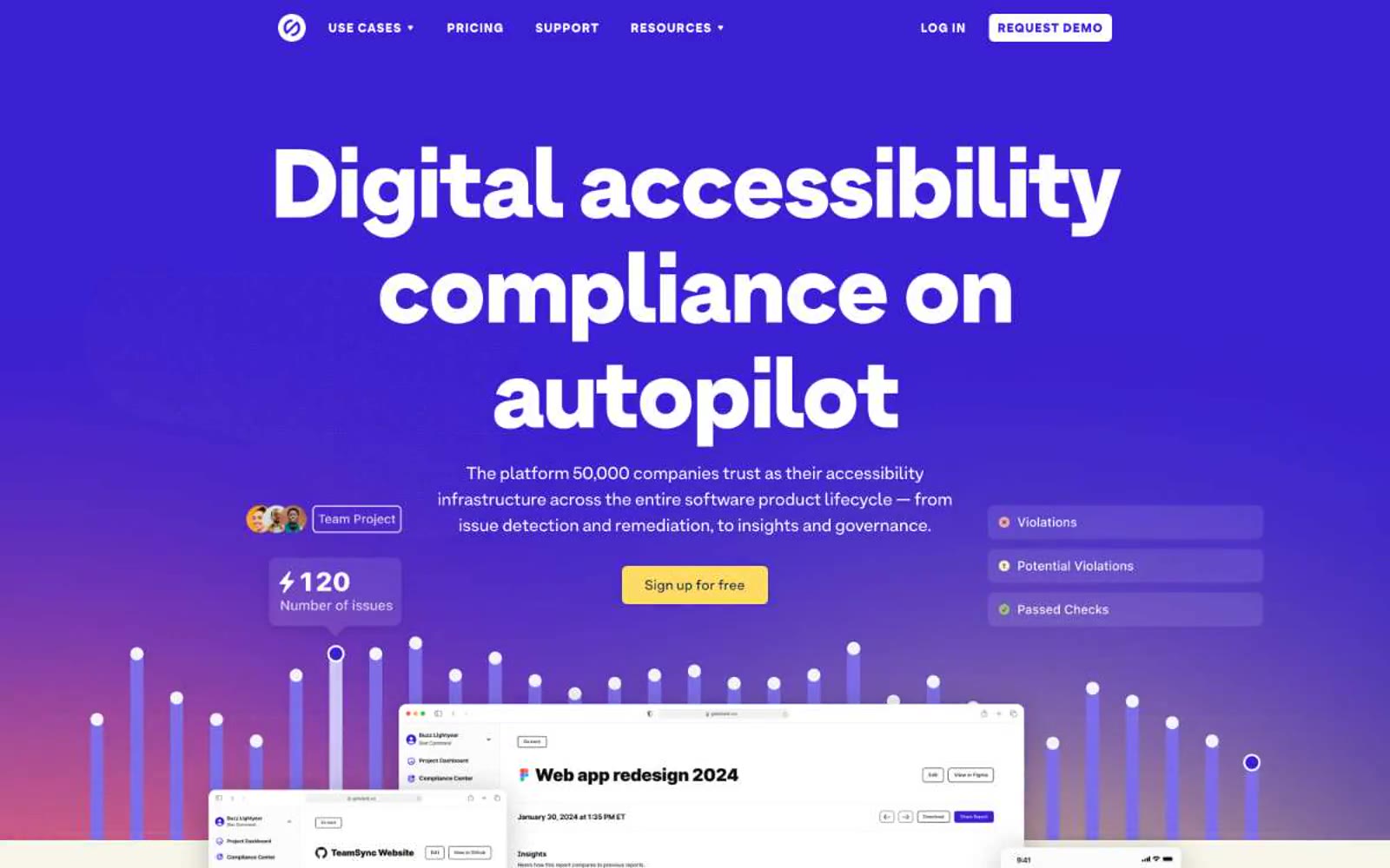
Stark
Stark — Style Reference
# Stark — Style Reference
> midnight lecture hall with yellow highlighter
**Theme:** light
Stark operates as a confident accessibility-infrastructure brand sitting on a dual-surface canvas: a deep midnight-navy hero that crashes into a warm cream secondary field, linked by a vivid violet primary action and a mustard-yellow highlighter that reads like a teacher's marking pen. The type system is anchored by ArminGrotesk at its heaviest possible weight (900) for hero display — the 110px headline is not a statement, it is a wall — then steps down through 56/48/28/24/20/16/14 with tight negative tracking (-0.02em) that pulls large letters into a single sculpted block. Yellow is not decoration; it marks emphasis inside running copy (the diagonal-split gradient) and signals one specific action. Violet is the chromatic engine: CTA fills, card borders, icon accents, active states. Everything else stays in a narrow achromatic corridor of #000, #fff, and #e5e7eb hairlines, so the two chromatic colors always read with maximum signal.
## Tokens — Colors
| Name | Value | Token | Role |
|------|-------|-------|------|
| Midnight Navy | `#10284b` | `--color-midnight-navy` | Hero background, primary headings, footer surface — the dominant brand color establishes authority and anchors the dark-to-light page split. Used as a background field for the above-the-fold section and as body-text color on the cream secondary surface |
| Stark Violet | `#381fd1` | `--color-stark-violet` | Primary action fills (Get started, Sign up, Request demo), card border accents, active nav state, decorative icon strokes, and inline emphasis text. The vivid violet against midnight navy creates a switched-on, electric feel without aggression |
| Highlighter Yellow | `#fedb63` | `--color-highlighter-yellow` | Diagonal text-highlight gradient fill, one specific secondary CTA, and illustration accent. Yellow never decorates broadly — it marks, underlines, and punctuates specific words within dark-on-light headlines |
| Lilac Tint | `#e5e0ff` | `--color-lilac-tint` | Soft button surface variant, gentle tinted card backgrounds. A desaturated wash of the violet brand that softens interactive elements without competing with the primary action |
Websites
Văn bản Markdown
design-md
website-prompt
landing-page-prompt
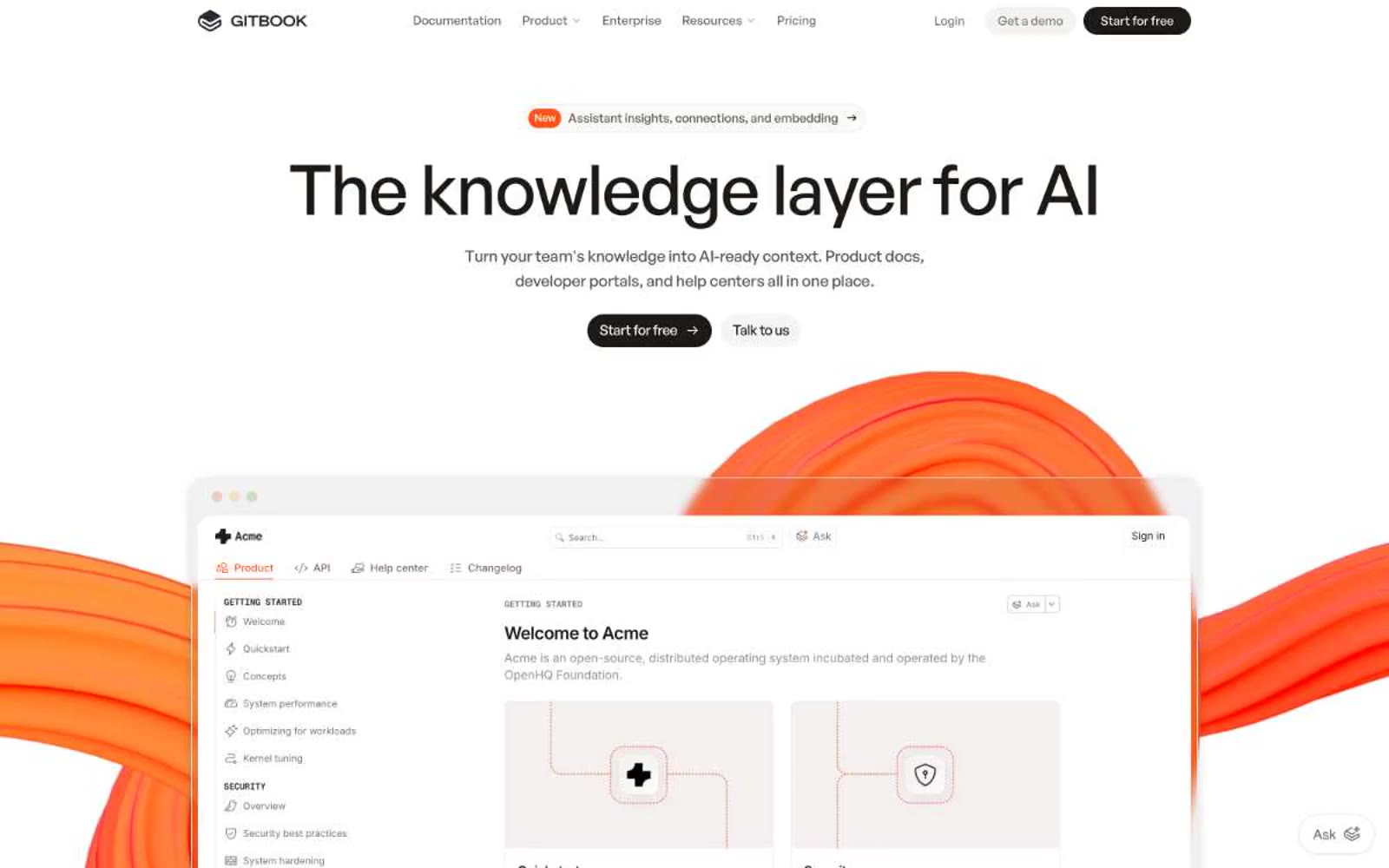
Gitbook
Gitbook — Style Reference
# Gitbook — Style Reference
> warm-white architecture studio with orange highlighter marks
**Theme:** light
GitBook projects the calm authority of a well-edited reference book: warm-white pages, generous breathing room, and near-black type that commands without shouting. A single vivid orange acts as a highlighter — appearing only in badges, the 'New' pill, the floating Ask widget, and the kinetic 3D shapes that bleed into the hero screenshot. The interface stays almost entirely monochromatic; color is punctuation, not atmosphere. Typography is the visual identity: a geometric bold display face at 45-55px with tight negative tracking creates editorial weight, while Inter handles the dense body copy. Components are paper-like — flat cards, hairline borders, pill buttons, minimal shadow. Everything reads as a knowledge product: structured, legible, confident.
## Tokens — Colors
| Name | Value | Token | Role |
|------|-------|-------|------|
| Flame Orange | `#fe551b` | `--color-flame-orange` | Orange outline accent for tags, dividers, and focused UI edges. |
| Ink | `#1c1917` | `--color-ink` | Primary action buttons, headlines, body text, primary borders — warm near-black replaces pure black for a softer, editorial feel |
| Paper | `#ffffff` | `--color-paper` | Page canvas, button text on dark fills, card surfaces — the dominant background |
| Bone | `#fafaf9` | `--color-bone` | Card backgrounds, subtle surface elevation above the white canvas, link/button ghost states |
Websites
Văn bản Markdown
design-md
website-prompt
landing-page-prompt
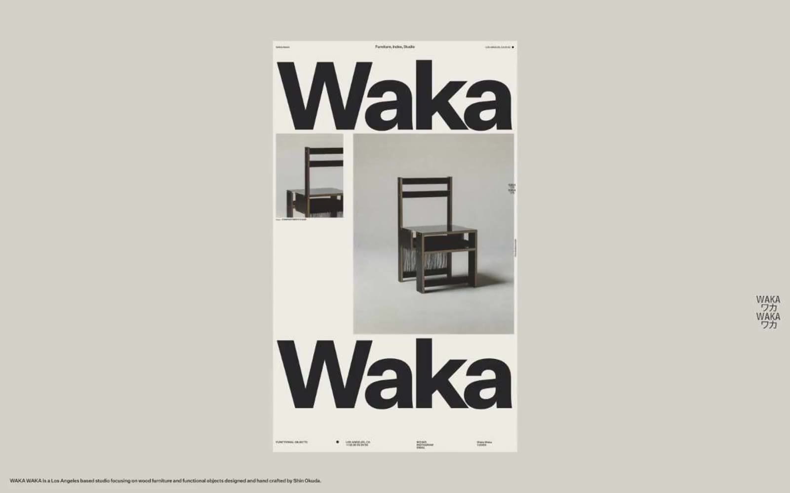
Waka Waka
Waka Waka — Style Reference
# Waka Waka — Style Reference
> poster bảo tàng trên nền giấy xương và mực — kiểu chữ grotesk đen hoành tráng in trên giấy trắng ấm, mọi thứ khác đều lùi về phía sau
**Theme:** light
Waka Waka xử lý website của mình như một catalog triển lãm in ấn: nền giấy màu xương ấm áp, một màu mực gần đen, và một typeface grotesk tùy chỉnh được triển khai ở cả kích thước footnote 10px và tỷ lệ hoành tráng 560px. Hệ thống về cơ bản là monoline và đơn sắc — không có điểm nhấn, không có sắc thái phụ, không gradient, và hầu như không có chrome trang trí. Phân cấp thị giác được tạo ra hoàn toàn thông qua trọng lượng typographic, tỷ lệ và khoảng trắng, với chính tên thương hiệu đóng vai trò là công cụ đồ họa chủ đạo trên mọi màn hình. Các component đều phẳng, không viền hoặc viền mảnh (hairline), và mang cảm giác được tuyển chọn hơn là tương tác — trang đọc như một bức tường gallery trưng bày các vật thể và chữ cái khổng lồ, không phải một giao diện phần mềm.
## Tokens — Colors
| Tên | Giá trị | Token | Vai trò |
|------|-------|-------|------|
| Bone Paper | `#edeae4` | `--color-bone-paper` | Nền trang, mọi bề mặt canvas — trắng ấm mang cảm giác giấy chưa tẩy trắng thay vì trắng kỹ thuật số |
| Stone Gray | `#c9c7c4` | `--color-stone-gray` | Bề mặt phụ và neutral ngữ cảnh mờ — xuất hiện trong các cặp tương phản như một lớp sâu hơn bên dưới canvas |
| Ink Black | `#28282a` | `--color-ink-black` | Văn bản chính, mọi đường viền, hairline rules, nét icon, và là neo màu sắc duy nhất trong hệ thống — gần đen nhưng pha chút ấm để nằm thoải mái trên nền xương thay vì rung động |
Websites
Văn bản Markdown
design-md
website-prompt
landing-page-prompt
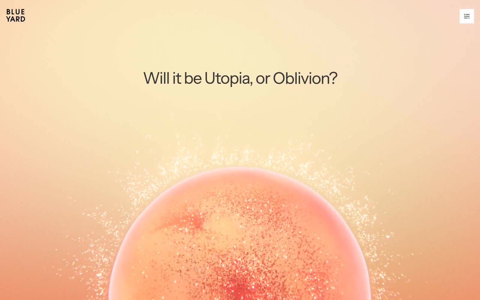
BlueYard Capital
# BlueYard Capital — Style Reference
# BlueYard Capital — Style Reference
> Sunset editorial observatory. Một đường chân trời đào ấm loang dần vào trắng tinh, một headline cỡ lớn nổi giữa khoảng âm bản, và một thiên thể 3D duy nhất treo bên dưới như hành tinh trong một monograph in ấn.
**Theme:** light
BlueYard Capital mang phong cách một ấn phẩm editorial in ấn được ngụy trang thành homepage của quỹ đầu tư mạo hiểm: một canvas trắng rộng lớn được neo bởi một mảng màu đào ấm, một headline Instrument Sans cỡ lớn duy nhất, và một tác phẩm hình cầu được render 3D hoạt động như ảnh bìa tạp chí. Bảng màu 98% là achromatic — một màu gần đen ấm (#3a3a3e) đảm nhận toàn bộ trọng lượng chữ trên nền trắng tinh — với ba sắc thái màu nhạt (đào, oải hương, hồng) chỉ xuất hiện làm nền card và đường viền mảnh, không bao giờ là nút chức năng. Cards phẳng, không viền hoặc viền mảnh, nổi trên whitespace thay vì nằm trong hộp đổ bóng. Navigation gần như không có: một wordmark hai dòng nhỏ và một ô hamburger. Toàn bộ site thu hút sự chú ý qua sự tiết chế và tỷ lệ, chứ không phải chrome.
## Tokens — Colors
| Tên | Giá trị | Token | Vai trò |
|------|-------|-------|---------|
| Canvas White | `#ffffff` | `--color-canvas-white` | Nền trang, bề mặt card, fill nút ghost — sân khấu chính cho mọi thứ khác |
| Graphite Ink | `#3a3a3e` | `--color-graphite-ink` | Chữ chính, màu link, stroke icon, viền mảnh, viền nút ghost — màu gần đen ấm mang 97% trọng lượng typography |
| Deep Carbon | `#090b11` | `--color-deep-carbon` | Chữ nhấn, stroke nav, viền card đậm — hơi lạnh và cứng hơn Graphite Ink, dành cho những khoảnh khắc tương phản tối đa |
| Ash Veil | `#b5b0b0` | `--color-ash-veil` | Nền body mờ, viền mềm — xám ấm dùng cho các dải nền phụ bên dưới canvas chính |